The Milanese studio Migliore + Servetto Architects handled the complete art direction of Blue Line Park (150,474 m2) and designed the pedestrian walkways, the access roads, the installations, the lighting, the wayfinding, the logo and the visual identity. A second phase is planned that will involve the creation of listening islands and sound installations to complete the path.
The Blue Line Park route begins in the ultra-modern Haeundae district and is divided into three main stages: the first is Mipo Station, the departure station, at the foot of the Haeundae skyscrapers; the route then winds along a rocky peninsula on the sea until it reaches Cheongsapo, a typical fishing village that stretches out onto the coast with its small port; finally, it arrives at the historic station of Songjeong (dating back to the 1920s), a seaside resort in Busan with sandy beaches loved by families and young surfers. The plans for an observatory on the sea and the two new stations –the first section of which has a panoramic cable car running alongside it – are by the Korean studio Mooyoung.
The input of Migliore + Servetto Architects has transformed the new functional route (panoramic railway-cable car-path) into a place with a strong experiential connotation geared towards hospitality, reactivating the relationship between the inhabitants of Busan and a long stretch of coast that has been neglected despite being home to a wealth of beautiful landscapes. The project is part of the movement to reconvert residual urban areas, especially disused infrastructures (former railways, tramways, elevated tracks, etc.) with a multi-purpose nature that lend themselves to generating interactive spaces on several levels, such as relational, naturalistic, playful, sporty or touristic.
The overall vision and the precise solutions adopted by Migliore + Servetto for Blue Line Park (installations, seating, flooring, signage, lighting) reflect the most advanced research in planning for recreational urban areas, which are increasingly necessary to rethink the livability of metropolises. These areas do not segregate nor are they segregated, but rather they intersect with the fabric of the city by repurposing disused land, incorporating small communities and urbanized nature (vegetable gardens, gardens, spontaneous greenery), breaking the productive rhythm of the city in favor of a form of time and space that is restored to relationships and basic actions such as breathing, walking and looking into the distance.
The Mipo entrance
First and foremost, the project addressed the relationship between the new route and the densely urbanized context of Haeundae, starting from the Mipo entrance, where a pedestrianized section of about 200 meters leads to Mipo Station, the departure point for the train and cable car. This initial segment acts as an entry for the park going into the city and as a space of transition from urban chaos to a slower-paced dimension that invites people to indulge in walking, leisure and contemplation of the coastal views. The entrance is marked by tall corten steel totems that welcome visitors, bearing information and maps, followed by a "forest" of yellow fiberglass poles towering at a height of over 10 meters, similar to gigantic blades of grass, topped by a spotlight. These iconic vertical signs also mark the access to the Cheongsapo and Songjeong stations, becoming landmarks of identity and orientation, even from afar.
“Visitors are thus invited to follow a park with a linear structure”, state designers Ico Migliore and Mara Servetto, “as they tread a path that interconnects natural splendours with the past and present history of the place. This journey is framed within a narrative that offers visitors new perceptions that constantly change over time. The line it traces does not only translate back to the old railway tracks, but it also becomes a synthesis, not only between the past of the site and its current form, but also between what the park is and what it could be, a place brought to life through being experienced.”
A square for Mipo Station
The entrance way is flanked by a system of corten steel benches with fluid shapes, some of which have a niche at the base, forming a 'cocoon' space equipped with wooden seats. This is followed by a clearing punctuated by six imposing metal arches that recall the train tracks and which intertwine with soft and irregular curves, marking the passage towards the station. The arches outline a new square, the Mipo Square, identifying a connecting area from the linear path in which the streets and lanes that were created to reach the surrounding gardens during the time of abandonment converge.
The arches are situated as dynamic presences in dialogue with nature: they delineate shaded passages in relation to the motion of the sun and the moon, and are molded by the surrounding greenery, which can grow to the point of enveloping them. Finally, small commercial boxes in corten steel have been created near the station. Like solitary wagons, they can host small businesses or workshops for the artisans from the area.
The signs, structures and installations of this first section of Blue Line Park converge, jointly defining its identity and communicating its functions while incorporating the context and entering into dialog with it.
The pavement and the walls
The paving of the entrance path is made from stone and resin (Mapei) in two colors, brick red and white, which outline a floor graphic with large white waves on a red background. This not only serves as a reference to the sea, which the path leads towards, but also forms a continuous horizontal sign that is perfectly legible even from the top of the surrounding skyscrapers. The walls that accompany the first section of the route are flanked by the newly planted green areas and have been conceived in order to harmoniously connect with the retaining walls of the traditional houses in this area. This is another element that links the context to its history.
Dalmaji Tunnel, the “Rainbow Tunnel”
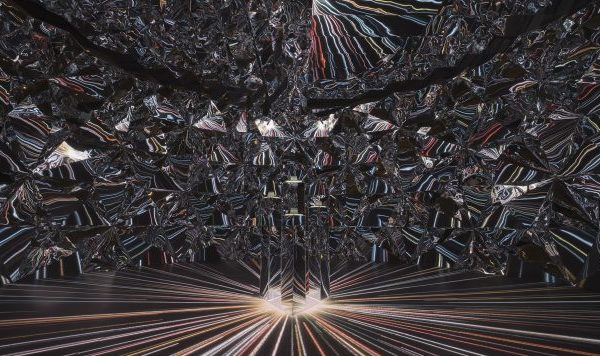
About 450 meters from Mipo Station the route meets a concrete tunnel that was part of the old railway. One side is backed against the hill while the other side is punctuated by arched niches open to the sea. Here the "Rainbow Tunnel" installation has added chromatic dynamism to visits: the niches of the gallery have been strengthened with suspended overhanging corten arches and painted with graded chromatic fields, combined with colored glass panels that alternately close them off. The colored glass allows the train passengers to view the sea through a continuous chromatic mutation while, vice versa, the pedestrians on the path perceive the train as a range of frames in different colors. The Dalmaji Tunnel is located in a panoramic point, which enjoys a spectacular view of Busan and its skyline of skyscrapers and bridges: the surrounding areas have been equipped for visitors to rest, like a sort of panoramic balcony. When the trains are stopped, the tunnel itself and its surroundings can be transformed into a setting for events, enlivened by the rhythm of the rainbow niches.
Wayfinding
The information system for orientation in Blue Line Park was designed by Migliore + Servetto Architects as a sort of artificial nature that is introduced along the path in a flexible and precise manner. Bundles of yellow stems, which are smaller in scale than the access elements, become reference points for information thanks to the circular drop-shaped elements, which come in different sizes according to the type of information, clearly orienting the visitors. The corten steel totems, which are in dialog with the seats made from the same material, have the role of providing broader insights and topographic indications.
The logo
In defining the visual identity of Blue Line Park, the logo represents a graphic encapsulation of the park's values: it has a central circle surrounded by thinner irregular rings that intertwine and overlap in a concentric motion without touching it. The circle represents the park as a place of perfect quiet, surrounded by the waves of the sea and the movement of the city. It also alludes to the moon, a celestial body much loved in Korean culture and the reflection of which can be admired in the waves along the pathway. The dynamism of the signs in the logo also underlines the sense of movement and evolution that is at the root of the design interventions.
Memory and reconciliation
The project does not erase the past but instead draws on and reinterprets it. For instance, the small craft activities and crop plantations had sprung up around the former railway line which was already also a destination for romantic walks. This pre-existing aspect is integrated into the new layout of the area, which enhances the relationship with the naturalistic elements (the rocky hill and the sea) and with the historic settlements a short walk from the skyscrapers, such as the village of Cheongsapo (the second station), where it is still possible to admire traditional seaweed fishing being practiced by women among the cliffs.
The reconversion of the old Haeundae railway is part of a wider territorial strategy launched by the metropolitan city of Busan aimed at harmoniously reconciling its past and future. Home to 3.6 million inhabitants, Busan is Korea's second city after Seoul and it is the country's main port hub with a strong orientation towards the sea, thanks also to its beaches, which attract tourists from all over the Peninsula. During the Korean War (1950-53), it was one of the few territories not to suffer destruction and to maintain it urban stratifications, which were lost in Seoul. This is an asset that Busan intends to enhance.
Project: Blue Line Park
Location: Haeundae-gu, Busan, South Korea
Clients: Haeundae Blueline Co., Ltd. , City of Busan
Commencement of works: March 2019
Completion of first part of works: December 2020
Area: 150,474 SQM
Track length: 5 km
Designers:
- Migliore + Servetto Architects: Art Direction, Installations, Lighting, Wayfinding, Logo, Visual Identity
- Mooyoung Architects: design of the observatory, the two railway stations and the cable car on rails:
- Haiin Land+Scape Design & Junglim Enc.: landscape.
Photo by Jae Young Park
{{item.text_origin}}

