The KALORIAS brand is in a period of rejuvenation. Following the adjustment of its corporate image into a new dynamic and modern design, the placement of a new unit at Forum Montijo translates a new business dynamic.
Based on this invigorating impetus, we were proposed the transformation of an old retail store into the new KALORIAS Club unit embed in the new brand concept. It should not be just another gym, however the development of a new image and unique identity replicable in future clubs. The aesthetics and the space should reflect concepts such as dashing, dynamic, simple but unique. Despite the creative challenge the budget was not proportional to the task, which made increasingly high the level of difficulty of the task upon us. The search for suitable materials at affordable costs, the choice for simple constructive solutions; the prioritization of nuclear areas in order to enhance the identity of the space; and the efficient use of resources were always present concerns. Above all, our thinking was in the assumption that this should be a gym for everyone, young and old, athletes and sedentary, a welcoming and socializing environment, a real club for the family, modern and contemporary.
PROGRAM
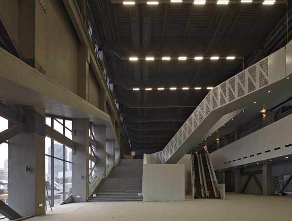
The target space of intervention is characterized by a huge room with a length of 62m in its longest side, a width of 26m corresponding to the store front and a ceiling height of 7m, covering a floor area of 1300m².
Analyzing the program requested and the physical dimensions of the space, we verified that many of the proposed uses did not need to take advantage of the huge ceiling height, related to an efficiency reason and also because of technical impediments. So our approach was defined by the strategic placement of closed lower dimension volumes, connected by the huge void of the existing space. We aimed to emphasize the spatial fluidity by painting in black (above 3.5 meters) all structural elements in order to dissimulate their physical limits, thus creating the illusion of a wider area. On the other hand, in the new raised volumes was decided to paint them in white achieving a more efficient diffusion of the natural light, which penetrates the existing glazing into the gym. In those volumes, the three Studios and the Kids Area were installed, since they have a more specific function. The studio A with an exclusive use for Spinning classes (one of the most requested activity by costumers), the Kids Area (one of the most significant amenities provided by Kalorias Clubs), the reception and the cafeteria area occupy the longitudinal strip of the outside glass facade. The dressing rooms and technical areas were positioned at the opposite end of the store front, creating a clear distinction between the activity gym space and the private use areas, enhanced by the clear marking of the physical boundaries that define them.
MATERIALITY
In the dressing room there was a more daring and experimental attitude, concerning the creation of different environments for distinct genres and users. The developed color study associates specific colors for each dressing room, as well as specific ceramic and lockers front panels patterns and metrics, emerging from the combining elements rhythms and contrasts that symbolize the three guiding pillars of the initial concept: urbanity, dynamism and diversity.
In the less public areas and of restricted use (the office rooms and the professional’s dressing rooms), we opted for a simpler and even elegant aesthetic language, highlighting the contrasts between black and white colors - in the case of the office rooms - and the grayness of the concrete block against the yellow color - in the professional’s dressing rooms. Having sought a solution that discharge the use of opaque false ceilings, a square mesh network nylon was placed, bordering the horizontal plane but as well establishing a permeability to the existing emptiness, leading us to the imaginary of net sports.
The Kids Area is one of the less expected functions in a gym. Therefore, the Kids Area turns out to be a "world" aside, for a very special and demanding public. Programmatically the space was divided into two areas, one dedicated to manual activities, reading and studies, and one other more suited to the physical activities. This separation is present not only conceptually, but also visually by the means of a diagonal line whose difference of material, color and texture, enhances the different space use.
{{item.text_origin}}

