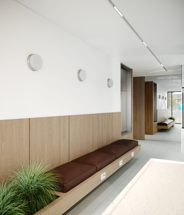
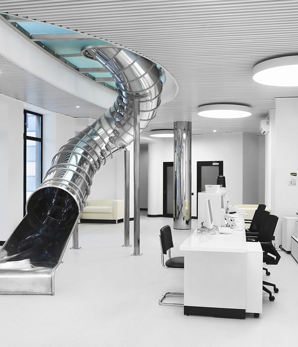
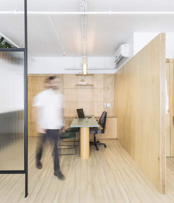
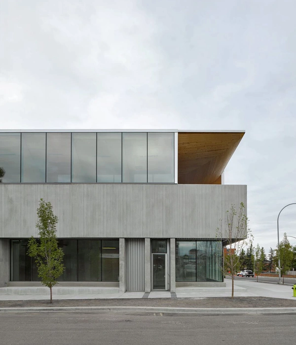
Impress's dental clinic concept is aimed at a young audience, which has grown with new technologies, since its offer is based on online treatments that reduce face-to-face visits. From the first moment, Impress looked for a fresh design, that represented the brand and its values, that moved away from the clichés of a dental clinic (white colors, aseptic environment).
The curves dominate the space, and the existing elements (pillars) that remain in between are treated with mirrors, to erase the spatial barriers and add spatial complexity through reflections. The curves are lacquered in white, and the access doors to the cabinets are pine wood boxes, embedded in the curves. Inside the cabinets, blue and white play in diagonal designs, which are a benchmark for the brand, and which signifies Impress's commitment to new generation dental clinics. On the ceiling the diagonal direction is reproduced in the position of llighting and grilles. The sales spaces are resolved in blue tones, covering the walls with carpets, and executing the furniture in situ with mass-colored fibreboards. The red tones in the background are precisely a claim to convert what a priori was the most residual and dark area into the most special area of the clinic.
collaborators architecture: albert montilla engineering: marés ingenieros
photo: David Zarzoso
{{item.text_origin}}


