Architects:URBANODE arquitetura
Area:301ft²
Year:2021
Photographs:Marcelo Donadussi
Manufacturers:Artlux Cortinas,Durafloor,Eliane,KWA Iluminação,L&M Serralheria,Marcenaria Nova Canaã,Mezas,SOS Vidros,Zero Máquina
Lead Architects:Alessandra Fassina, Eduardo Paiva Ribeiro
Cliente:Rafael Paiva Ribeiro
City:Porto Alegre
Country:Brazil
Text description provided by the architects. In general, when we are hired to design a small office space, we seek to bring the steady program together. Sometimes we propose 1 or 2 volumes that are multifaceted and help in solving the program in general. In the case of this physiotherapy and osteopathy practice, we did not need considerable space for storage, so the most important was to propose free areas and fluidity (as a more abstract concept).
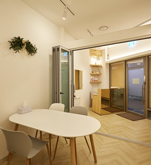
In programmatic terms we had to solve the reception area, exercise area and handling on the stretcher (with circulation around). We opted to position the table immediately next to the access door, since the width of the space there is smaller due to the volume of the toilet. The measures were sufficient to place two chairs for patients and still have good circulation.
We use navy plywood joinery to solve more than one problem: the access wall is the one that has the presence of the installations (circuit breaker box and intercom), and, to organize, we move the panel away, creating a false bottom. Another issue was the visibility of the pantry (which had a predetermined position by the building's infrastructure) that would be in the angle of view of whoever entered, so we wanted to create a filter.
Thus, we prolong the joinery and thicken (for aesthetic reasons) the panel up to the limit of the cup volume. This alignment is the imaginary line that separates reception from the exercise and manipulation zone. It is from this same line that we chose to exchange the materiality for a black painted metalwork, subtly defining the project areas. The partition in metalwork and corrugated glass was thought to give privacy to the stretcher.
The metallic elements of the project dialogue with the lighting infra (and exposed concrete slab painted in white) exposed, including the round metal lamp that was designed and executed by our team.
One last important detail that highlights how the design solutions were designed is the consistency established in relation to the vertical plan of the project. The height of 2.20m is the limit of joinery, metalwork, mirror and shelves; upwards, there are only the installations that are distributed by cable trays, lower to the walls and run behind the panels.
Project gallery
Project location
Address:Porto Alegre, Río Grande del Sur, Brazil
{{item.text_origin}}


