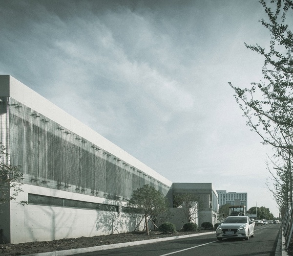
傍晚,我们回访绿峰中心时,摄影师正在内街拍摄。相机对着内街的西侧,阳光从西北角上空斜射进来,刚好捕捉到了斜向下的建筑形体和斜射进来的光线,建筑有着明确的线条和阴影。
The photographer was shooting on inner street when we returned to visit the Lvfeng Center in the evening. The camera was pointed at the west side of the inner street, and the sunlight was slanting in over the northwest corner, just capturing the slanting downward building form and the slanting light. The buildings have defined lines and shadows.
©GLA 建筑设计
设计表皮用了圆润的线条,但关键是斜线。它塑造了这个建筑的形体和空间,同时解决了项目在城市区域关系、产业升级特征、空间感受营造方面的一些设计问题。
The design skin uses rounded lines, but the key is the diagonal lines. It shapes the form and space of this building, and at the same time solves some design problems of the project in terms of urban-regional relations, the characteristics of industrial upgrading, and the creation of spatial feelings.
▼项目概览,project overview © 建筑译者姚力
01 城市区域关系
Urban-regional Relations
绿峰中心位于杭州紫金港科技城,原本是片工业园区。随着整片区域的产业升级,新建项目要满足新的城市形象和空间需求。项目基地位于该片区域中心东西轴线的南侧。按照城市设计规定,中心绿化带占据了建设基地的一大部分,建筑可建设范围又被中间的公共通道分成两部分。同时,规划要求高层建筑对中心绿轴保持 26 米的退让,叠加 4.0 容积率的要求,建筑形体基本限定为两幢方方正正的塔楼,在朝向绿地的多层部分设计一些退台。
▼形体生成,volume generation©GLA 建筑设计
Lvfeng Center is located at Hangzhou Zijingang Science and Technology City, an originally industrial park. With the industrial upgrading in the entire area, the new project has to fulfill the requirement of the new urban image and spatial needs. The project is placed on the south side of the east–west axis of the city center. According to the urban design regulations, the central green belt already takes a large portion of the construction lot, and the buildable area of the building is further divided into two sections by the public passageway in the middle. At the same time, the planning requires high-rise buildings to maintain a 26-meter setback distance from the central green axis. Together with the requirement of a 4.0 plot ratio, the building form has been largely limited to two square towers, with a number of setbacks on the multi-story section.
▼与面对面的建筑形成呼应关系,relationship with the opposite building © 建筑译者姚力
当我们才开始设计时,地块北向的楼栋已经开始了建造。其形体与我们地块的常规方案类似,只是在转角部位增加了圆弧变化。如何在符合规划要求的情况下,与周边建筑——特别是与面对面的建筑形成呼应关系,建造一个有关联的建筑组群,同时又保持自身特点的建筑,是一开始构思就需要解决的问题。
When we started designing, construction of the north-facing building on the plot has already begun. Its form is similar to the conventional scheme of our plot, only with the addition of rounded variations in the corner areas. How to create an echoing relationship with the neighboring buildings-especially those facing each other and to construct a grouping of related buildings while complying with the planning requirements and maintaining its own characteristics was a problem that needed to be solved from the very beginning of the conceptualization.
▼外观概览,appearance overview© 建筑译者姚力
在前期沟通过程中,业主提出一个空间设想:在项目中设计一条街道。从数据尺寸分析,保证塔楼的面积下,体型无法缩小,多层建筑也要保证最小的进深以满足使用功能。因此,常规形态的多层和高层建筑之间几乎没有街道的尺寸,想设计一条尺度恰当、氛围适宜、界面完整的街道是很难实现的。
于是设计用第一条斜线——在主楼底部内切的这条斜线,它形成了内街最基本的尺度和特征,也把底部几层进深大但采光不足的室内空间,置换出一条可以遮阳避雨的室外街道。
▼立面生成, facade generation©GLA 建筑设计
In the process of pre-communication, the owner put forward a spatial conception: to design a street in the project. From the data size analysis: to ensure the area of the tower, the body size can not be reduced. Multi-storey buildings also need to ensure the minimum depth to meet the use functionality. Therefore, there is almost no street size between the conventional form of multi-storey and high-rise buildings, and it is difficult to realize the design of a street with appropriate scale, suitable atmosphere and complete interface.
Therefore, the design uses the first diagonal line – the diagonal line cut inside the bottom of the main building. It forms the most basic scale and character of the inner street, and also replaces the indoor space of the bottom floors, which has a large depth but not enough light, with an outdoor street that can be shaded from the sun and rain.
▼主楼底部内切,the diagonal line cut inside the bottom of the main building © 建筑译者姚力
而第二条斜线将多层建筑两端切去,使原本朝向中心绿化稍显呆板的界面生成与绿轴平行的层层退台,却又有别于北向建筑的退台形式。
The second diagonal line cuts off the ends of the multi-storey building, making the original interface towards the center of the green which is slightly dull to be layers retreats parallel to the green axis, but different from the form of the retreat in the north-facing building. ▼多层建筑两端切去,
the ends of the multi-storey building are cut off© 建筑译者姚力
在确立形体后,设计又采用建筑角部圆弧化的处理,建立和北向建筑的对话关系,让这个区块看似一个整体,又不失各自特征,达到和而不同的结果。
After establishing the form, the design also adopts the rounding treatment at the corners of the building to establish a dialogue with the north-facing buildings. So that the block seems to be a whole without losing its own characteristics and achieves the result of harmony and difference.
▼角部圆弧化处理,rounding corners© 建筑译者姚力
02 产业升级特征
Characteristics of Industrial Upgrading
Hangzhou Zijingang Science and Technology City was originally an industrial park consisting of one closed factory area, facing the demand for sky plants and industrial upgrading. Because it is located in the urban area of Hangzhou, its industrial upgrading is based on industry. It integrates the urban life functions, industrial elements and urban synergistic development, presenting a state of integration of industry and city.
The design of Lvfeng Center presents the architectural spatial characteristics of open and rich space at the bottom, efficient and flexible production office space in the middle, and comfortable and relaxing management office at the top.
The bottom space is not only a workplace but also a living place, which needs to be built around the functional configuration and environment of the industrial population. More open and rich spaces can attract people and have exchanges and collisions, and stimulate the innovative power of the place. This is also the reason why we understand and support the owner to build the inner street.
▼开放的丰富的空间,open andspacious spaces © 建筑译者姚力
▼底部空间,bottom spaces© 建筑译者姚力
中部的建筑标准层是一个方正的平面,由核心筒和外圈柱形成通用空间,另外在货运流线,荷载管线方面做了合理的预留,为使用提供了更多可能性。当下生产方式的变化也是经常性和难以预测的,因此这部分的设计更加注重灵活使用和高效利用。
The standard floor of the building in the center is a square plane, formed by the core cylinders and the outer ring columns to form a common space. In addition, reasonable reservation is made in the freight flow and load piping, to provide more possibilities for the use. Changes in production methods are also frequent and unpredictable, so the design of this part of the building focuses more on flexible use and efficient utilization.
▼仰望, upwards view© 建筑译者姚力
顶部形体是形成建筑天际和形体特征的关键,其具备良好景观视野,使用者多为企业管理者和核心人员,因而这部分处理很重要。第三条斜线在主楼顶部斜切,给顶部三层提供朝向中心绿化的露台空间。宜人室外空间使技术交流和商务谈判在放松氛围中取得更良性成果。同时,两幢主楼露台相对形成对话,与底部二道斜线形成呼应关系,构成完整设计逻辑。
The top form is often a key part of the building’s skyline and formal character. The top often has a wide and good view of the landscape, and its users are mostly the managers and core staff of the company, so the treatment of this part is also an important issue. The third diagonal line cuts diagonally down at the top of the main building, giving all three levels of the top a terrace space facing the central green. A pleasant outdoor space tends to make technical exchanges and business negotiations more benign and fruitful in a relaxing atmosphere. At the same time, terraces of the two main buildings are opposite to each other, also forming a dialog with each other. It also echoes with the bottom two diagonal lines, forming a complete design logic.
▼主楼顶部斜切,top of the main building is cut off diagonally © 建筑译者姚力
03 空间感受营造
Creation of Spatial Feeling
Lvfeng Center focuses on creating the feeling of space at the bottom, and these bottom spaces have become the signature feature of this project. The first diagonal line mentioned earlier basically characterizes the inner street space at the bottom: a trapezoidal space with a width of 13 meters at the bottom and a gradual tapering off at the top. The second diagonal on the multi-storey building is directionally perpendicular to the first diagonal, creating an interesting echo. This also makes the entrance to the inner street less closed and more open and bright.
▼入口空间, entrance space © 建筑译者姚力
设计的斜线隐藏在层层叠退立面表皮下,作为控制线和结构的骨架存在。每层表皮会有 4 次叠退,加上转角使用和对面建筑呼应的圆弧元素,让斜线不那么尖锐,最终在形式和空间感受上,都让人觉得温柔和亲近了许多。
The diagonal lines of the design are hidden in the façade skin of layers of retreats, functioning as the control line and the skeleton of the structure. Each layer of the skin will have 4 stacked retreats. Together with the use of the corner and arc elements echoing to the opposite building, the diagonal line is not so sharp. Ultimately, it makes people feel much more gentle and intimate in the form and spatial feeling
▼温柔亲近的空间感受, gentle and intimate feeling © 建筑译者姚力
再往里面走,二层的连结走廊和三层连结的玻璃廊,将这条 130 米长的内街从视觉感受上分为三段,让空间有了节奏。
Further inside, the linking corridor on the second floor and the linking glass gallery on the third floor divide this 130-meter-long inner street into three sections in terms of visual perception, making the space full of rhythm.
▼连廊,bridge corridor© 建筑译者姚力
▼内街,inner street© 建筑译者姚力
中段和中间南北走向的公共空间垂直交汇,这是项目的核心空间。从这里往北穿过过街楼,就进入城市中心绿轴。可以在建筑边的外摆空间闲坐交流,也可以在草地上休息和进行户外活动,获得进一步放松的体验。
The middle section and the north-south direction public space meets vertically, which is the core space of the project. From here, people can pass north through the street crossing building and enter the green axis of the city center, and sit and communicate in the outward swinging space at the side of the building, or rest and have outdoor activities on the grass, acquiring further relaxing experience.
▼城市绿轴,urbangreen axis © 建筑译者姚力
反向往南走,能看到一个跨度 24 米的灰空间,也是项目底部的标志性空间。在这入口的大灰空间下就隐藏着第四条斜线——8 级叠退的大跨顶形成一条南低北高的斜线,也勾勒出这个梯形灰空间的特色。自然光透过顶部的穿孔板洒下来,空间的光线明亮又柔和。平时,这里作为两幢主楼的入口空间;在未来某些时段,也是一个全天候室外活动的舞台。
Walking backwards to the south, you can see a grey space with a span of 24 meters, which is also the signature space at the bottom of the project. The fourth diagonal line is hidden under the large grey space at the entrance – the large-span top with 8 levels of stacked retreats creates a diagonal line that is low in the south and high in the north, which also outlines the characteristics of this trapezoidal grey space. With natural light spilling through the perforated panels at the top, the space is bright and softly lit. It serves as an entry space to the two main buildings at usual time; and could also serve as a stage for all-weather outdoor activities at some point in the future.
▼隐藏的梯形灰空间,trapezoidal gray space © 建筑译者姚力
在建筑投入使用后,期待有这样一个画面:某个活动正在这片大的灰空间中进行,恰巧有几个人正在跳舞。即使是正午,阳光通过穿孔金属板菱形的空洞洒下来,就像穿过树叶一般变得柔和,人们就像是在树林间活动一样。在有人的场景里,建筑充满着生命感。
After the building is put into use, we expect an image like this: some event takes place in this large gray space, and it just so happens that a few people are dancing. Even at midday, the sunlight pours down through the diamond-shaped cavities of the perforated metal panels, softened as if through leaves, and it seems that people are moving among the trees. In a scene with people, the building is full of life.
▼低层平面,lower floor floor©GLA 建筑设计
▼中层平面,middle floor floor©GLA 建筑设计
▼ 高层平面,upper floor floor©GLA 建筑设计
项目名称:杭州绿峰中心
项目类型:办公建筑、商业建筑
设计方:GLA 建筑设计
项目设计:2020
完成年份:2024
项目地址:浙江省杭州市西湖区三墩镇西湖科技园西园七路 6 号
建筑面积:123394㎡
摄影版权:建筑译者姚力
客户:杭州绿城理想生活产城科技有限公司
材料:铝板、铝型材、玻璃
品牌:铝板(上海吉祥)、铝型材(广东兴发)、玻璃(信义)
Project name: Hangzhou Lvfeng CenterProject type: Office Building, Commercial ArchitectureDesign: GLA DesignDesign year: 2020Completion Year: 2024Project location: No.6, Xiyuan 7th Road, Xihu Science and Technology Park, Sandun Town, Xihu District, Hangzhou, Zhejiang, ChinaGross built area: 123394㎡Photo credit: YAO LiClients: Hangzhou Greentown Ideal Life City Technology Co.Materials:Aluminum panels, aluminum profiles, glassBrands: Aluminum panels(Shanghai Jixiang), aluminum profiles(Guangdong Xingfa), glass(Xinyi)
{{item.text_origin}}

