Firm: ARTEC
Type: Commercial › Office
STATUS: Built
YEAR: 2020
SIZE: 5000 sqft - 10,000 sqft
BUDGET: $100K - 500K
MOVING STILL SPACE
Being aware of this, we thought we could tackle these drawbacks of working online, with design. Thus, the underlying theme of design in Telegrafi offices is “Technology as an invisible bond between people and space”, giving the latter much more agency than it usually has. A space that has agency is more alive, it interacts and gets to know the people it interacts with, and by developing through learning, it achieves a long-term symbiosis between the two. This was done using smart systems, which analogous to the role of the brain in the nervous system, control, modify, adapt every aspect of the space, ensuring a work environment that is focused on the wellbeing of workers meanwhile maximizing work effectiveness.
An innovative use of such smart systems was incorporated in 26 round lights custom built for the space with LED strips on the perimeter fading towards the center creating a unique effect of natural light, a contrast to the monotone plain light surfaces used nowadays as a result of technological advancement. When these same 26 lights that are equipped with RGB light are put in work by a smart system, and some of them “the odd” ones, and are assigned random colors which discretely change places throughout the day create a feeling of movement and passing of time, similar to the notion of how each time we look at the sun during a day, we perceive its position to be moving .
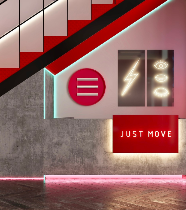
To address the unhealthy lifestyle so common in the 21th century workplace, every hour lights start a light show, as a way of reminding people to stand up and move.
Furthermore, the smart system can use these lights to personalize the space for event such as birthdays, anniversaries, national holidays, welcoming guests, changing the mood etc., thus creating a unique context related perception of space.
Also, on a more functional level, since the entire space is intended for shooting of various types of visual materials, they serve an additional purpose, that of creating sceneries & intros for shows.
Element design is rather simple, with no elements that serve as only decoration. Every element has a function, with some of the elements even exceeding their primary function, for example the greenery stands are also used as an installation duct, enable cables to reach tables from the ceiling mounted cable trays, as we named them “Power Plants”. The ceilings were left untouched, bare concrete, with metallic black painted cable trays put in grid so every position on the ground has accessible installation. Seating layout in designed in a non-orderly, non-hierarchal fashion, providing a sense of freedom to workers. All journalists work in the same space, divided in two zones, each consisting of 10 stations. Some more private working areas such as the meeting box, phone booth, transcript & video-chat box, were also integrated into the design due to the competing needs the space was supposed to meet, that of a co-working space, and of a quiet, private areas to work and handle delicate information, with an additional role of one of these areas (The meeting box), that serves as a shooting setting for a short online show called “Boxed”.
The second floor of the offices is dedicated for executive staff, financiers, sales and other administrative staff that are accommodated in four offices. The floor also has a training area, a meeting room, all linked via a hallway/waiting area, dominated by a bold pink cushion seating, and common kitchenette/bar.
{{item.text_origin}}

