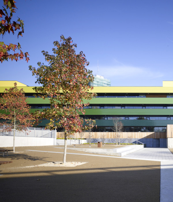
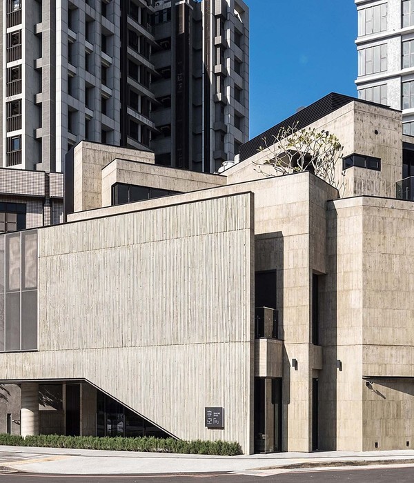
‘Driven by lack of space, the Gerrit Rietveld Academie and Sandberg Instituut ordered the construction of a complementary third building on its grounds, opposite the building designed by Gerrit Rietveld and next to the expansion by Benthem & Crouwel. The resulting campus provides this leading art school with a new setting.
User Expertise and Experiment. With regard to the selection of the architects, the art academy decided to stay close to the character of the community and launch an in-house competition. Fedlev won. This cooperative of designers has turned its user expertise into a concept. ‘Experimentation is key at the academy. This essentially means looking across borders and disciplines.
The autonomous departmental culture of the academy didn’t contribute enough to an interdisciplinary way of working,’ says architect and Fedlev initiator Paulien Bremmer. The starting point for the expansion was a scenario for the creation of a collective, interdisciplinary educational environment. The result is a landscaped building: a backdrop to making, meeting and exchange. Interaction as a Starting Point.
In the preliminary design stage, Fedlev entered into a partnership with Hootsmans architects. The new building, completed in January 2019, has a rectangular floor plan and consists of three layers, one below ground level and the top one cantilevered. Next to each other on the street side are the wood workshop and the library. The spaces on the first floor are earmarked for students of the Sandberg Instituut. Other spaces in the building are shared, including facilities such as the assembly hall, the auditorium and the film studio.
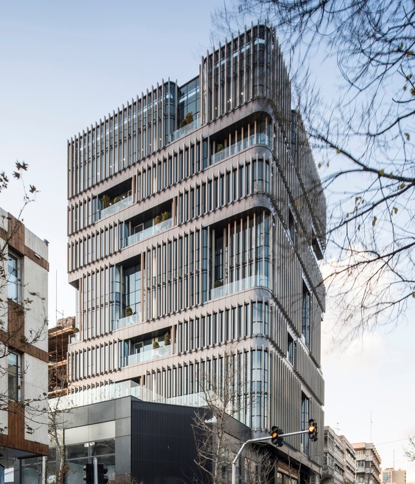
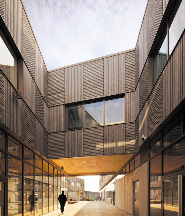
At the ground level, a modest reshuffle of the existing buildings’ programmes made room for a shared space around the base of the building. The extension’s glass façade can be opened in many places, facilitating interaction in the space between the buildings. A communal roof area that is suitable for exhibitions, performances and the making of temporary constructions gives the new building back the space the extension occupies on the ground. To stimulate interdisciplinary activity, the architects created project spaces on different floors throughout the buildings.
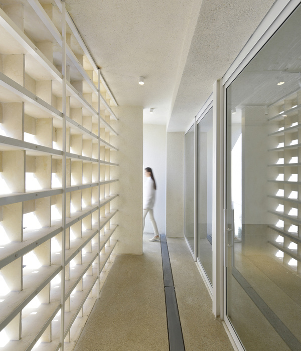
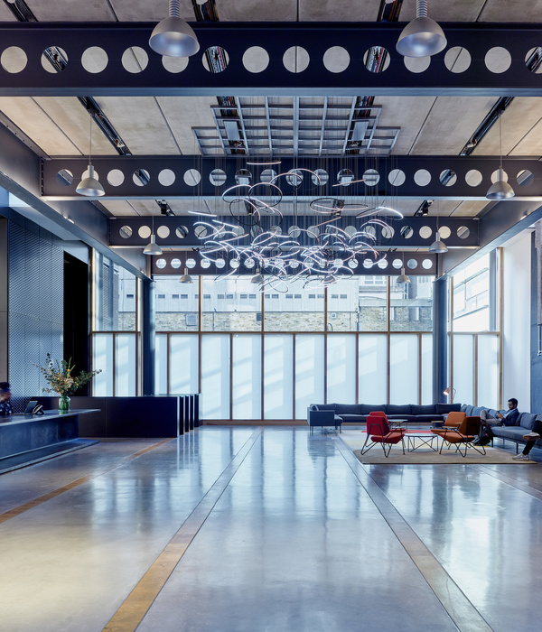
The spaces offer students the opportunity to work and experiment freely, separate from the departmental structure. Architectural Finishing. Part of a landscaped spatiality, the building’s floors and functions are connected in various ways. Transparency and visual links characterize the interior. There are no stairwells or corridors, which means the making process is always visible and interdisciplinary exchange is always possible.
Varying, often industrially executed floors and walls define successive places. The diversity of spaces is increased by the introduction of the ‘white spaces’ in the design: parts of the interior designed and executed by third parties in the community. The smart and low-tech construction of the exterior façade creates natural ventilation and thus keeps the number of technical installations to a minimum.
The overhangs and the woven-steel façade limit heating by incident sunlight. Beneath the overhangs are transitional spaces that people can claim as work spaces. The building is a social hub that quite naturally accommodates and spatially connects education, encounter, relaxation and collectivism and in which changing perspectives inform the educational environment. It is an interactive and dynamic setting for making and experimenting; a building that generates ideas, thoughts and works.
▼项目更多图片
{{item.text_origin}}

