The challenge of this project was to solve the layout that should be arranged in a terrain of 12 meters long by 5.9 meters wide, without appearing too narrow. Knowing this, the solutions found were; to implant a 3 meters ceiling height, to create communication with the street, to elaborate a background in the store that was more inviting and to sector the floors.
On the first floor was concentrated an exhibition space of the pieces, with furniture and pictures arranged along the hall, down the stairs were located shelves with the purpose of displaying the sculptures and includes a pantry, in addition, a bathroom located in the open loft below the ladder.
To the bottom was established a limit of construction to 100 cm of the wall already existing in the later side of the store, that both on the ground as on the second floor, which made possible the creation of a winter garden on the first floor, that communicates with the second floor and with the terrace, this purposeful spacing created a connection of the floors that through skylights chimneys bring natural light and ventilation to the back of the Gallery, a place that doesn’t allow the installation of windows and was unattractive.
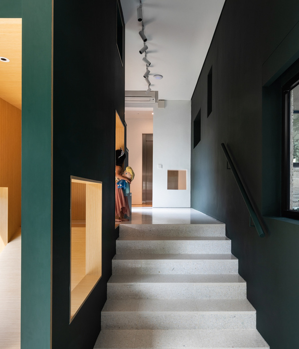
The stairs leading visitors from one floor to the other one was made with plaid sheets supported by a central beam, on the second floor it gains a new functionality, in addition to the communication between one floor to another, it receives a body guard curtain screens painted in yellow and that pivot when necessary to expose works of art.
This floor also gains a window that functions as a large showcase and generates communication between the street and the inner space of the gallery, because it is an area with fewer functions - restrooms, pantry, displays - it receives the bigger furniture of the store, like tables, shelves and armchairs.
Another interesting part to solve a common function in the gallery was the way of exposing the frames, instead of nails on the walls, suspended chains were placed and the pictures are exposed in different heights and positions without having to damage the walls.
After solving the obstacles of function and use of the terrain, the facade needed to stand out in the street, then precast concrete blocks were applied to vertical garden, so was created movement with a simple element where the same techniques of Athos Bulcão was used, that is, to create a composition logic, so a constructive element directed to receiving plants in the wall became a key piece to transform the facade into something attractive.
{{item.text_origin}}

