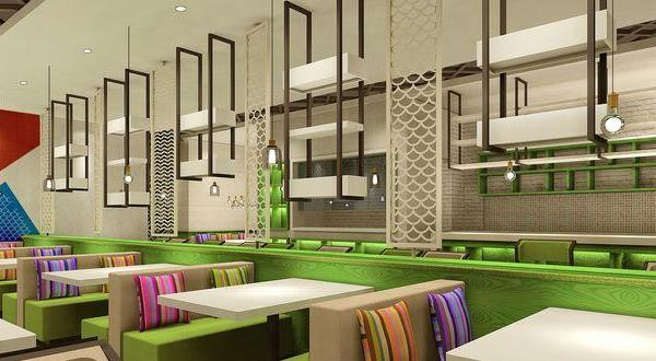
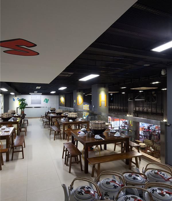
Located at a commercial area in Setrasari, Bandung, this project is converted from a four storey shop-house. The challenge is how to design a space that doesn’t have a shop-house feel in it. And as usual, time and budget are also included in the design constraint.
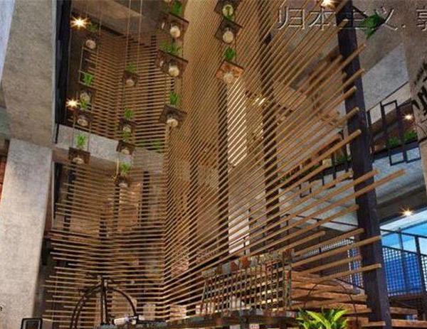
Our initial idea is to create space continuity. To achieve this, we took down part of the floor. Leaving a big void at the center of the building. Then we added a bridge like mass to connect the separated areas of the floor. This create a visual connection between two floors, bringing in daylight and continuous air flow. Exterior and interior material concept is mainly focused on budget and accommodation. So, the design team decided to use common materials available on the local market and applied them mostly raw.
The walls are covered with white light bricks to create a more spacious and clean impression to the interior space. To balance hardness of the wall, raw-unfinished plywood is applied to the ceiling. The natural wood pattern gives warmness and coziness, thus adding more layers of materiality in the design.
Six scaffolding are inserted to the first floor, adding a mezzanine floor to the space. This would create sense of lightness and break the harshness look of the brick wall. The beverage bar is then situated above this new added floor. Overall, this area easily become a vocal point which attract passersby and guests.
As for the exterior, two layers of polycarbonate sheets are applied to the façade to block outside view while still allowing natural lights to penetrate into the building. Resulting a striking effect in the night, distinguishing the building from the typical shop-houses around.
{{item.text_origin}}

