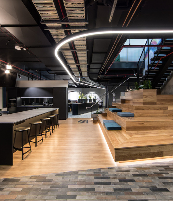
Polyglot既不是一个企业空间,也不是一个华而不实的空间;它并不是简单地将华美的新材料铺设在办公室的墙面、天花板和地板上,也不是一个通常情况下的仓库改造,更不是将当代建筑元素简单地插入一个工业旧址中。恰恰相反,它是一个真正意义上的建筑重新构造项目。建筑师通过对区位和设计布局的反复推敲,强调了原有建筑元素和新增建筑元素之间的关系,实现了最优化的设计。可以说,它将现代建筑元素低调地融入了工业旧址中,实现了两个时代的和谐统一。
Polyglot is not corporate, it is not slick. It is not a polished new-materials-on-wall-ceiling-floor office fitout. Neither is it a normal warehouse conversion; industrial heritage polished up alongside detailed contemporary intervention. Instead it is a true palimpsest, a humble insertion into a heritage space that through careful zoning and layout of a design parti enhances what is there with what has been added, achieving maximum impact.
▼办公室室内概览,interior space view
Polyglot是一家非盈利性的儿童剧院公司,以“孩子是我们艺术的核心”为企业宗旨。他们希望建筑师能够帮助他们找到一个合适的基地,并且制定出一个可行的、资金匹配的设计方案。经过调研,位于阿伯茨福德修道院的圣心大厦无论是从哲学意义上,还是从自身建筑价值上,都是一个完美的场地。在建筑师的帮助下,Polyglot最终选择了一个层高较高的一层空间作为本项目的基地。该空间内建筑桁架完全外露,饰面已掉漆,部分瓷砖已经不知所踪——这是前女子修道院中的一个重要空间,其窗户上还保留着曾经装饰用的金属条。
Polyglot, a not-for-profit children’s theatre company; with “children at the heart of our art”. They approached us to help find a suitable site and interpret / extrapolate the brief into compliant grant documentation subsequently approved with a matched-funding model. The Sacred Heart building at Abbotsford Convent was the perfect fit, an alignment of philosophy and values. We helped select a soaring first-floor space with exposed trusses, peeling paint and lost tiles a palimpsest of the former young women’s ward at the convent, complete with decorative metal bars still on the windows.
▼传统百叶区,从中心空间看向厨房,原有的褪色百叶窗围合出厨房空间,the Heritage Screen, kitchen view from the central space, the heritage screens with faded paint define the kitchen area
这是一个非常特别的空间,室内洒满了阳光,角落里布置着一系列淡黄色、蓝绿色和淡紫色的隔板,时不时就会勾起人们的好奇心,而在室内的另一角,则布置着淡黄色的瓷砖。建筑师明确指出,虽然Polyglot是一家专为孩子们服务的公司,但这仍然是一个成年人办公的地方;因此,他们希望将这里打造为一个充满趣味、奇迹和喜悦感的空间。同时,建筑师希望这个项目既能够具有社会可持续性,也能够通过采用当地或者澳大利亚本土的产品,尽可能地适应Polyglot公司的价值观。项目预算十分紧张。最终,本项目的设计方案被定义为一个以中心空间即Polypod为基础,逐渐向周围延伸的空间。因此,一个设计大胆的、弯曲的会议室被布置在空间中央,该会议室由碳酸聚酯板打造,足以吸引人的眼球,不仅改变了整个空间的氛围,还给人强有力的视觉冲击。
An extraordinary space, light flooding in, with the curiosity of a beautiful pale yellow, teal and lavender screen in one corner and in the other corner pale yellow tiles. We articulated the dichotomy that although Polyglot is a company for children, this was to be an office for adults; yet we wanted to design a space with a sense of playfulness, wonder and joy. We wanted a design that was also socially-sustainable, with local or Australian-designed products sourced wherever possible, to align client values. And when we say tight budget, we mean extremely tight! The design solution is centred around; The Polypod. A bold curved polycarbonate boardroom pod designed to draw the eye across the space in an optical illusion that transforms the entire tenancy, giving maximum impact.
▼办公空间的绿化系统,办公桌边缘的绿化种植槽限定出办公空间,黑色的垂直面板衬托出浅色的室内空间,the Greenery in the working zone, the custom desks house a planter that defines the edge of the working zone, and the the black verticals on the desks foil the interior space which is in a palette of light color
在更细微的层面上,整个室内设计实际上有5个建筑区域:
1. 传统百叶窗区,这也是旧址中原有的一个元素。原建筑遗留的百叶窗被保留了下来,划分出了厨房区域,经过岁月的侵蚀,原始的色调柔和的油漆已经开始褪色。在厨房内,在原有的水磨石台面下方,固定的细木工制品和遗留下来的水池仍然清晰可见。 2. 绿化。在办公区内,定制的办公桌的一侧设有专门的种植卡槽空间,限定出办公区的边界,种上绿植后,不仅可以为办公人员提供感官上的私密性,更有利于创造一个健康的室内环境。 3. 位于空间中央的Polypod区。会议室的墙面采用垂直曲线形的彩色碳酸聚酯板,十分醒目,其内部空间另辟蹊径,参考了旧址的原始色彩,采用绿色作为主色调,增强了会议室的雕塑意味。 4. 公用长桌区。众所周知,移动式的桌子可以促进创造性的交流,本项目这样设计也是出于以上的考量。长桌使用具有社会可持续性的公司Koskela所生产的竹料。 5. 阅读角。阅读角区域采用传统的黄色瓷砖作为墙面的饰面,设置舒适的沙发长椅,使用澳大利亚本土制造的Warwick纺织品作为沙发坐垫以及Shaw-Contract地毯,同时其采用的独特的粘合剂系统也符合旧址苛刻的要求。
At a more nuanced level there is actually a parti of 5 elements:
1.The Heritage Screen – Original feature! Lightly sanded, original pastel faded paint and heritage protected. Demarcates kitchen area, with lightly fixed joinery and heritage basins still visible underneath benchtops, original terrazzo below. 2. The Greenery – The custom desks house a planter that defines the edge of the working zone, providing perceived privacy with the-well-acknowledged benefits and detoxification that indoor plants provide. 3. Polypod – The boardroom pod clad in striking verticals of curved coloured polycarbonate and a stunning green interior that uncannily references the heritage colours of the space and is detailed to reinforce its sculptural nature. 4. Co-Lab tables – Mobile collaboration tables fostering creative communication, the space defined by the bamboo cloches from Koskela, itself a socially-sustainable company. 5. Reading Nook; Informal banquette setting defined by the heritage yellow tiles, utilising Australian-made Warwick fabric upholstery and Shaw-Contract carpet, with the unique adhesive system meeting the strict requirements of the heritage permit.
▼从办公区看向中央会议室,the central boardroom (Polypod) view from the working zone
▼中央会议室(Polypod),会议室的墙面采用垂直曲线形的彩色碳酸聚酯板,十分醒目,the central boardroom (Polypod), the boardroom pod clad in striking verticals of curved colored polycarbonate
▼会议室内部,内部空间参考了旧址的原始色彩,the interior space of the boardroom, the palette of the boardroom interior space uncannily references the heritage colors of the space
设计采用Mr Kilty种植盆——一种由澳大利亚设计师设计的传统的经济适用型花盆,从而通过植物强调出入口空间和室内流线。隔音设计则使得各种活动都可以在室内进行。鉴于所有的室内设施都需要略微接触地板和墙壁,因此设计方案需要经过测绘员和维多利亚遗产保护(Heritage Victoria)条例的许可,并严格遵守相关规定。条例规定,室内空间不允许出现凹进或齐平的建筑细部,因此有助于提高物体的稳定性,同时可以保证在痕迹允许的情况下,用户得以轻松地拆卸部分室内设施。
The Mr Kilty planter pots – a budget-friendly design classic from an Australian designer – use planting to define entry areas and mark circulation routes. Acoustic zoning allows for a graduation of noise and activity. The entire fit-out needed to “touch the floor” (and walls) lightly, needing approval from the building surveyor / Heritage Victoria, compliance with the heritage permit and conservation management plan. No recessed or flush-finish details were permitted, fixing for stability and ease of removal without leaving a mark non-negotiable.
▼阅读角,阅读角区域采用传统的黄色瓷砖作为墙面的饰面,设置舒适的沙发长椅,the Reading Nook, the reading nook is equipped with the informal banquette setting defined by the heritage yellow tiles
项目招标过程涉及到与首选建筑商Sinjen的谈判问题,最终,Sinjen选择以合作的方式,与建筑事务所mcmahon and nerlich共同完成这个项目。在预算紧张的情况下,通过合作、项目决心和专业精神,包括所有办公桌、公用长桌和会议室桌子等在内的所有功能性建筑构件均为Sinjen公司的定制细木工产品。黑色的垂直面板衬托出浅色胶合板的家具,整合了混乱的原始空间。关于座椅,在预算紧张的情况下,建筑师没有选择使用便宜的进口商品,而是使用由澳大利亚为数不多的办公椅设计和制造商提供的Advanta座椅作为会议室用椅,使用墨尔本新兴的线上创业公司制造的椅子作为其余空间的用椅,将室内舒适性最大化。纵观整个室内,唯一不是本地采购的家具便是从旧址上回收回来的桌椅。由此可见,整个项目没有使用昂贵的建筑废料和过多的其他建材,项目的可持续性显而易见。本项目体现出建筑师的坚持——方法本质上的可持续才是最为重要的(室内设计和装修过程不包括是室内地板、墙壁和地基维护等)。
The tender process involved negotiations with the preferred builder Sinjen, who approached the relationship in the spirit of partnership. With cooperation, determination and finessing, the key functional elements including ALL of the desks, co-lab tables and boardroom tables were custom made to a tight budget by their joiners and enhance the space, the pale smooth plywood furniture with feature black verticals a foil to the messiness of the heritage fabric. The Advanta boardoom chairs were sourced from one of the few locally-designed and made office chair suppliers in Australia to meet the tight budget in lieu of cheaper imported copies, and the remaining stools and chairs from a new Melbourne-based on-line startup. The only elements not locally sourced and designed were the desk chairs which were recycled from the old office. The sustainability of the fit-out is evident, with no expensive construction waste or excess of materials. The palimpsest approach is inherently sustainable. (*excluding tenancy floor, walls and base services).
▼共享长桌空间,移动式的桌子可以促进创造性的交流,the Co-Lab tables, mobile collaboration tables fostering creative communication
Project size: 200 m2 Site size: 200 m2 Completion date: 2018 Building levels: 1
{{item.text_origin}}

