“ 见说朱樱正及时,眼穿火齐晓云披。 ”
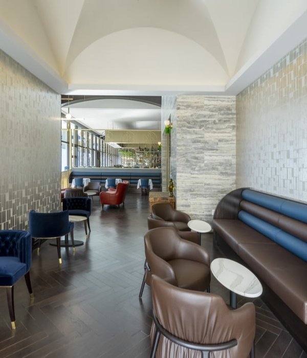
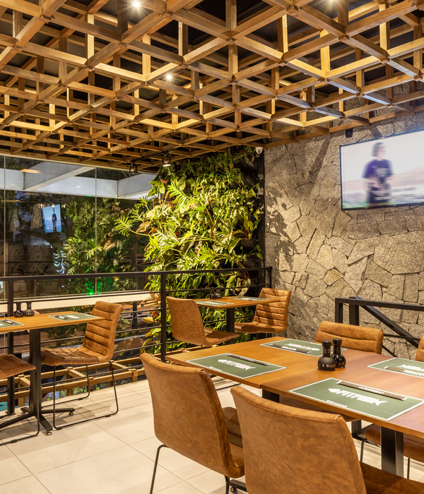
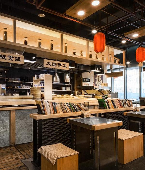
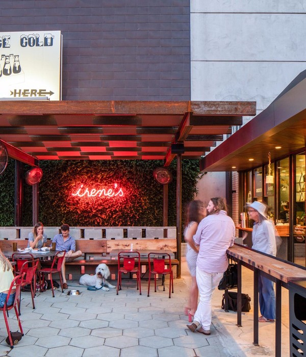
设计师手记 超美的橙红调 有极强的视觉冲击力, 让人情不自禁的驻足欣赏 热情和感性并存的气质, 让它有非同一般气场 搭配深灰的色彩 摩登且散发着艺术气息 如此具有魅力的颜色 运用在空间设计中 一面足以倾心
| Taraho Select Cafe
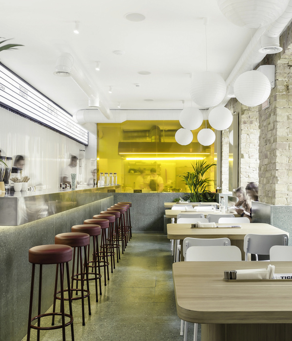
FudgyBro和Selective Coffee是两个特征完全不同的品牌,放在一个屋顶下。如何将咖啡品牌与冷滑氛围相融合,将热巧克力品牌与温暖柔和的氛围相融合是主要的难点。这个地方成为他们两人的新家,容纳他们自己的独特性。设计旨在展示如何在同一屋檐下,将每个品牌不同独特特征组合成一个全新的设计。
Fudgybro and selective coffee are two brands with completely different characteristics, which are placed under one roof. How to integrate the coffee brand with the cold and slippery atmosphere and the hot chocolate brand with the warm and soft atmosphere are the main difficulties. This place became their new home and accommodated their own uniqueness. The design aims to show how to combine the different unique characteristics of each brand into a new design under the same eaves.
主入口有一条长长的小巷的寒冷氛围,天花板上有一面长长的大镜子,以便在到达主区域之前为顾客创造一条看起来很长的道路。在他们到达二楼的楼梯之前,这一区域被设计为惊喜的开始元素。
The main entrance has the cold atmosphere of a long alley and a long large mirror on the ceiling to create a seemingly long road for customers before reaching the main area. Before they reach the stairs on the second floor, this area is designed as the starting element of surprise.
当顾客离开这条长长的小巷时,他们被温暖的陶土氛围所包围,每一层都通过楼梯连接起来。这个区域是这个序列的主键,因为它有色块陶土,在顾客从漫长寒冷的小巷里出来后立即带来温暖的氛围。
When customers leave this long alley, they are surrounded by a warm clay atmosphere, and each floor is connected by stairs. This area is the primary key of this sequence, because it has colored clay, which brings a warm atmosphere immediately after customers come out of the long and cold alley.
当顾客离开温暖区域时,他们走进另一个寒冷而光滑的咖啡馆环境。这个地方主材料是混凝土、不锈钢和原天花板。在咖啡厅的尽头,用陶土砖为顾客创造一个温暖的区域,代表着刚从烤箱里出来的温暖咖啡。
On the second floor, when customers leave the warm area, they enter another cold and smooth Cafe environment. The main materials of this place are concrete, stainless steel and raw ceiling. The brick stands for a warm area at the end of the coffee oven for customers.
Bar · Olive Oil
这是一个餐厅和酒吧融合的商业空间,原木吧台体现自然的纹理,取自自然的枯木成为天花板的艺术装饰品。餐厅空间围绕一颗银灰色的橄榄树展开,香槟色波点在黑色面板上,提供带来一种时尚感。
This is a commercial space integrating restaurants and bars. The log bar reflects the natural texture, and the natural dead wood becomes the artistic decoration of the ceiling. The dining room is surrounded by a silver gray olive tree, and the champagne color wave is dotted on the black panel, providing a sense of fashion.
穿过圆拱形墙面旁边有一个儿童玩乐区,果冻色的座凳和白色的游戏桌摆放着各种积木、玩具。一整面黑板,给孩子提供自由涂鸦的机会,孩子可以在用餐中自由畅想,渡有一个愉快的用餐时光。
Through the arched wall, there is a childrens play area next to it. Various building blocks and toys are placed on the jelly colored stool and white game table. A whole blackboard provides children with the opportunity of free graffiti. Children can imagine freely and have a happy meal.
天花板和墙面运用水泥灰元素,亮橙色皮质沙发搭配原木桌,座椅选用黑色展现空间的时尚简约。香槟色波点墙面成为餐厅的背景,打造一种时尚、个性的用餐氛围。
The ceiling and wall are made of cement gray elements, the bright orange leather sofa is matched with the log table, and the seat is made of black to show the fashion and simplicity of the space. Champagne color wave point wall becomes the background of the restaurant, creating a fashionable and personalized dining atmosphere.
另一面墙安装黑色的电视,简约的筒灯在黑色天花板背景中闪烁着光芒,几盆古朴花盆摆放在窗户中并入周围的背景,餐厅外凉棚传递一种现代餐厅的既视感。
A black TV is installed on the other wall. The simple downlight flashes in the background of the black ceiling. Several ancient flowerpots are placed in the window and incorporated into the surrounding background. The canopy outside the restaurant conveys a visual sense of a modern restaurant.
RITZ-GHOUGASSIAN
该项目以CF Rojo-Sons的名义作为家具车间,后来又作为Thonet家具展示厅,向遗址历史原型致敬,项目设计和重要性取决于现有立面和周围环境。
空间位于由红色压砖墙和旧灰泥构成原始遗产立面内,用砖铺路机铺设巷道在脚下延伸,同时混凝土柱上升至涂有红色氧化物天花板网格。
The project serves as a furniture workshop in the name of CF Rojo - Sons and later as a thornet furniture exhibition hall, paying tribute to the historical prototype of the site. The design and importance of the project depend on the existing facade and surrounding environment. The space is located in the original heritage facade composed of red pressed brick wall and old plaster. The roadway is paved with brick paver and extends at the foot, while the concrete column rises to the ceiling grid coated with red oxide.
天花板网格将空间分隔开来,创造出明暗、体积和亲密空间。
厨房的钢覆层看起来像是从天花板网格中挤出的。
木质家具与过去的建筑相呼应,并通过骨架式货架单元将空间分隔开来。
Ceiling grids separate spaces, creating light and shade, volume and intimacy. The steel cladding of the kitchen looks like its extruded from the ceiling grid. Wooden furniture echoes the past buildings and separates the space through skeleton shelf units.
{{item.text_origin}}

