- 项目名称:NUTSPACE螺母空间
- 项目类型:室内设计
- 设计方:苏州无外设计事务所
- 完成年份:2022.7.3
- 室内设计团队:辛斐 庄嘉其 莫诗龙 李玥涛 陶晨
- 项目负责人:莫诗龙
- 项目地址:苏州
- 建筑面积:260㎡
- 摄影版权:小谢氏
- 材料:不锈钢,艺术漆,灯膜,小青砖等
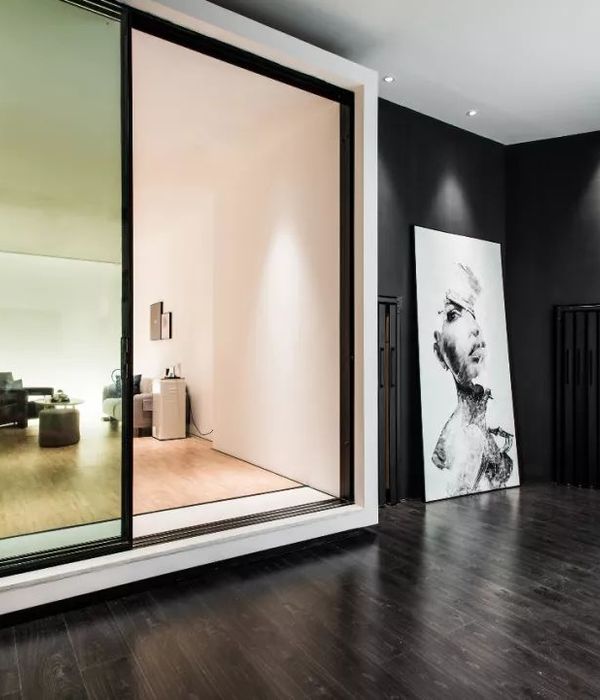
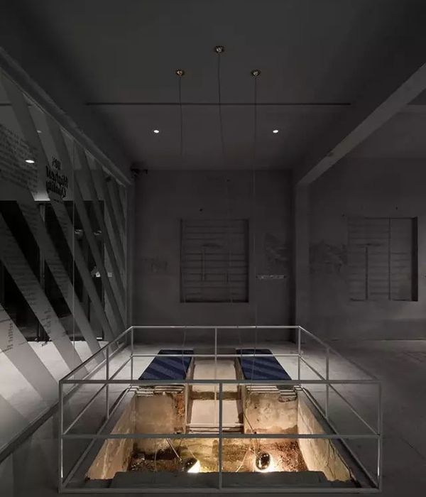
NUTSPACE是一家复合型商业空间,融合了时装、快闪、饮品等业态,为青年群体建构了一个新兴的文化社交平台。NUTSPACE的整体设计风格以黑色调为主,我们试图运用不锈钢、黑色艺术漆等材料营造出一种冷峻、硬朗的空间氛围。店铺一楼包括了咖啡、精酿啤酒及快闪活动的业态,而二楼则是以服装售卖为主的买手区。
Nutspace is a complex business space, integrating fashion, flash, drinks and other formats, and building a new cultural and social platform for young people. The overall design style of nutspace is mainly black. We try to use stainless steel, black art paint and other materials to create a cold and tough space atmosphere. The first floor of the store includes coffee, brewed beer and flash events, while the second floor is a buyer’s area dominated by clothing sales.
室内空间概览,overall view of the interior space
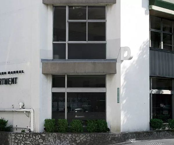
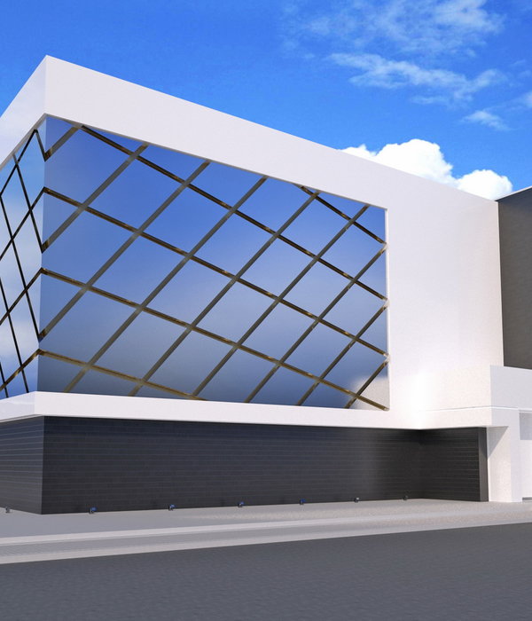
在建筑外立面设计上,我们将整个立面做成斜坡的形式,并在右侧提供了一个舒适的户外休息区及折叠窗,以此形成空间的穿插,模糊了室内外的界限。
In the design of the external facade of the building, we make the whole facade into a slope form, and provide a comfortable outdoor rest area and folding windows on the right side, so as to form the interspersed space and blur the indoor and outdoor boundaries.
店面外观,external view of the store
▼店铺外的休息空间,rest area outside the store
一楼的室内空间则以长条形吧台为视觉中心,兼顾了产品售卖、聊天洽谈等功能。我们将吧台吊顶切成了“钻石型”,以此让顾客能从不同角度看到不一样的吧台空间。而在底部我们选用可变色的发光膜来应对日间咖啡,晚间酒水的不同业态模式。吧台右侧是快闪活动的产品展示区,对侧则是座位区。
▼一层空间分解轴测图,exploded axonometric of the first floor space
The interior space on the first floor takes the long bar as the visual center, taking into account the functions of product sales, chat and negotiation. We cut the ceiling of the bar into “diamond shape”, so that customers can see different bar spaces from different angles. At the bottom, we choose a color changing luminous film to cope with the different business modes of coffee during the day and wine at night. On the right side of the bar is the product display area for flash events, and on the opposite side is the seating area.
一层空间概览,overall view of the first floor space
▼吧台,bar counter
▼餐饮区使用可移动家具,beverage area with movable furniture
▼从餐饮区看向室外,view to the outside from the beverage area
▼展示区与标语,exhibition space and the slogan
▼空间细部
space details
我们将通往二楼的楼梯间重新粉刷成黑色,并用T5灯管进行空间的基础照明。同时,我们拆除了原建筑的常规扶手,更换为定制的钢管扶手来突出空间的个性。
We will paint the staircase leading to the second floor black again, and use T5 light tubes for basic lighting of the space. At the same time, we removed the conventional handrails of the original building and replaced them with customized steel pipe handrails to highlight the personality of the space.
▼黑色的楼梯间
staircase in black color
楼梯间内的照明与开窗,illumination and opening in the staircase
我们在二楼则通过环形流线的布局来进行服装的展陈,环形的中间是两个试衣间及一面大镜子。需要强调的是二楼的休息台阶,我们运用传统的小青砖来装饰地面,而铺装的方式及自然缝的保留却是用的现代设计语言。
▼二层空间分解轴测图,exploded axonometric of the second floor space
二层空间概览,overall view of the second floor
On the second floor, we display our clothes through the layout of circular streamline, with two fitting rooms and a large mirror in the middle of the ring. What needs to be emphasized is the rest steps on the second floor. We use traditional small green bricks to decorate the ground, while the way of pavement and the preservation of natural joints are in the modern design language.
▼空间中部的镜面,mirror in the center of the space
▼休息台阶,rest steps
▼休息台阶细部,details of the rest steps
▼从台阶上看向售卖区,view to the sales area from the rest steps
▼陈列细部,display details
▼一层平面图
first floor plan
▼二层平面图
second floor plan
项目名称:NUTSPACE螺母空间
项目类型:室内设计
设计方:苏州无外设计事务所
完成年份:2022.7.3
室内设计团队:辛斐 庄嘉其 莫诗龙 李玥涛 陶晨
项目负责人:莫诗龙
项目深化:李玥涛 陶晨
平面设计团队:张智程
项目地址:苏州
建筑面积:260㎡
摄影版权:小谢氏
材料:不锈钢、艺术漆、灯膜、小青砖等
Project name: NUTSPACE
Project type: Interior design
Design: wwd-studio
Completion Year: 2022.7.3
Leader designer & Team: Xin fei, Zhuang jiaqi, Mo shilong, Li yuetao, Tao chen
Project Leader: Mo shilong
Project deepening: Li yuetao、Tao chen
Graphic Artist Designer:Zhang zhicheng
Project location: Suzhou
Gross built area: 260㎡
Photo credit: xiao xieshi
Materials: Stainless steel, art paint, lamp film, small green bricks, etc
{{item.text_origin}}

