Architects:Felipe SS Rodrigues
Area:200m²
Year:2023
Photographs:Fran Parente
Lead Architect :Felipe SS Rodrigues
Collaborator Architect :Juliana Gilardino
Engineering :Later Engenharia
Clients:Eduardo Mufarej / Raphael Falcioni
City:São Paulo
Country:Brazil
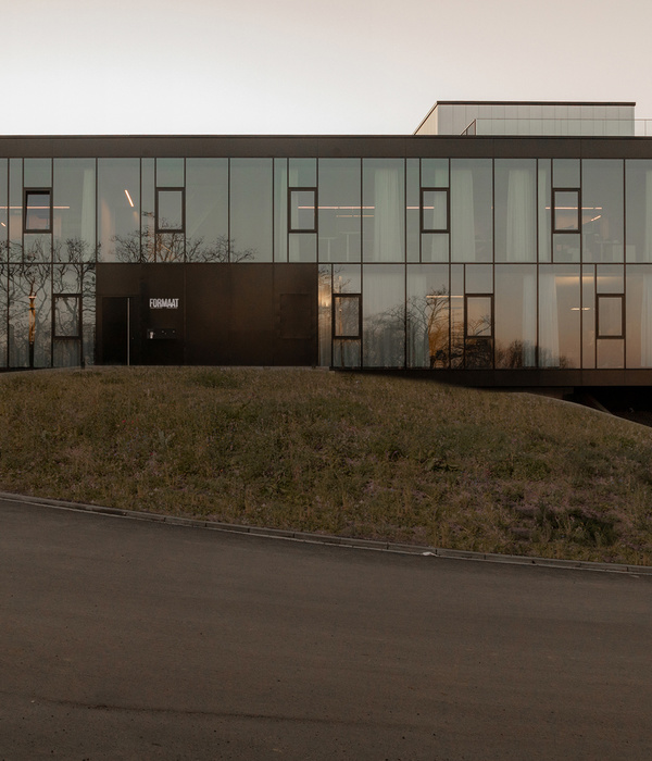
Text description provided by the architects. GK Partners is a positive impact investment firm that seeks minority stakes, with governance, in established and growing companies in the people development, healthcare equity, and climate action sectors. Located in the Capitânia Building, designed by architect Pedro Paulo de Melo Saraiva, on the corner of Faria Lima and Cidade Jardim, the medium-sized building attracts tenants looking to escape mirrored or textured towers with little or no architectural culture. Although designed in 1973, the building retains timeless qualities, such as an external pillar structure to the floor plan and large windows that create large glass panels, both of which enhance user well-being before even celebrating the architectural landmark that is also recognized in the book Arquitetura moderna paulistana (São Paulo: Editora Pini, 1983) by Alberto Xavier, Carlos Lemos, and Eduardo Corona.
This new project responds to the office's expansion needs. The first version was made in 2019, in ¼ of the typical floor plan, which has a total area of 400m2. The previous office capacity was 15 people and jumped to 30 with the lease of a double unit in the same building on a lower floor.
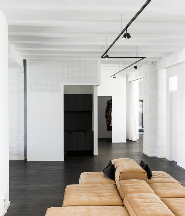
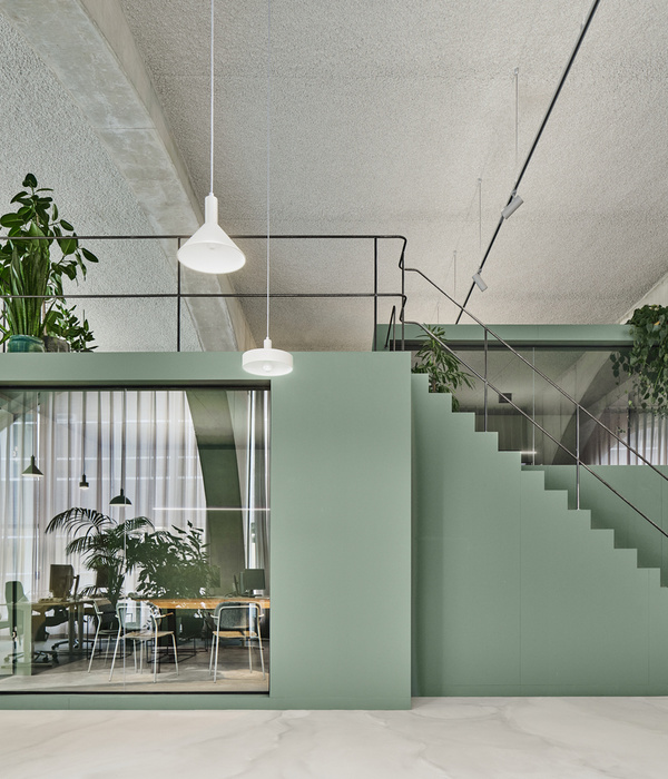
This new version featured a greater number of meeting rooms. To ensure that spatial perception was not diminished, glass rooms were created with permeable fabric between them so that when a user or visitor uses a room, even if closed, they can have a sense of the whole, in a plan that appears infinite through the curtains, almost like a mist.
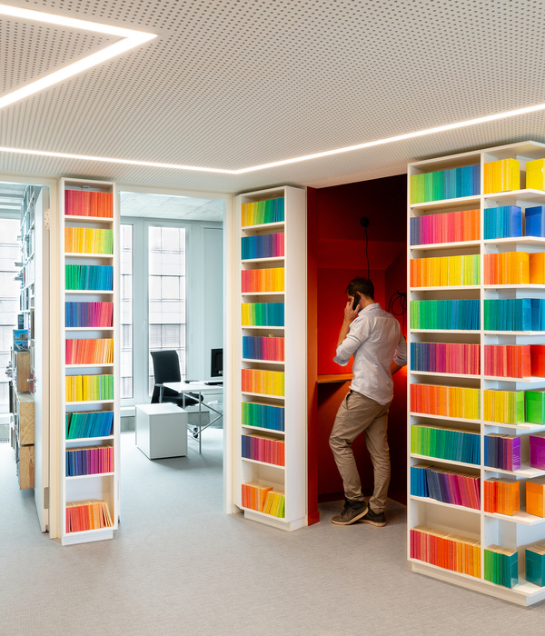
The main hall was divided by a bookshelf that organizes the office circulation without invading the collective work area - it is a waiting area, pantry, and discursive motif for the investment office specializing in sustainability. On the back, the bookshelf received two whiteboards that are available to the team to deposit their strategies.
The beam structure was exposed in this GK version, with a ceiling only in the meeting room area - used for air distribution in the hall. For user comfort, it received a homogeneous white paint, covering the exposed concrete and removing the constant feeling of cloudy weather over our heads. In addition to painting, the project featured a super-slim luminaire that illuminates downwards and upwards, further enhancing the structure.
The fact is that corporate spaces have changed a lot in recent years. They have moved away from the compartmentalized formality of the 1950s and reached great informality in the 2000s. This informality still needs to be calibrated because it is not uncommon today for decompression rooms to be confused with daycare centers or some lounges with McDonald's party halls. Gradually, companies regain the balance of their aesthetics. It is not about marble floors and wood-paneled doors from floor to ceiling, nor is it about ultra-colorful playgrounds for adults. We seek to design a space with timeless strategy, without exclusively looking at the fashion of the present time, capable of comfortably welcoming not only a specific group but anyone who is capable of feeling.
Project gallery
Project location
Address:São Paulo, Estado de São Paulo, Brazil
{{item.text_origin}}

