The siting of the planned building is generated taking as a reference the orthogonal organization of other buildings in the Guillén Lafuerza Public School.
Due to the constraints of the program, we propose a design that minimizes covered pedestrian circulation from the other buildings and the proximity to the traffic area, to enable access of goods to the dining hall kitchen from the existing car park.
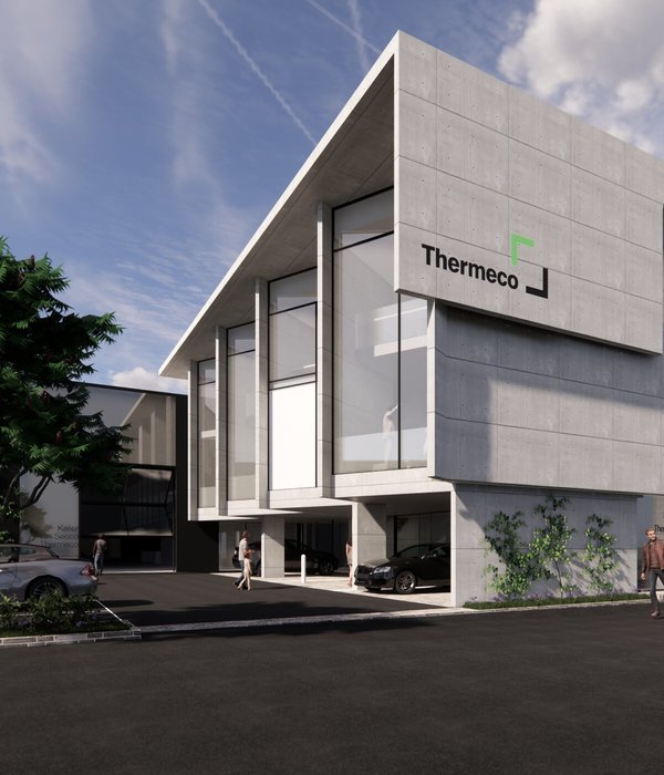
The building, rectangular in plan and with a prismatic shape, is clad with a metal plate envelope, with curved edges to soften the visual impact of its siting. This solution also prevents possible gutters and meetings between the walls of the facade and roof, facilitating the maintenance of the building.
The plan, barely compartmentalized, has a room for dining, a kitchen, a cloakroom and storage area for backpacks, and restrooms for both genders.
The openings on the enclosures are sized seeking a balance between the amount of natural light and heat loss of its components. For their location and proportion, we have considered, besides their orientation, the scale of its users and existing views from inside.
The building has two entrances, both pedestrian. The main one, located on the west facade is covered with a canopy that extends the building envelope and links to the covered circulation of the school. The other service access, located on the north facade, links to the car park.
Considering the short period of time allocated for construction, due to the urgent need of the facility, a prefabricated solution was proposed, by subdividing the main volume into four prismatic modules supported on a concrete wall and steel pillars with different heights to adapt to the topography.
We propose using only two colors in claddings, gray [RAL 9006 silver metalic] in the steel sheet and a warm color, yellow [RAL 1003], for other materials.
{{item.text_origin}}


