Mini Cuppa 上海大宁茶饮店 | 模块化设计打造独特茶空间
- 项目名称:Mini Cuppa上海大宁茶饮店
- 项目类型:餐饮室内设计
- 位置:中国上海大宁广场
- 设计团队:German Roig,Natalia Moreno,陈卓然
- 业主:Mini Cuppa
- 详细地址:中国上海共和新路1898号5号楼101
- 完成日期:2019年12月
上海和瓦伦西亚建筑工作室Raams在中国上海完成了第一家MiniCuppa茶饮店。店供应新鲜牛奶和时令水果混合的奶盖茶,设计选用了白色方形模块作为店铺的主要建筑元素。
Shanghai & Valencia based Raams Architecture Studio has completed the first Mini Cuppa tea shop in Shanghai, China.
A white illustrated square module is chosen by the architects to frame the store, which serves up the popular cheese-capped tea blended with fresh milk and seasonal fruits.
▼白色层叠模块构建上海奶茶店,White stepped blocks f rame cheese – tea shop by Raams Studio ©牧一制作
过去,茶作为饮料,在中国主要被老一辈人饮用,而且大多为男性。位于上海人口密集的长宁区,Raams希望打造一家适合全年龄客群的茶饮店,并关注女性的需求,为打造一个可以会友、放松和喝茶的空间。
Traditionally, tea as a drink was mostly consumed by the elder generation in China and mostly popularized by men. Located in a dense new urban area in west Shanghai, Raams’ aspiration is to create a tea shop for both young and older generations, and a women-inclusive space to meet, relax and drink tea.
▼店铺外观,Store front ©牧一制作
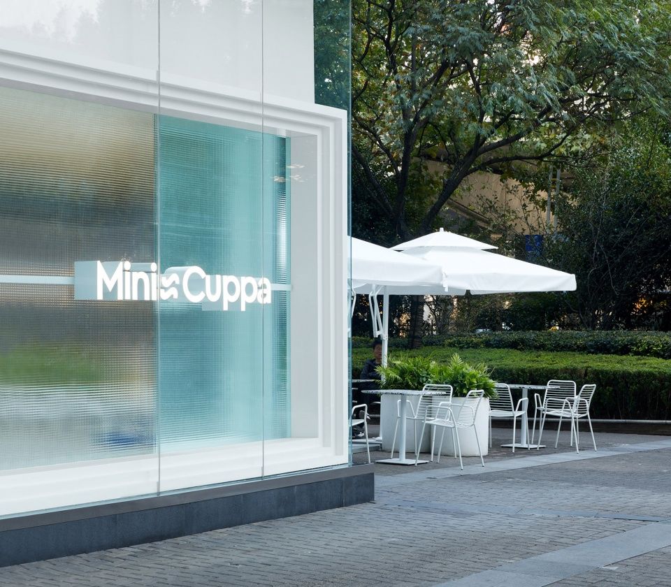
Raams建筑事务所重新诠释了弗兰克·劳埃德·赖特经典的工艺砌块模块化系统,用一个单一的建筑元素来定义茶饮店的尺度,创造了一个灵活且有质感的建筑室内空间。
The studio brings back a reinterpretation of the classic block modular system from Frank Lloyd Wright to solve the space with a singular architectural element defining the scale of the shop and creating a flexible and textured architectural interior.
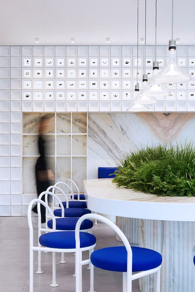
茶饮店室内,模块墙,中央公共桌 ©牧一制作
Interior tea shop, modular block wall, central communal table
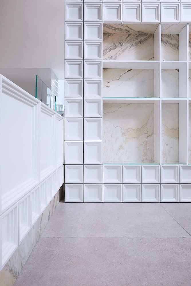
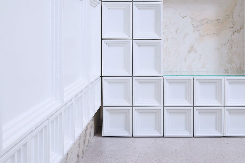
▼层叠的模块墙,展示架和台面转角细节 ©牧一制作
Stepped block system wall, shelves and counter corner detail
这些模块用磁铁吸附,平行的堆叠在彼此之上。这样简单的构造系统可以适应品牌未来的空间需求,从而创造出无限多种布局,并使每一家品牌店铺似曾相识,实则新颖独特。
▼模块系统示意,Modular System ©RAAMS 建筑事务所
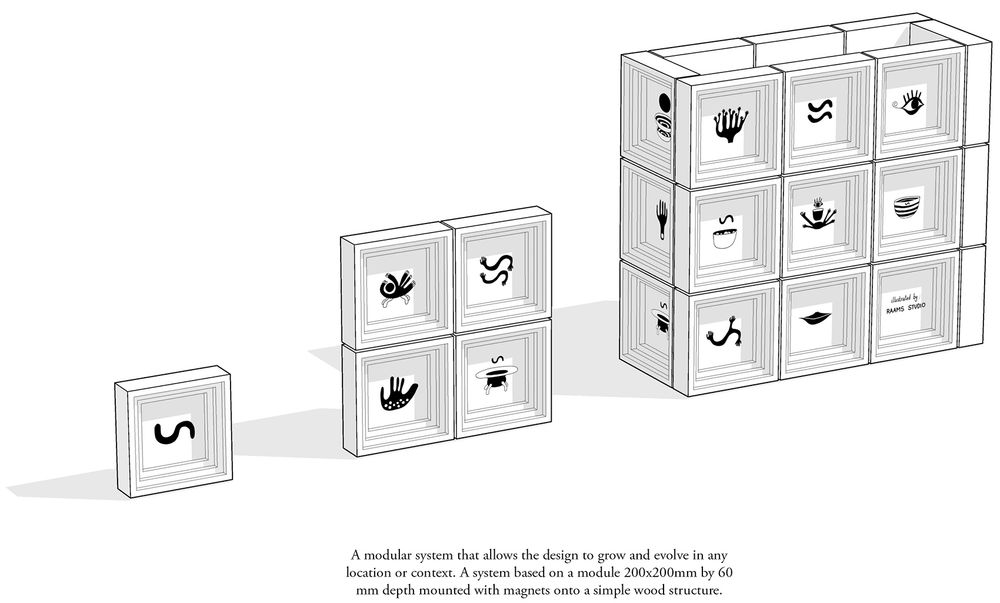
▼单元模块,Single Module ©RAAMS 建筑事务所
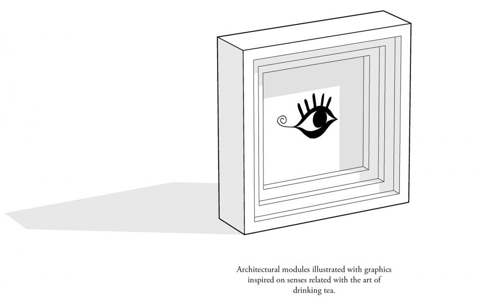
The blocks were stacked directly a top each other in parallel rows using magnets.
The simple assembled system can adapt to future spaces of the brand creating infinite layouts and making each shop to feel similar but new and unique.
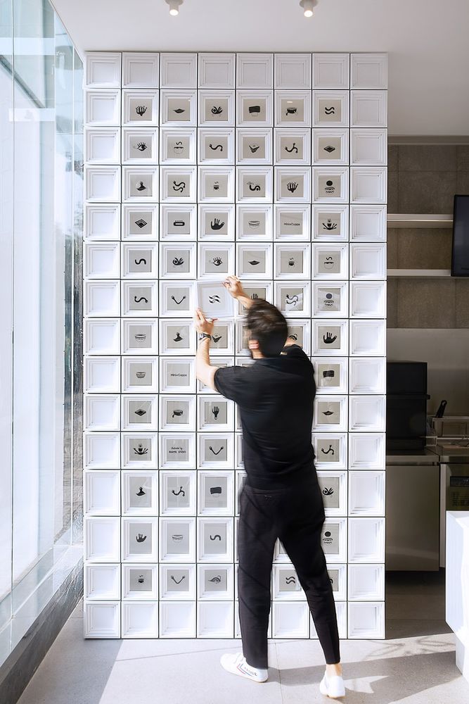
▼模块墙可以创造出无限多种布局 ©牧一制作
The simple assembled system can adapt to future spaces of the brand creating infinite layouts
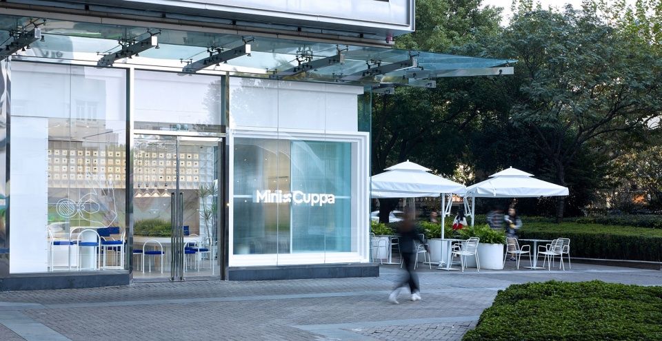
更大尺寸的模块还延伸到了店面外,配以三块玻璃橱窗划分店面。
“建筑师解释道:“XL尺寸的框架外立面是一个引人瞩目的元素,它可以吸引来往人群,并且将Mini Cuppa 与周边商铺区分开来。”
In larger sizes, the module also extends to the shop front, framing the store with three inner windows.
“The XL framed façade it is an eye-catching element that attracts people passing by and distinguish Mini Cuppa from their neighbor’s shops”, the architects explain.
▼Mini Cuppa 白色室外装饰,XL尺寸的框架橱窗及雾面的玻璃旨在激发顾客的好奇心 ©牧一制作
Exterior of white Mini Cuppa, the XL framed inner window with the blurred glass intends to produce curiosity of passengers
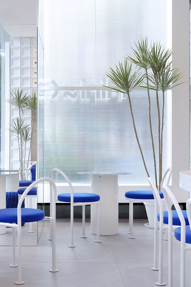
该设计营造出一个平静又温馨的氛围,邀请人们进来放松心情,享受一杯茶。外部花园的斑驳绿色透过雾面玻璃被引入内部空间。
The design creates a calm and welcoming atmosphere inviting to come in and enjoy a small cup of tea. Blurred green sparkles from the exterior garden comes inside the space through the reeded glass.
▼茶饮店一侧的镜面转角,内部雾面玻璃后的Loop椅和茶桌 ©牧一制作
This side of the tea shop features the mirror corner with the Loop-chair and tea table behind the reeded glass window
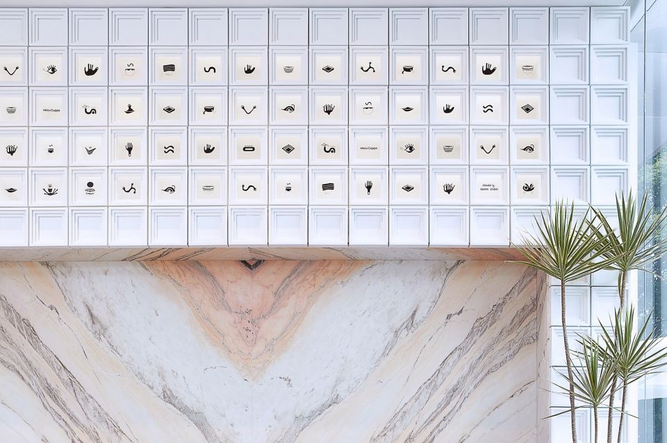
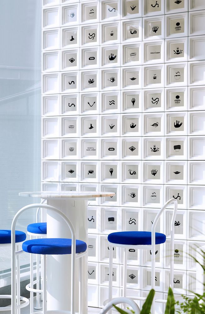
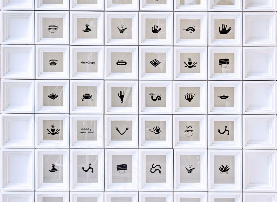
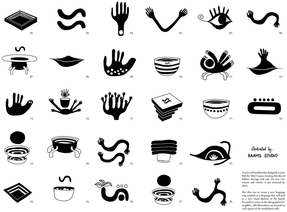
为创造品牌独特的视觉化信息,选择使用“符号”作为一种隐秘的语言及艺术性的表达方式,创意总监German Roig 绘制了多达400个模板图案,这一系列手绘的专属图像是对人类感官和茶文化主题的表达。
占主导地位的白色内饰和品牌最主要的饮品元素——白色的奶盖遥相呼应,同时也是设计师自我表达的“画布”。
The use of simbology as a hidden language and art expression is chosen to create visual messages for the visual identity of the brand. More than 400 blocks were illustrated by creative director German Roig, who have unique graphic series of images that represent the human senses and tea motifs.
The predominant white interiors connect to their most important beverage ingredient, the cheese, while acts as canvas for the designer illustrations.
▼带图案的白色模块墙,Loop 高椅和咖啡桌 ©牧一制作
Illustrated white assembled block-wall. loop-stools furniture and coffee table
▼模块墙细节,block-wall detailed view,©牧一制作
▼为品牌专门定制的符号元素,Symbols designedfor the visual identity of the brand©RAAMS 建筑事务所
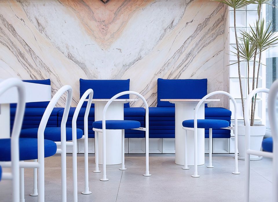
店内的家具均由Ramms建筑事务所设计并生产,包括大理石面的茶桌,带有靛青色织物软垫的Loop高椅和Loop椅。这些极简设计风的家具独特且经久耐用,具有遵循品牌标识的女性化气息。
巨大的对页拼花粉色大理石板,放置于店铺后侧,成为蓝色长凳的背景,为整个空间增加了一抹柔软的质感。
Furnishings of the shop were designed and produced by Raams Architecture Studio, this includes the tea tables with marble tops and the loop-stools and loop-chairs upholstered in vibrant indigo blue Kvadrat fabric. They are minimal, unique & durable pieces with a feminine touch that follow the brand identity.
Book-matched big slabs of pink marble are mounted on the back shop becoming the back drop of a built in blue bench, which adds a softer touch to the whole space.
定制家具上方:对页拼花石墙,Bespoke furnishings Above: Book-matched stone wall ©牧一制作
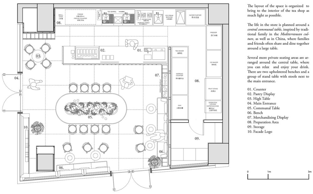
店铺的整体空间布置围绕着一张3.5米长的中央公共弧形桌进行规划,灵感源于传统的地中海家庭文化,在中国也同样如此,家人和朋友们通常围坐在一张大桌子旁。
The layout of the store is planned around a curved central 3,5m length table, inspired by traditional family in the Mediterranean culture, as well as in China, where families and friends often gather together around a large table.
▼带有野生绿植的对页拼花大理石公共桌,Book-matched marble communal table with wild greenery ©牧一制作
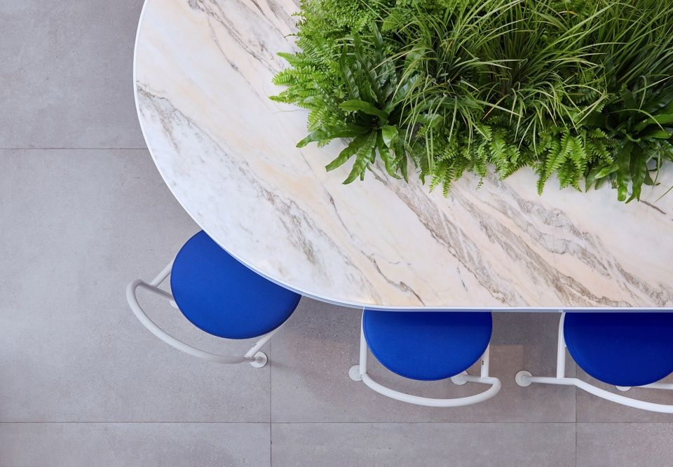
在桌子中间,专门定制的野生绿植花盆将自然带入了室内,并充当了一个半透明的视觉分区,为顾客提供了一定的私密性。Viabizzuno吊灯为中央桌提供照明。
In the middle, a customized plant pot with wild greenery brings nature to the space and acts as a semi-transparent visual division, offering a sense of privacy for customers. Lighting Viabizzuno pendant lamps illuminate the central table.
室内空间,厨房工作台,Interior, kitchen counter ©牧一制作
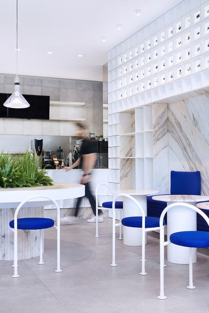
该茶饮店是融合了多学科设计的成功案例,它将图形、家具和室内设计的语汇融合进了餐饮商业中。
The tea shop is an example of multidisciplinary design that blends the languages of graphics, furniture and interior design into the F&B business.
室内细节,Interior details ©牧一制作
▼空间布局轴测图,scheme – axonometric ©RAAMS 建筑事务所
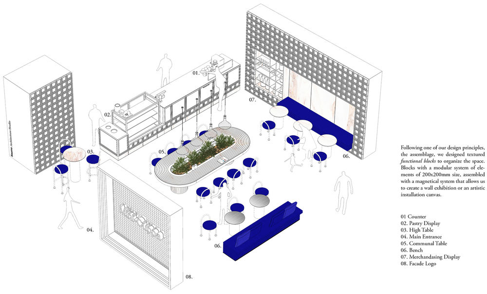
▼平面图,Layout ©RAAMS建筑事务所
项目名称: Mini Cuppa上海大宁茶饮店
建筑设计: RAAMS 建筑事务所
项目类型: 餐饮室内设计
位置:中国上海大宁广场
设计团队: German Roig, Natalia Moreno, 陈卓然
业主: Mini Cuppa
详细地址: 中国上海共和新路1898号5号楼101
面积: 90m2
完成日期: 2019年12月
PROJECT NAME: Mini Cuppa
ARCHITECT: RAAMS Architecture Studio
CATEGORY: Interior F&B
LOCATION: Life Hub Daning Shopping, Shanghai, China
DESIGN TEAM: German Roig, Natalia Moreno, Zhuoran Chen.
CLIENT: Mini Cuppa
SITE ADDRESS: 1898, Gong He Xin Road, Building 5, Room101, Daning, Shanghai, China
AREA: 90m2COMPLETION DATE: 2019
Photographer Credits: 牧一制作 Concept+ Production/Alexis


