活力四溢的墨尔本 Yakimono 餐厅设计
Architects:Russell & George
Area :685 m²
Year :2021
Photographs :Tim O’Connor, Tom Blachford
Lead Architects :Ryan Russell, Byron George
Interior Designers :Russell & George
Project Manager :Armitage Jones
Services Engineers :JJA Consulting Group
Structural Engineer :AECOM
Main Contractor :MPA
Electrical Contractor :Engie
Associate : Caitlin Ripper
Designer : Rimgaile Fletcher
Graphic Designer : Projects of Imagination, Nick Cox
Client : Chris Lucas - The Lucas Group
Industrial Designers : Russell & George
Facade Engineers : Arup
Kitchen Consultant : Eatscape
Joinery : Michael Schiavello
City : Melbourne
Country : Australia
@media (max-width: 767px) { :root { --mobile-product-width: calc((100vw - 92px) / 2); } .loading-products-container { grid-template-columns: repeat(auto-fill, var(--mobile-product-width)) !important; } .product-placeholder__image { height: var(--mobile-product-width) !important; width: var(--mobile-product-width) !important; } }
Good restaurants are places that take you somewhere else. Places where you go on a journey to somewhere you haven’t been; places where you suspend disbelief. This is really the fundamental driver of any good restaurant design, to create a series of spaces that support the experience of a great restaurant operator. They are also places that speak about our culture and dining together. Melbourne is one of the world’s great cosmopolitan dining cities. Its restaurants are diverse and varied. Yakimono is one of the latest venues that represent that great dining culture.
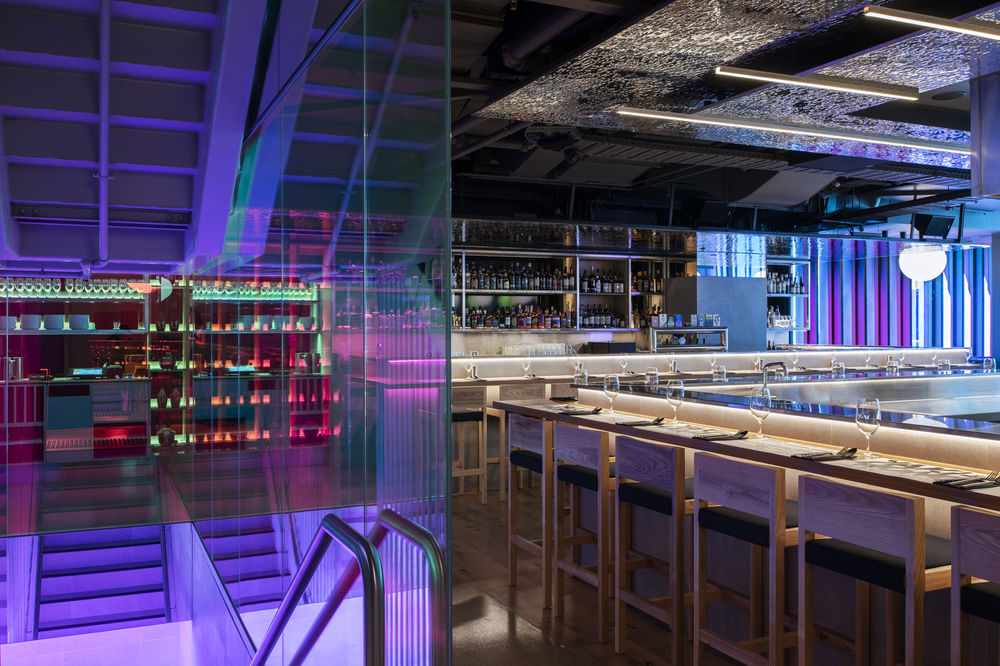
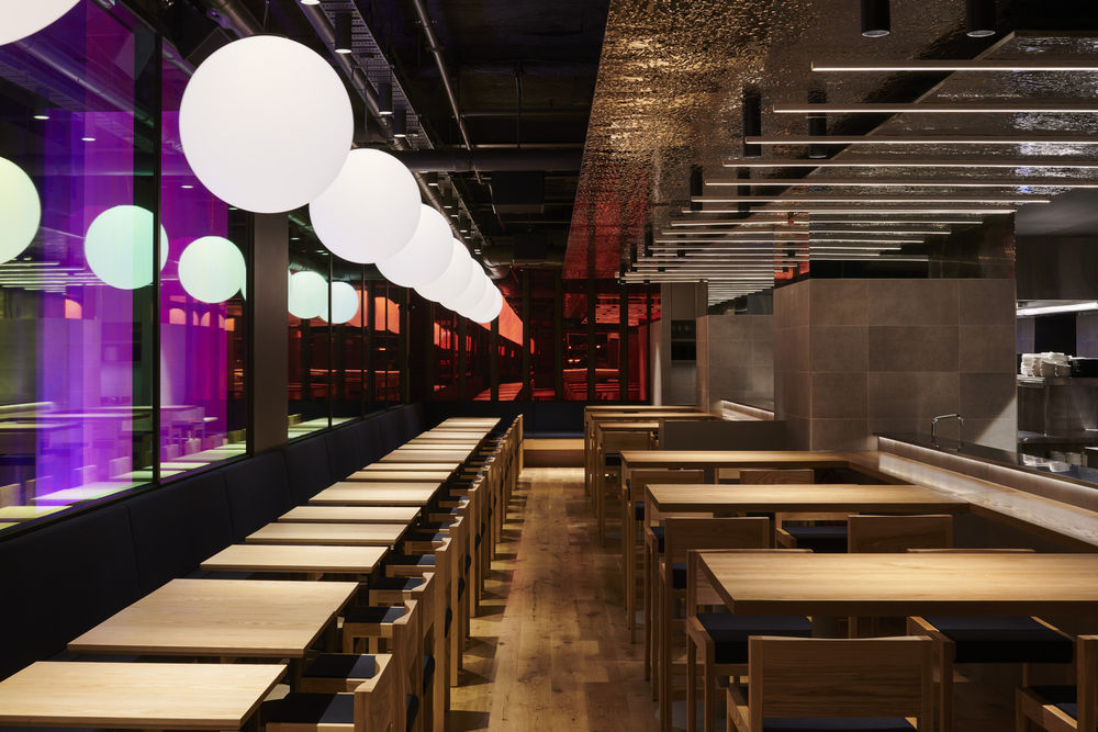
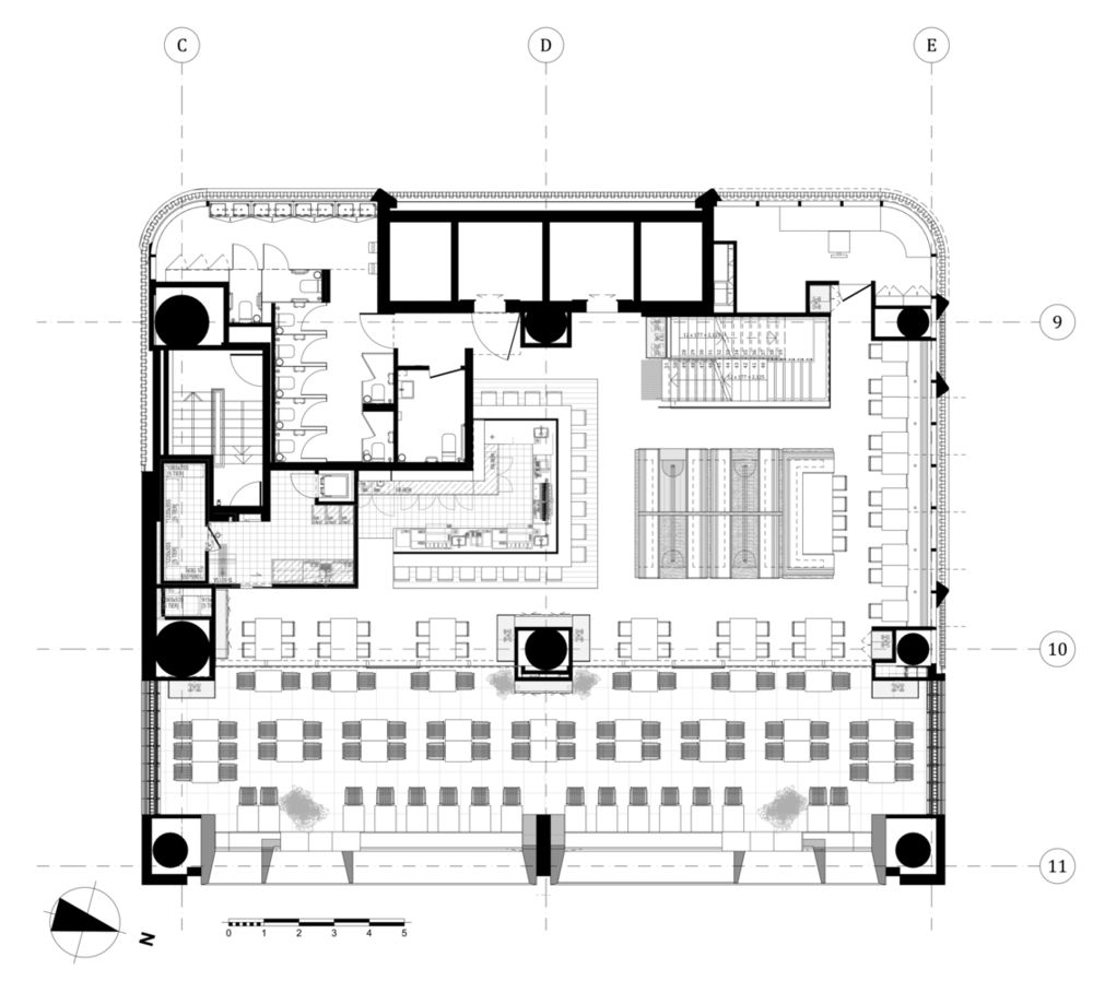
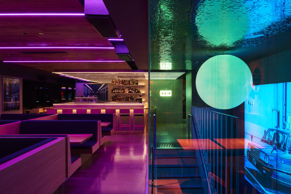
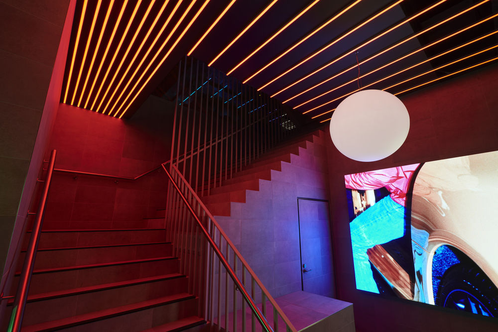
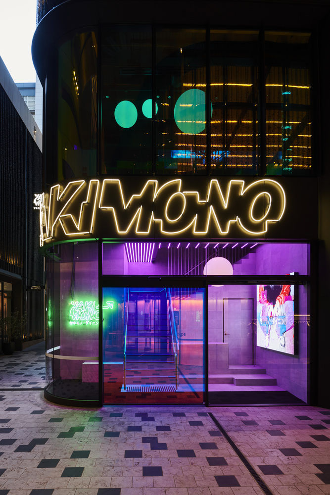
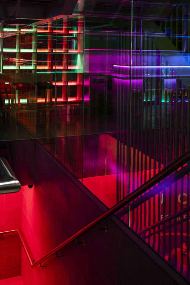
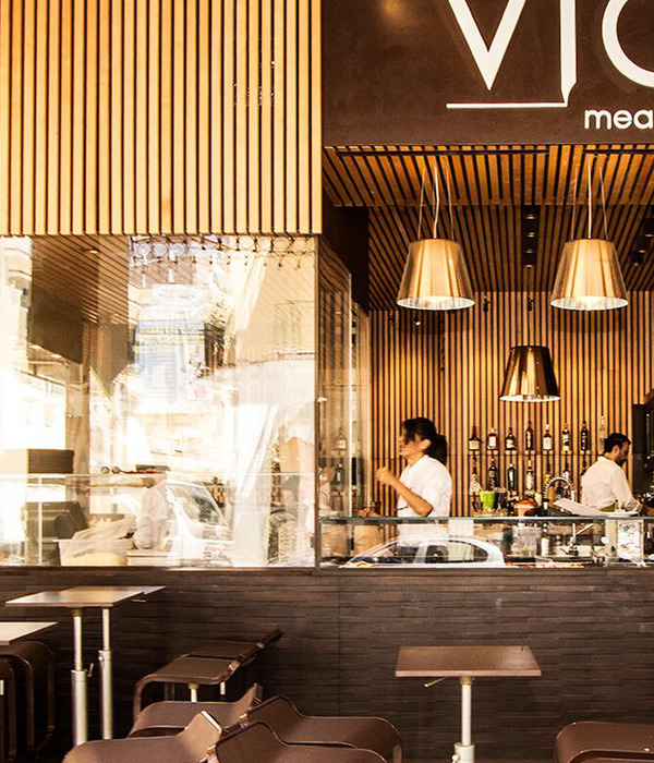
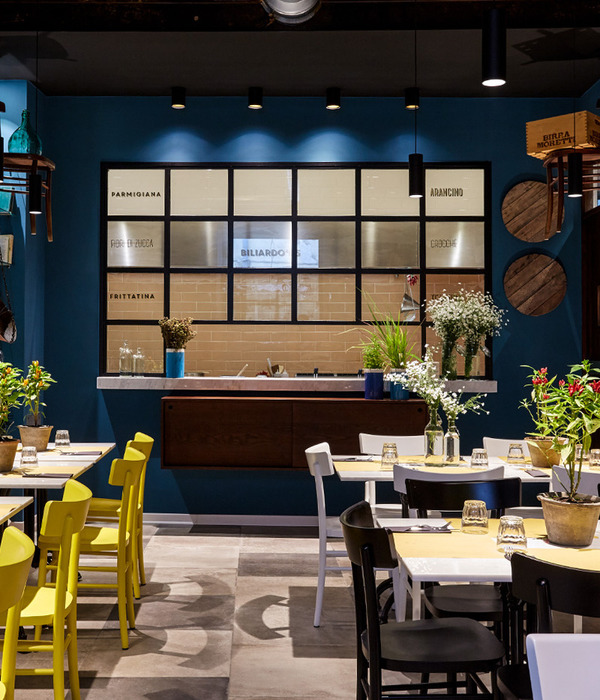
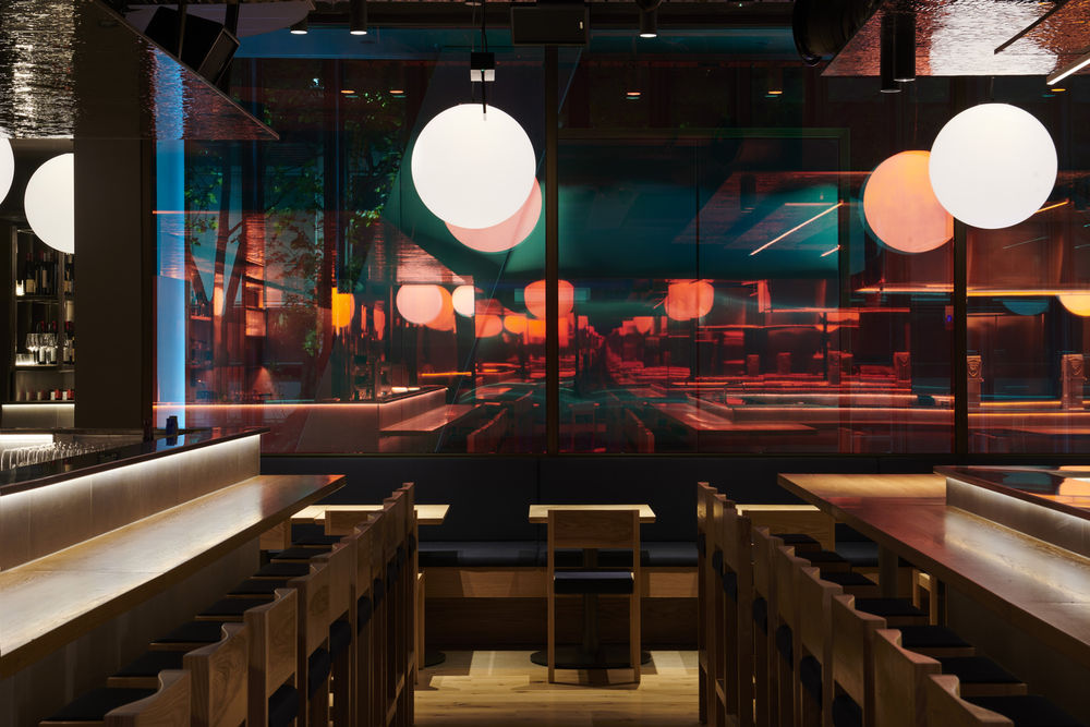
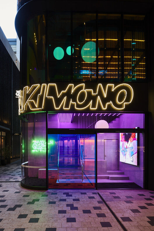
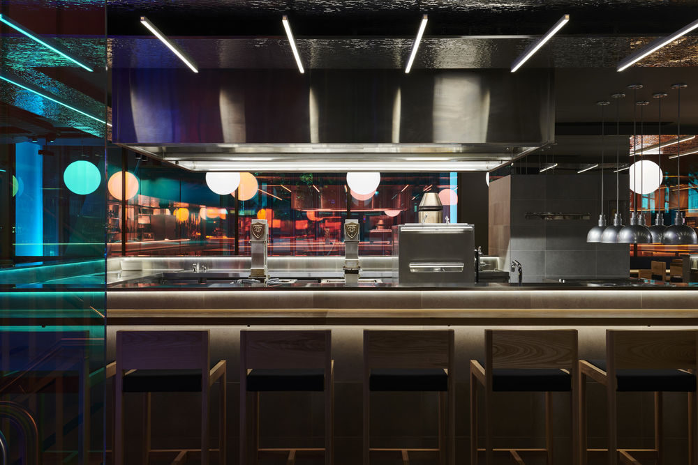
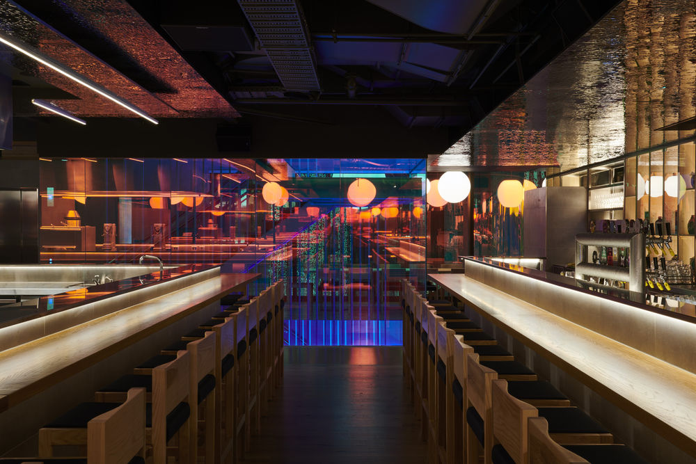
Situated in the 80 Collins Street redevelopment, Yakimono spans three levels and 685 square meters. It’s designed to reference rain-drenched Tokyo streets and the vibrancy and energy of that great capital. From the electric and vibrant entrance, Yakimono is clearly designed to take you somewhere else. Your sense of disbelief is suspended from the moment you enter the restaurant on the ground floor, from its provocative LED and neon-lit entrance to the assault of sound and light. This restaurant is all about energy. Ascending the stairs, you are transformed into another world, a neon-lit immersive space with a large central kitchen, smoking grills, and perimeter seating in the style of a traditional izakaya. But this is not a traditional Japanese restaurant. The style and approach are uniquely Australian.
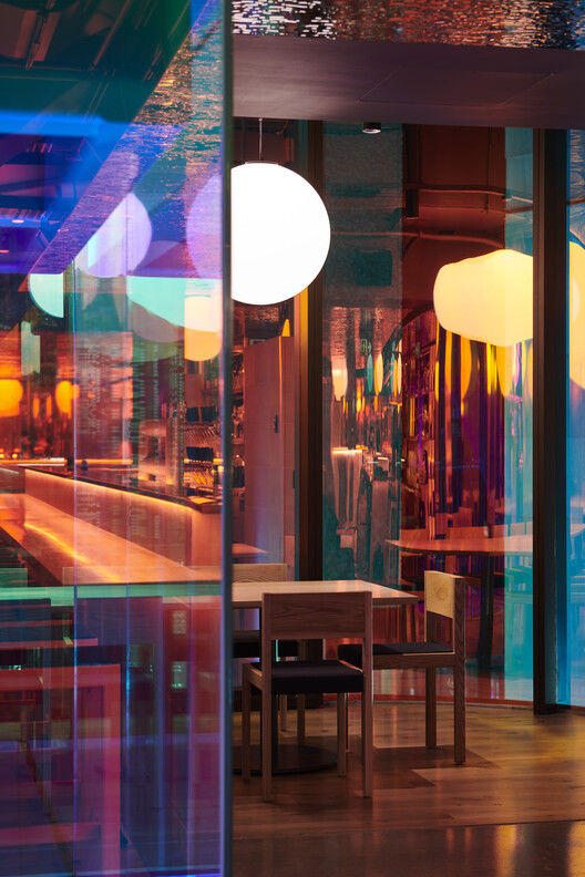
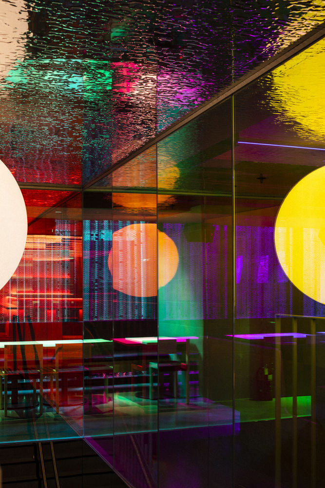
The use of dichroic film for external glazing and the main circulation stair creates an environment that changes as you move around. Large circular pendant lights appear to change color depending on your vantage point within the restaurant, as they are reflected in dichroic film applied to most glazed surfaces. The use of traditional Japanese timber joinery proportions in pine and oak sits in contrast to the reflective ceilings in patterned polished stainless steel. Hidden sound attenuation and a nightclub-grade sound system add to the energy and vibrancy of this restaurant. Sitting at the bar becomes a transformational experience.
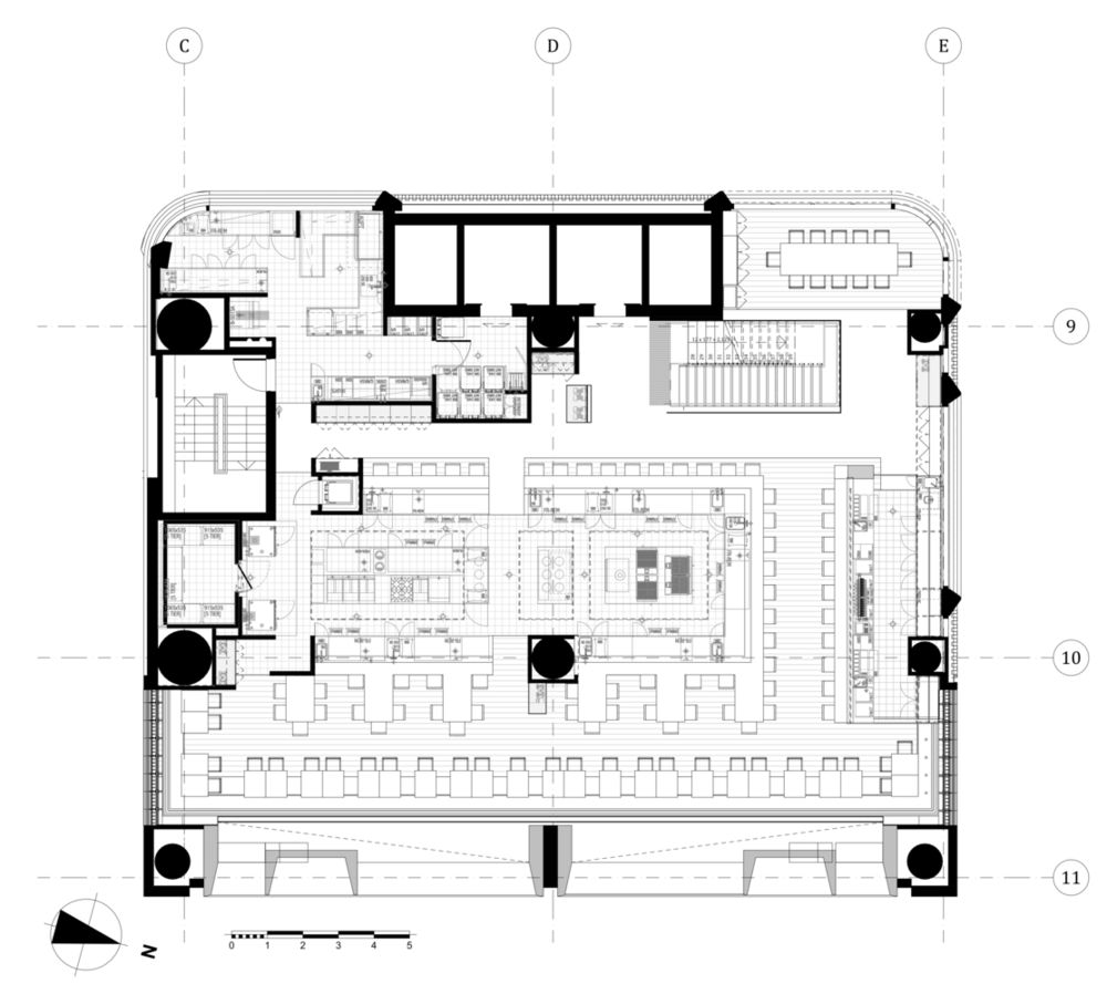
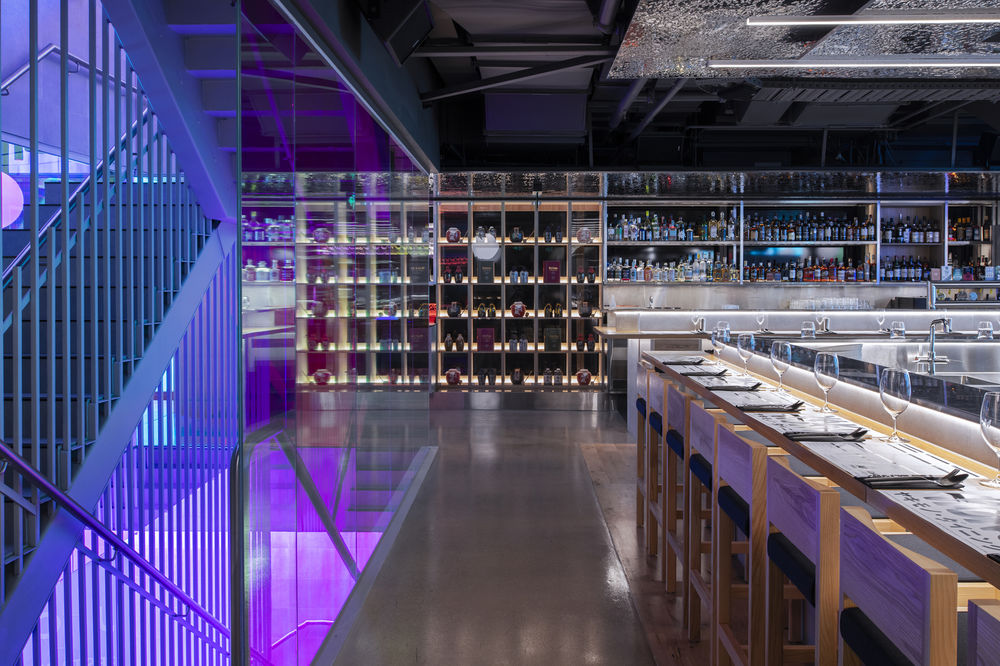
The upper level is the bar, and booth seating is modeled on seating on a Japanese train. The experience on this level has a different kind of energy but reflects the same unique Australian take on a Japanese experience. All furniture in the restaurant is locally made, and the seating was designed by Ross Didier for JRF. Tables and integrated furniture were designed by the architect, in line with the overall concept. As a result, the space is completely immersive. From an operational point of view, the service model and staff flow were as important as the customer experience. The design of this restaurant seamlessly integrates form and function, providing a seamless experience for the patron.
▼项目更多图片


