© Harry Noback & Maarten Sipma
哈里·诺巴克
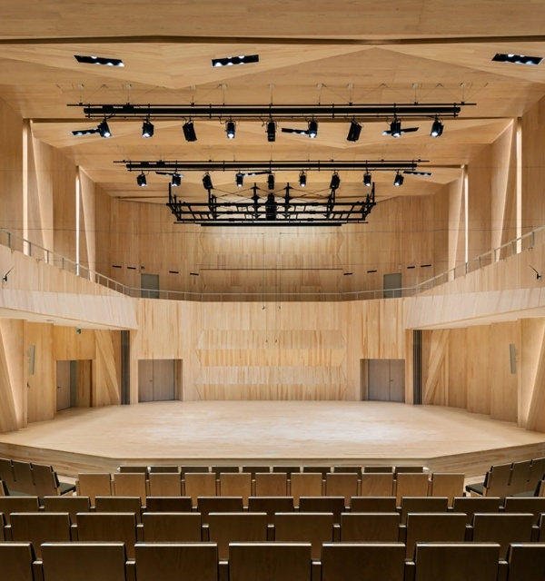
“该项目的主要挑战之一是如何使大楼与一大群不同的用户连接起来。该建筑群不仅是为了迎合从事体育活动、音乐和文化活动的广大用户群体。
“One of the main challenges in this project was to get the building to connect with a large and diverse group of users. The complex is not only intended to cater to the large groups of users who engage in sports activities and musical and cultural events.
© Harry Noback & Maarten Sipma
哈里·诺巴克
最重要的是,当地人会把它看作是一个真正的聚会场所:一个你在一周内拜访其他人的地方。正因如此,无论在字面上还是在比喻上,建筑设计都需要非常透明和方便,这样才能成功地与周围的社区连接起来。“
Above all, locals will see it as a true meeting area: a place where you drop in on a week day to meet other people. That is why both in a literal and figurative sense, the building design needed to be very transparent and accessible so that it can successfully connect with the surrounding neighbourhoods.”
Ground Floor Plan
这座建筑利用了在工地上发现的高度差异。该建筑群中相当大一部分实际上位于地下。以景观中的这一位置为出发点,这座建筑群似乎几乎完全折叠起来,这要归功于它突出的屋顶,它通向关键的公共区域。
The building takes advantage of the height differences found at the site. A considerable share of the complex is actually situated below ground. Taking this position in the landscape as a point of departure, the complex seems to almost literally fold open thanks to its striking roof, which opens out onto the key public zones.
© Harry Noback & Maarten Sipma
哈里·诺巴克
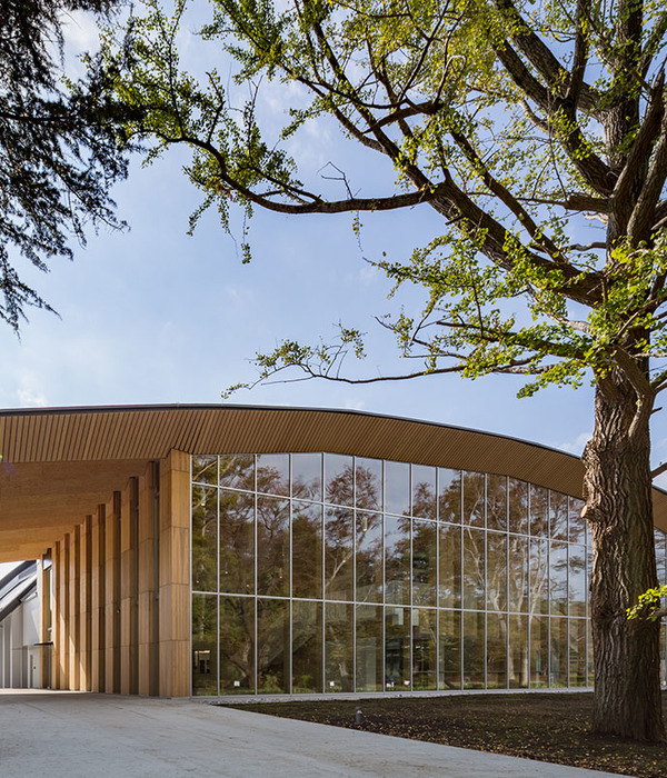
屋顶边缘的锯齿形线是建筑物最具特色的特征之一。事实上,人们可以把绿色屋顶称为这一设计的地标元素:它突出了新建筑群内和周围的关键点。周围景观的斜坡和建筑沿着侧壁相交一半,其中的设计包括一个宏伟的入口区域。
The zig-zag line of the roof edge is one of the building’s most characteristic features. In fact, one could call the green roof the landmark element of this design: it highlights key points in and around the new complex. The slopes of the surrounding landscape and the building intersect half-way along the side wall, where the design incorporates a grand entrance area.
Cross Section
行人可以从一楼进入建筑群,如果他们到达停车场,也可以进入街道层。这两个入口都是在立面的一个凹槽处出现的,在那里,它们之间有一道楼梯连接在一起,楼梯似乎从建筑物的内部向外移动。
Pedestrians can enter the complex from both the first floor and, if they arrive at the parking lot, street level. Both entrances come together at a recess in the façade, where they are linked by a staircase that seems to move outwards from the building’s interior.
© Harry Noback & Maarten Sipma
哈里·诺巴克
“在我们看来,公共建筑的吸引力并不总是取决于它的透明度。它也是关于吸引人们并掩盖他们所看到的。我们的立面设计在这方面起着重要作用。你对建筑物内部的体验是由其外部的深垂直柱决定的。换句话说,你的优势点在你与内在的视觉联系中起着关键的作用。“
“In our view, a public building’s appeal isn’t always determined by its transparency. It’s also about drawing people in and veiling what they see. Our facade design plays a major role in this. Your experience of the building’s interior is determined by the deep vertical columns along its exterior. In other words, your vantage point plays a key role in your visual connection with what lies inside.”
Exploded Axonometric
爆炸轴测
此外,立面使建筑具有庄严的质量,并改善了与周围景观的互动。
In addition, the facade lends the building a stately quality and improves its interaction with the surrounding landscape.
© Harry Noback & Maarten Sipma
哈里·诺巴克
Architects MoederscheimMoonen Architects
Location Zwolle, The Netherlands
Category Community Center
Architect in Charge Erik Moederscheim
Area 3000.0 sqm
Photographs Harry Noback & Maarten Sipma
{{item.text_origin}}

