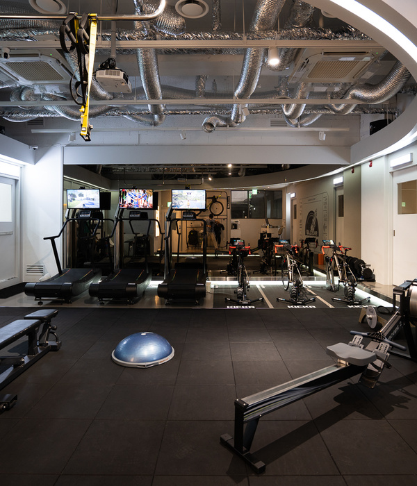
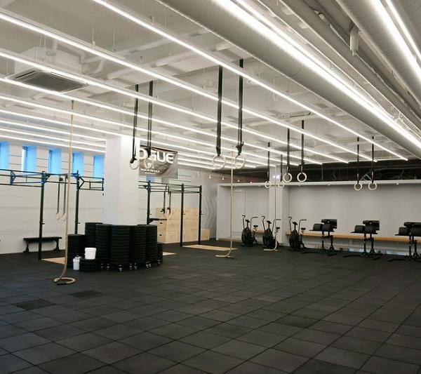
The challenge of this project and the main goal was to design a gym to look as unique as possible while keeping a low budget and still a stylish appearance. By responding imaginatively to the task, we tried to use modest materials in new ways resulting in a space with an industrial look yet luxurious in some details.
Functionally we were constrained to develop a layout within 290m² in an existing retail space to accommodate a dual studio fitness concept. In each studio there is one essential activity: functional training divided into several training stations in a single room (Panic Room), and a studio for Spinning classes (Stress Room) with an amphitheater disposition, with loud music and flashy images. Moreover, the changing rooms, a sales corner and a lounge area define the other areas.
In terms of materials, all the walls were built in concrete blocks, most of the time left uncovered, while for the floor covering recycled rubber tire grain was the option for the Panic Room, because of its impact absorption capacity and noise reduction ability, while in the rest of the areas concrete was poured in the floor.
To emphasize the reception, the lounge and the dressing rooms entrance, glossy square tiles were used enhancing the contrast between the surrounding materials.
In the Stress Room a double inverted amphitheater was designed to allow the instructor and the XL screen to be seen by the gym-goers. The space was all painted in black, while the RGB led tape changes the mood of the studio and highlights the space shape.
The reception area and the circulation is lit by vertical industrial light fittings framed by distended metal sheet, taking advantage of the ceiling height, which add a distinct underground atmosphere whilst complimenting the overall gym design. All materials are low budget solutions but applied in a distinctive way. Using mainly a color scheme from gray to black and different material textures we managed to give more or less roughness to the space feeling.
{{item.text_origin}}


