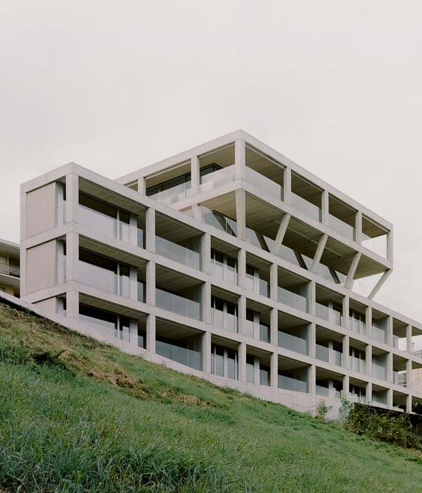
Architect:Phaedrus Studio
Location:Toronto, ON, Canada; | ;
Project Year:2023
Category:Shops;Apartments;Housing
While designed for a specific client and a site with opportune zoning and planning, Hi-Lo Hybrid tackles a prevailing narrow lot condition along Toronto's main streets. Despite the demand for increased density and housing options on these existing transit and mixed-use corridors, they remain largely underdeveloped, including an estimated 250km composed of existing single-family homes reinforced by low-rise residential zoning and planning. Outdated zoning and current planning policies limit the range of infill opportunities, driving homogenous stacked townhouse forms, as well as outsized mid-rise developments and retail spaces requiring long term lot assembly. Over time these development models become further entrenched. Hi-Lo Hybrid demonstrates a modest yet robust alternative.
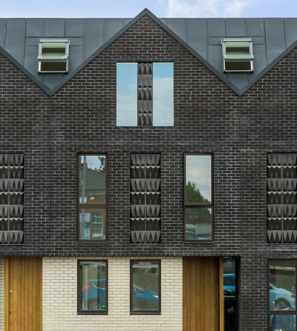
Unlocking development potential on smaller individual sites is critical to increasing the supply and diversity of housing options while maintaining an existing lot fabric suited to small independent businesses at grade. There is the added benefit of reduced construction timelines and the potential for better distribution of transitional forms on existing infrastructure. The architecture requires maximizing minimums, with each element and gesture in concert, providing maximum utility and purpose. Hi-Lo describes not only the project's stature but the qualities of a high-rise typology with a consolidated mechanical and vertical circulation core along with the repetition of similar size and quality floors and elements. The core equally divides a symmetrical typical floor spanning between a "main" street and a laneway, yielding two mirrored units or a single large unit within the same design module. The core is set back from the property line to provide daylight and natural ventilation for internalized spaces, mechanical ventilation at each level and breaks up the building depth. The offset core paired with at-grade retail at the street and a sunken two-story live/work townhouse at the laneway maximizes floor area and activation of the public realm while minimizing the cost associated with a reduced impact on adjacent building foundations. Simple horizontal carves establish direct relationships to the porch, porch soffit, and eaves of the adjacent built forms while providing pedestrian-oriented massing. A singular vertical gesture creates opportunities for balconies without impacting unit viability, defines the building entrances, breaks up the building depth opposite the core, and emphasizes a one and two-story base. Contextually compatible and human-scaled articulation, detail, and texture reinforce the building base and pedestrian experience. Hi-Lo's highly rationalized plan and a taut building envelope geared towards stackable modules are married with strategically isolated architectural features to maximize architectural impact through efficiency and utility.
▼项目更多图片
{{item.text_origin}}

