Designer:Space Matrix
Location:Shenzhen, Guangdong Province, China
Project Year:2020
Category:Offices
‘What does a typical day here look like?’ At the end of a job interview, this is one question candidates often ask to get a feel of the workplace. At one time, the interviewer may have launched into details about the work timings, lunch hours and coffee breaks. Now however, in most modern organisations, the interviewer is unlikely to be able to give a singular, straight answer.
This is especially true in a company like Vanke. As an urban and rural development provider and a living space management company, the firm has too many diverse business interests for the work roles to fit into traditional definitions. With their operations expanding and diversifying even further, Vanke’s leadership team wanted to shift to a workplace strategy that would reflect this change. Moreover, since the firm was looking to promote collaboration and attract young talent, the management realised they couldn’t operate out of a space that is purely driven by productivity and traditional values. That’s when they reached out to
Space Matrix
After intensive engagement and discussion with the leadership team, we identified four main needs that the workplace was to meet. Here’s a look at how the new space is designed for each of those 4 requirements.
1. Focus
If not planned well, focussed work becomes challenging in open space office design concepts. We wanted to ensure that this doesn’t happen here in Vanke’s new workspace. So, 43% of the total floor space was specifically devoted to focussed work areas.
This is where our designers decided to play the building’s unique layout to their advantage. The building has a polyline exterior, which would have otherwise resulted in a lot of dead corners and unused spaces. Our designers turned each of these corners into private little work nooks. These nooks have cosy seating options — sofas, cushy booths, pouffes and accent chairs, all arranged around centre tables of an adequate height. Being located as they are, against the glass exterior, these are particularly sunlit spots with great views of the scenery outside. This makes these nooks the perfect places to retreat to for a couple of hours of focussed work, be it individually or in small groups.
The individual workstations too, are designed as small clusters located in areas that receive maximum natural sunlight. They are equipped with ergonomic chairs for optimum comfort, and a touch of biophilia is added with individual planters above each workstation.
2. Collaborate
The management was also looking to make the office more vibrant and energetic. They wanted it to be a space that would foster collaboration and naturally guide people to engage and interact more meaningfully. In order to ensure this, we designated 18% of the office space to function as collaboration zones.
We created customised, glass-walled meeting rooms that would let in natural sunlight further within the space, while also retaining the open, transparent feel of the office interiors. In stark contrast to stuffy, traditional meeting spaces, these collaboration rooms are playful and inviting. With whimsical accent walls, exposed brick textures, chic mosaic floors and bright, comfortable furniture, these are rooms where teams can have long meetings and brainstorming sessions without feeling walled in. Apart from this, we also have various casual meeting spaces like the curved booths, the bar seating area and the low sofa clusters. To enable seamless interaction, these rooms are fitted with smart screens, digital walls and whiteboards.
The stunning central staircase makes for another off-beat collaboration area. As it connects all the seven floors, it functions as the one major throughway of the office. With employees from every floor running into each other here, it offers a great scope for impromptu collaboration. The landings thus, are designed to be wide enough to encourage such interactions.
3. Learn
Fostering a culture of training, knowledge sharing and individual growth is very important to an organisation like Vanke — and this needed to be reflected in the new workspace design. We thus dedicated 14% of the available space to learning zones.
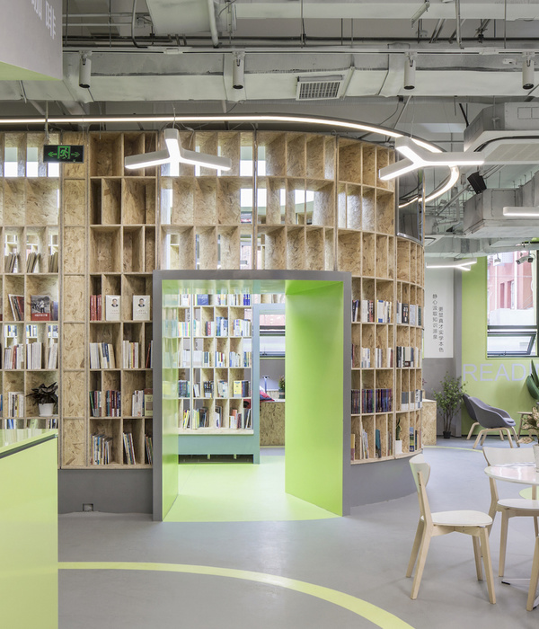
The first learning zone that one sees is the gorgeous library, which forms the backdrop to the reception. This sprawling library spans across two levels and houses everything from business and self-help books to trade literature and books about the company. The second floor of the library has seating spaces where employees can settle down comfortably for an hour or two of quiet reading and research. A far cry from any traditional real estate workplace, this library immediately sets the tone of the Vanke office as a space that encourages learning and developing various cultural interests that go beyond just work.
Continuing the spirit of training and education, we created various brainstorming spaces for smaller group sessions. We also added in a spacious 200-person training room that is perfect for larger conferences and industry seminars.
4. Socialise
Of course, spaces that enable people to socialise, bond and enjoy their time at work are extremely important in any modern workplace. Here at the Vanke office, 9% of the floor space is devoted to these zones.
The wide, open staff canteen is one such space that enables people to enjoy their social interaction. This space is equipped with comfortable chairs arranged in intimate clusters. The sophisticated, soothing colours of the furniture here are set off by a trendy, eye-catching floor design that adds a playful touch to this zone. Glass walls line the area on two sides, making this a bright, sunlit spot ideal for a shared meal or an exchanged anecdote. This is supplemented by outdoor seating that invites employees to step out for fresh air and a conversation or sit at the outdoor bar area to unwind.
Similarly, every floor of the office has cosy little breakout areas where employees can sit down, stretch out and relax during their coffee breaks. One part of the office is also sectioned off into a chic sports-themed step seating area. Subtly underlit and highlighted with trendy graphics, this makes for a perfect hangout spot for bigger groups.
This variety of function-driven spaces enabled us to create a contemporary, future-focussed workplace for Vanke.
Looking to update your workplace strategy to meet your firm’s changing needs?
We can help you there
▼项目更多图片
{{item.text_origin}}

