Dubbeldam Architecture + Design was commissioned to design the new headquarters for Azure magazine, a leading global design publication based in Toronto, Canada.
The company’s new offices are housed in a former transformer factory in the city’s historically industrial Junction Triangle neighbourhood. The converted factory, dating back to the early 20th century, boasts large floor plates, high ceilings and generously scaled windows, ideal for the multitude of creative enterprises that it now houses. Across the road, occupying the century-old Tower Automotive building, the recently relocated Museum of Contemporary Art has become a significant presence and anchor in the community.
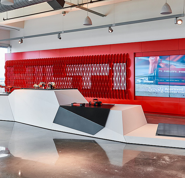
Within this emerging creative precinct, Azure has situated itself in 5,600 square feet of space spread out over two levels. The entry is demarcated by its distinctive logo, rendered in a bold orange supergraphic, visible through the reception glass on axis at the end of a long corridor leading to their space. In keeping with the Canadian designers routinely featured in the magazine, the whimsical pendant light fixtures overhead are by MOLO, a Vancouver-based furniture and product design studio. Made of paper, they cluster like an assemblage of cumulus clouds, floating above a reception desk whose sinuously organic wood top is crafted by the Brothers Dressler, an established furniture design duo who are also neighbours on Sterling Road.
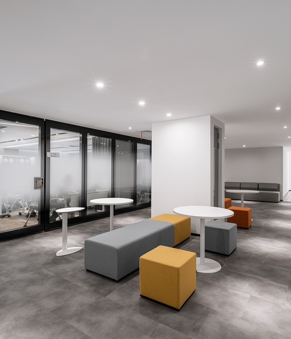
The reception area is flanked by a large, open-concept space that accommodates 26 workstations, a pair of private offices and meeting room all serving a team of editors, publishers, writers and advertising sales. Equipped with ergonomically superior desks and chairs by Teknion, this quiet zone is conducive to professional focus, as it is for accommodating client meetings and collaborative brainstorming sessions. To optimize structure and order, reference material and personal belongings can be stowed away in the numerous integrated bookshelves and storage cubbies. The space is bathed in natural daylight from both south- and east-facing windows, increasing productivity and a sense of wellbeing for staff.
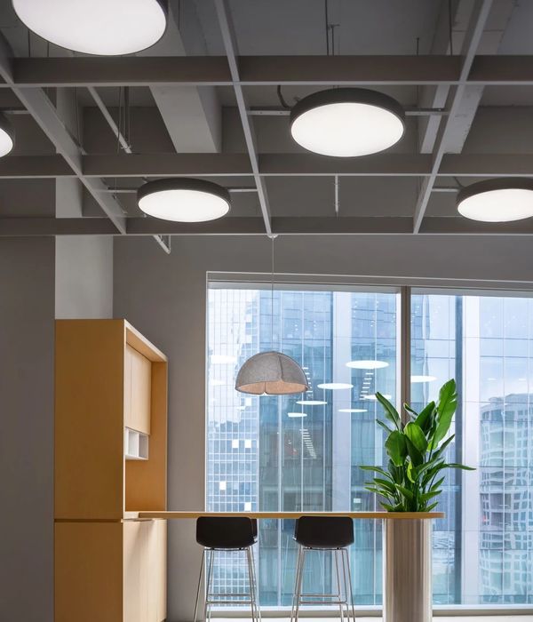
On the opposite side of reception, a soaring double-height space captivates with a sense of volumetric expansion. Sixteen-foot-tall original factory windows framed in black metal allow constant and even north light to illuminate the area. Flexible in nature, the space is suitable for social events and recreational activities. The adjoining lunchroom and staff kitchen – fitted with Scavolini cabinets – can be discreetly closed off by a sliding translucent acrylic screen, a device used throughout the office to maintain a modicum of privacy without sacrificing light transmission.
Throughout, the factory’s original, industrial character has been preserved and accentuated, instilling an authenticity to the space while revealing traces of its past. The new office’s material palette is a strategic interplay between white and bright pops of colour introduced through graphics, seating and signage, contrasting the neutral palette of the historic textured red brick walls, beautifully aged wood plank ceilings, newly installed honey-blonde maple floors, and darkened rough steel columns and beams.
Design: Dubbeldam Architecture + Design
Design Team: Heather Dubbeldam, Marisa Maggs, Andrew Snow, Joseph Villahermosa
Photography: Scott Norsworthy
10 Images | expand for additional detail
{{item.text_origin}}

