Location:Wuhan, Hubei, China; | ;View Map
Project Year:2020
Category:Shops;Shopping Centres
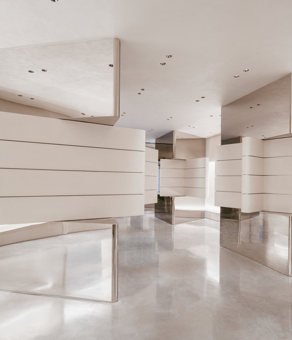
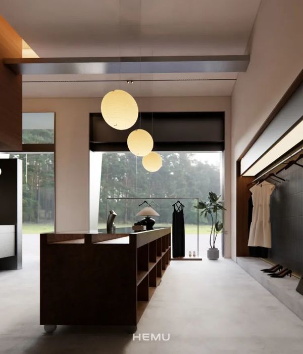
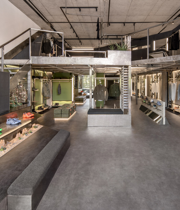
Rather than organizing the store areas by single brands or by typology, we intend to shuffle brands and items in order to create visuals and possibility of combining different items from different brands, enhancing the buyer’s experience and the potential amount of purchases. Therefore the shop would be made of different volumes and clusters rather than surfaces and open spaces.
Architectural elements are separating the spaces and at the same time host different items in “fashion island” : clothes, accessories, wearables, shoes, scarves, hats, etc., displayed next to each others.
Vertical surfaces are articulated to create different kind of niches and spaces, to allow displaying different brands and typologies together, integrating mirrors and mannequins within the same areas.
In order to optimize the space usage and blend, at the same time, different items and display corners between different areas in an harmonious way, we image to create volumes and surfaces that can work not only as separations, but as background, partition, display, advertising and showcase of accessories.
Cabinets for trying on clothes are usually far away corners within any shop, we instead imagine to turn the fitting room into a cozy element with a physical presence, and scatter this volumes around the store in strategically located areas. The elements, with iconic shape, would be integrated with mirrors and accessories for trying them on with your new different outfits.
The plan is organized in order to ensure visual channels throughout the shop from the main entrance, arranging products in cluster of display islands of different size, height and scale, while the outer edges of the store are articulated into niches that frame the products enhancing their visual appeal.
The central core is hosting the cashier, a lounge next to a generous fitting room, and a permeable set of smaller display. Doing so the store is divide in two main wings, each one with their independent fitting room, that can be dedicated to targeted genders (women/menswear) or styles (casual/elegant or young/mature) while ensuring the proper co-existence of different brands.
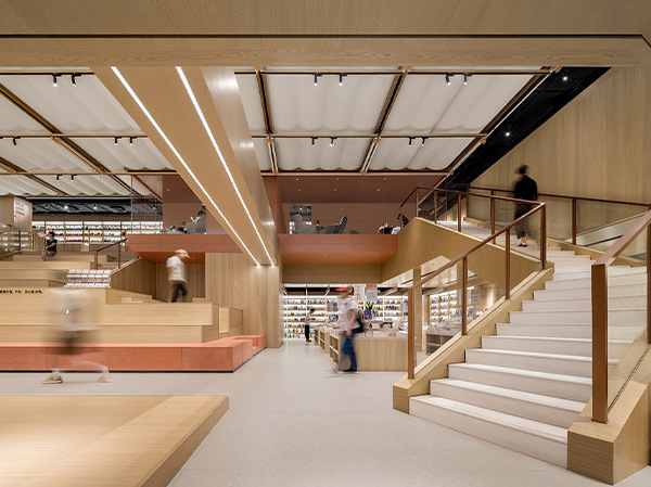
The store is ensuring a smooth flow to the buyers, leading them across the different areas thanks to the gentle curves of the walls and of the furniture. The largest “fashion islands” protruding from the ceiling and the fitting rooms shaped like house, are giving visual reference to the visitors, inviting them to explore the entirety of the store, discovering pleasure in unexpected discoveries of different brands, products and accessories, strategically arranged and distributed overall.
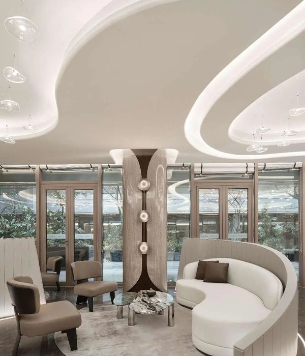
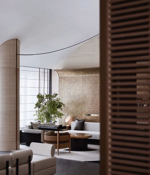
The selection of materials ranges is made of warm tones, ranging from stones to metals, from subtle wallpaper to shades of melamine veneer in shades of grey. Some specific details are realized in the tone of Burgundy Red, expressing elegance, sophistication and comfortably welcoming customers into LA GALLERIA’s buying experience.
The floor is treated like a large neutral canvas of white stones, but is visually elevated with a metallic effect tiles in the more cozy areas such as fashion islands, fitting rooms and the cashier.
The same idea is applied to most of the vertical surfaces, where we adopted a mono-chromatic wall-paper with a subtle pattern, while within the niches the displayed items are enhanced by the use of metallic background, applied either in its full height in the curved niches, or using a dotted mosaic of different effects.
▼项目更多图片
{{item.text_origin}}

