dongqi Design has transformed the first floor of an old building on Anfu Road in Shanghai into a flexible and dynamic space for the brand “lost in echo.”
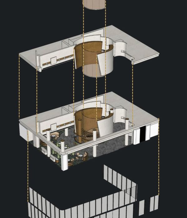
Stemming from the intention to diminish the presence of the existing columns, the design introduces multiple rotatable mechanical triangular prism structures to freely enclose or define the space.
With careful consideration of proportion and functionality, the triangular prism has been divided into three parts vertically, with the middle section at eye levels that extends into arms of different lengths. From the top view, each arm can be rotated to any angle, offering a range of combinations that accommodate various scenarios.
Whether a fluid unrestrained space or an orderly rectangular space, the scheme creates an atmosphere of diversity and novelty, challenging the conventions of functional space. Shifting between fragmentation and continuity, the movement of the prisms guides the movement of people, continuously redefining the interior spatial relationships.
The top and bottom sections of the prisms are applied with a smooth reflective surface in contrast to the textured middle section. Especially when in motion, the materiality accentuates the illusion of floating mechanical arms, enacting an ambiance of “lost.”
Folding doors, which can be fully opened, have also been divided into three parts same as the proportions of the prisms. The top and bottom mirror finishing stainless steel reflects the front yard as well as the busy street scene, while the middle glass portion draws people in. Scenes of street life bounce off the mirrors, and glimpses of the interior are revealed through the glass, forming a collage of interweaves inside and outside.
dongqi designed a variety of merchandise supports that can be hooked into the horizontal slots and moved freely on the rotatable prisms, offering a flexible system for merchandising visualization while also being easily taken off. In each case, the space is calibrated for retail, exhibition, and public or private events.
The side walls have specifically designed fillet corners, in the same language as the prisms, forming soft curves to achieve a relaxing and light ambiance. The hanging rail is hidden behind the wall extended down from the ceiling, which allows the hanging pieces to appear suspended in the air.
Materials used to enclose interior space are a consistent gray, with different handmade finishings allowing for subtle changes in textures. The brand’s signature purple applied at the all-glass cashier counter stands in contrast with the refined tactility of the gray-toned ambiance.
The irregular volume between the two fitting rooms is specially designed as a mirror-covered space, creating an immersive experience for customers. As if lost in the echo of endless reflections and movements, the design visually translates the meaning behind the brand’s name.
{{item.text_origin}}


