The Crossboundaries completed the Lavender Ward renovation for Bhailal Amin General Hospital in Vadodara, India.
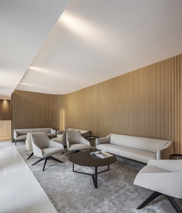
Reception areas enhance the experience of those visiting the hospital from the point at which they approach the building. Designing an aesthetically pleasing and functional space is what ensures a welcoming feel and comfort for the visitors. In order to deliver a warm and safe environment, hues of white and beige are used across the area, complementing the existing rich green marble flooring that was retained during this design process.
A pair of linear profile LED lights can be seen on either side running past the flat white ceiling as we enter, creating a sense of linearity. The ceiling interacts with the walls using a language of soft curves and indirect light.
To intensify the verticality, wooden panelling in precise grooves is used. These panels are placed with an offset, creating a sense of curiosity regarding the voids behind them.
The key plan is self-directing. It consists of transitional spaces, providing various choices and supporting a range of different postures and activities.
Creating clean interior with an ambience of calmness, a customised L-shaped reception desk with a curve surface and an indirect light at the bottom is designed, on the right as we enter. Following the minimalistic approach, the waiting area on the left side of the entrance has formally organised SS chairs for seating. These are placed in rows and are divided by tall planter units. The waiting area offers different activities like work settings, benches, chairs, etc. for longer waits. Fixed air-bikes are installed in order to engage the visitors in the waiting lounge.
Huge wall openings covered with glass windows throughout the entrance lobby, reception and waiting area opens up to already existing lush green plants as the hospital ages to year 1964 and is covered with greens all around. Further, behind the reception, a cosy and comfortable area right at the entrance of the medical insurance office is designed. An artistic yet functional element in this area is the library unit which also acts as a partition between the passage to the toilet and the seating.Toilets stick to a monochromatic grey palette, making it look subtle. Long back-lit mirrors throughout doubles up the space visually. Simple ledge in the corner which is barely visible as it merges with the wall, provides seating space.
The modernized Lavender Ward brings a refreshed brand and patient experience to the hospital. Due to the community’s long-standing relationship with the facility, the goal of the newly renovated Ward was to seamlessly blend the new feel into the existing hospital.
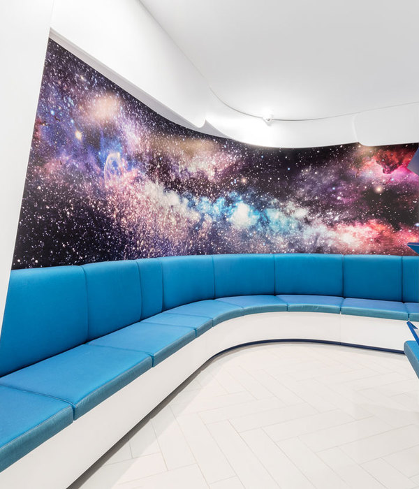
A neutral, reflective, and light color palette was used to increase ambient daylighting and bring light into the floor’s core ward areas. The narrow floor plate allows light to move deeper into the patient floors to connect patients and staff members with the outdoors. Additional color is introduced through waiting and reception areas with unique furniture selections.
Design: The Crossboundaries Photography: Ashish Chakroborty
Design: The Crossboundaries
Photography: Ashish Chakroborty
12 Images | expand images for additional detail
{{item.text_origin}}

