It should be said at the outset that the shape and geometry of the land (the right triangle) make it distinct from most urban buildings.Naturally, this and its challenges have influenced the main design of the Parmida project. The considerable width of the land, the need to emphasize on an impressive entrance as well as the staircase and elevators, enabled the design team to divide the main building into two parts: east and west.
This midrange has brought about better proportions of volume, dynamics and formability. In the second step, the dual commercial- office use of the project, while maintaining overall unity, is expressed in volume. As such, commercial showcases have been completely differentiated from the upper levels of office. To achieve this goal, urban rules and regulations about the cantilevered area in the passage were used. This separation of uses is also achieved by emphasizing the transparent - semi-transparent and the dark – clear dual features.
Accordingly, unlike the fully transparent commercial shell, the porous shell of office spaces has been incorporated into the original volume. This shell not only emphasizes the separation of building uses but also has a very effective climate function on the south and sunny side of the project, thus providing the required transparency of office spaces, as well as effectively controlling the sun's radiation. In an attempt to avoid static design, designers applied cantilevered area to design the exterior shell dynamically creating vertex triangles in the outer fabric. One of the most important benefits of this concept is the diversification of plans of offices as well as the identification of offices in the urban facade. In addition, it is important to note that the use of large triangles in the facade divides the shell into even parts, which is itself derived from the different geometry of the project land, which is also manifested in a tangible and different way in the project view.
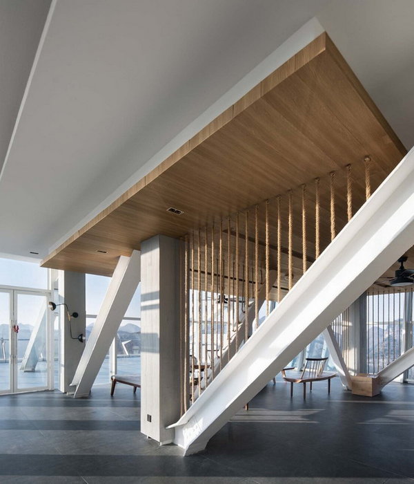
The dynamics of the outer shell also have a profound effect on the quality of the interiors. In this way, inside, one can come across a variety of transient light shells, each with its own geometrical features. In other words, these walls are also the main element of interior design. Hence, other interior elements such as false ceiling, lighting and flooring have been designed to address this idea. In the design of the plan, the main focus of the designers is to maximize the use of natural light as well as to position the access corridors on the non-light side.
In the commercial part, the only border between the inside and outside of the building is the glass wall of the showcase, which enhances the quality of the spaces above. The main entrance of the building, with a marked set back, is completely distinct from commercial showcases. Finally, an interconnected chain of details, iterative elements, and motifs are applied throughout the project to emphasize the unique identity of the building, including motifs in flooring and lighting fixtures, entrance lobby bodies, stairs, roof gardens as well as urban walkway flooring.
{{item.text_origin}}

