Kosei University Library
设计方:Bang Keun YOU, DongWoo Architects and Consultants
位置:韩国
分类:教育建筑
内容:实景照片
设计团队:Seong Gil Kim, Seong Han Kim, Seong Jun Lee, Jeong Su Kim, Hee Tae Park, Ha Yan Ryu Structure Engine
建筑公司:Hanjin Construction
图片:28张
摄影师:Concept
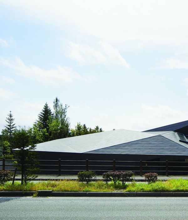
这是由Bang Keun YOU 与 DongWoo Architects and Consultants联合设计的韩国湖西大学图书馆。大学就如同一座小城市,如果不想建筑隐藏于城市景观中,它就需要有属于自己的建筑语言。在下雨或者下雪的季节,湖西大学看起来就带点忧郁的气质,对学生而言没有什么吸引力。事实上,大部分现状建筑面向北面的主入口,它们楼层相近,立面也都是使用花岗岩制成的。湖西大学图书馆的设计需要与普通的单调校园景观有所区分,成为对学生而言有辨识度的图书馆建筑。该图书馆位于校园主入口的左边,在入口就能被直接看见。建筑师期望这座图书馆是轻盈、明亮而造型独特的。图书馆的造型的设计灵感来自一堆书籍,每本书堆叠交错创建了图书馆多样的功能空间。
译者:筑龙网艾比
From the architect. A university is like a small city; If you don’t want a building to merge anonymously with the cityscape, it needs to have his own architectural language.By rainy or snowy days, the Hoseo University could look particularly gloomy and unappealing to the students. Indeed, most of the existing buildings are facing North main entrance, they have similar number of stories and also similar facades made of granite.The design of Hoseo University Library had to clearly contrast with the general campus monotony, being clearly identifiable by the students as the library building.
The library is located on the left of the campus main entrance. With a straight visibility from the entrance, i wanted the library to feel light, bright, with a distinctive emblematic shape. The library mass is inspired by a stack of books, each book shifts creating various functional spaces all-over the library volume.The facade cladding pattern was created from the library name’s (Jang yeong sil) QR code translation.
Each black and white QR code dot is associated with a stainless steel cladding panel with different surface finishes; That way the facade shine pattern varies according to the seen angle. I wanted the library interior to be planned as a place where students not only could read books, but also debate, communicate, have a coffee and relax freely, without feeling enclosed.Thus every different functional spaces are connected each other by a main central open space, naturally creating views all across the volume, and accentuating the user-friendly side of the library.Again, the interior spaces extends freely to the outside through large transparent areas, and generous accessible terraces, keeping the library users visually connected to the surrounding gardens and landscapes.
The two recessed double height entrances highlight the terrain level difference. They give a direct access to the central void, with the main stairs connecting both upper reading spaces and lower relaxation areas.Like a protective shell, the North and South facades are mostly opaque, and cladded with stainless steel panels.Contrary to the East and West facades that are fully glazed, using serigraphed glass. This way the deep morning light floods the floor with text shadows, as a way to interact poetically with the readers. In the middle of a uniform campus atmosphere, i wanted the library to bring a breath of fresh air to the students.
韩国湖西大学图书馆外部实景图
韩国湖西大学图书馆外部夜景实景图
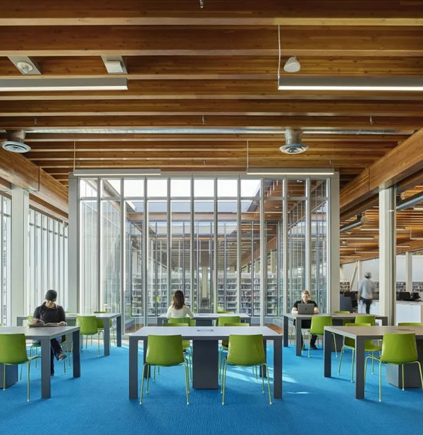
韩国湖西大学图书馆内部实景图
韩国湖西大学图书馆略图
韩国湖西大学图书馆平面图
韩国湖西大学图书馆剖面图
{{item.text_origin}}


