Architect:Co-Architectes ADHOC Architects
Location:Saint Joseph, Reunion Island
Category:Libraries
“By working on very strong mental images which spark off one’s imagination, we want to draw a parallel between traditional Reunion Island architecture and a contemporary reinterpretation”.
Nicolas Peyrebonne, Architect
This building’s intriguing shape, one that is out of time and beyond fashion, relates a special story, that of a place, Reunion Island, and its climate, materials and imagination, yet it is first and foremost the story of the women and men who inhabit the island and live there. The observation made by project owner and designers alike, in rising to the challenge of growing a facility from 400 to 2,600 sq. metres, is that “everyone likes this place for different reasons”.
The project’s success comes from the ever growing audience attracted to the building. It has also won a number of prestigious prizes: Green Solution Awards, “Energy and Hot Climates” category, National then International winner, Livres Hebdo magazine Grand Prix winner for French language libraries, Reunion Island Architecture Prize, IFLA finalist, National Construction Prize for Wood and Sustainable Growth OFF prize winner.
A building as a signal:
A media library serves to make a social statement as it offers access to culture and knowledge to all. Consequently, it takes its own place in local life. The Saint-Joseph Media Library on Reunion Island is no different. A building as a signal, it marks its position in its location, its architecture and its materials, echoing the island’s imagery, its creole identity, its rural signature and its landscape. Its very design and its original shapes are revealed by a large mineral and planted piazza rounded off by an amphitheatre. The complete whole forms a new living and meeting area, at a crossroads, bringing a joyous dynamic influx into a neighbourhood previously hard to identify for Saint-Joseph’s residents and one that will soon see profound changes.
References to very strong local imagery:
The creole language, like the island’s many locations, is full of the imagery, stories and symbols that inhabit the memories of the islanders and make an impression on its architecture. The media library draws its inspiration from this, offering a contemporary reinterpretation. These icons come from rural life, the island’s very strength: sugar cane carts, vetiver bundles, basalt representing Reunion’s volcanic rock. The project’s core reuses the image of a bundle of vetiver, an emblematic plant of the Wild South. Its geometric lozenge-diamond shape is a reminder of that of a bundle while the wooden strips represent the plant’s roots. The complete structure rests on a stone base symbolising volcanic basalt rock.
The colours of the wild south (green, blue and black, to which red is added) and the many materials used (stone, wood, concrete, cladding and shingles) all enrich the project.
A succession of spaces inspired by domestic creole architecture
The traditional Reunion island domestic architecture is built on a succession of spaces defined progressively between the public outdoors and private indoors. Different architectural figures have been applied to arranging host houses, based on traditional homes and the designers at the Co-Architectes agency reused them, with a contemporary parallel, to imagine the equipment used.
The formal garden is materialised by the grand piazza, the first step when approaching and understanding the facility. The main building is identified by its statutory façade, one that symmetrically composed, displaying its status to the town while staging the building. Once through the “varangue”, the veranda that is typical of homes on Reunion and its concrete columns, the visitor enters a reception and exhibition area with its half-in, half-out, half-public, half-private status.
From this limit, the move indoors progresses and is accentuated until the “kour”, our rear courtyard, is reached, the incarnation of intimate family space where the youth area is arranged, deployed through a succession of child-size cabins. Another emblematic building is the “longère”, the traditional long farmhouse that housed farm labour or animals, but in this case dedicated to administrative and media library staff. All of the buildings are linked by indoor or outdoor walkways, forming a simple pathway.
learly mapped out organisation:
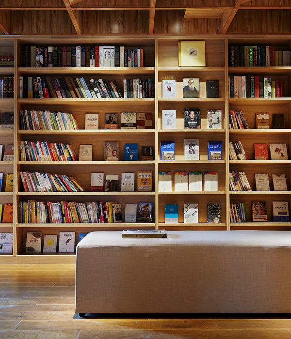
Fragmenting the building into a number of entities brings clarity to the project and an easy to understand layout. Following the same aforementioned logical progression from public to private areas, the main entrance opens directly into the ground floor of the main building, with reception, exhibition current events and multimedia areas. The first floor hosts the audiovisual section topped by two levels for the adult section. The youth section is housed in the Gecko whereas administrative and service areas are in the farmhouse that forms the northern end of the property with its dedicated access and service ways. Everyone can find their own ideal space and all coexist in harmony, coming together in the shared usage areas where the sections meet.
Blurring the limits between indoors and outdoors:
The other characteristic of living on Reunion is finding a constant relationship between indoors and outdoors. Outdoor and protected living areas form extensions to the built sequences, always retaining their dialogue with the close up or distant landscape environment. Here we come to “varangue” verandas, patios, terraces, awnings as well as the presence of this luxuriant vegetation together with framed views of the Piton Babet rise or the Indian Ocean beyond.
Not content with creating a wide range of spaces and atmospheres, this intermingling allows finding solutions to obtain the thermal comfort best suited to Reunion’s tropical climate while limiting energy usage as far as possible.
“Acting with the climate and not just against it” says
Nicolas Peyrebonne
Being inspired by Reunion’s architecture by setting up a constant relationship between the building its outside surroundings and environment is interacting with the climate and not just against it, while preferring low-tech solutions.
Faced with a new found eco-conscience and a hot and humid climate along with the desire to build a facility that is a comfortable one in the contemporary sense of the word, the architects implemented a number of mechanisms to design a passive building, i.e. one that uses a little energy as possible to cool its main areas without the need for air-conditioning.
In a tropical climate, managing thermal comfort is based on balancing the air temperature-humidity-flow rate trio. The aim is to not raise the temperature. This is why some principles are retained: fitting the media library into a refreshing landscaped patch prolonged by partly planted roofs, splitting the project into a number of units so that buildings stay thin, allowing them to use natural ventilation, properly orienting these buildings, installing protection from the sun to avoid direct exposure to sunlight, a well-insulated envelope and generous use of low inertia materials like wood to avoid any effects of overheating.
The virtuous thermal specificity of this project is that it is based on the use of the wind, or rather the winds, on-site. They blow from façade to façade, passing through the buildings with the airflow removing any overheating. This air circulation brings the temperature as felt down by 3 to 4 degrees.
If the wind is insufficient, a large extraction chimney serves to increase the exhaust air flow, to increase the movement of the air. Fans that use little power complete the system while air-conditioning is reserved only for the “server” and “precious collection” rooms.
The large volumes of air generated by the low pressure chimney are incompatible with quality acoustics. This is therefore compensated for by the use of sound absorbing materials like the baffles in the centre of the extraction chimney, the acoustic damping ceilings, the sound absorbent walls, furniture, book shelves, etc. The non-orthogonal and non-parallel shapes used in the building ensure that sound waves cancel each other out, with the very shape of the building playing a part in acoustic comfort.
A modern agora
The large entrance piazza extended by an amphitheatre of greenery naturally extends this place of culture and knowledge. Truly an outdoor stage, it provides a place for shows, festivals, celebrations, meetings and a variety of events where everyone is free to come and share a joyous time. A modern agora that will continually confirm its role and place along with the urban development projects to come.
Materials used:
1. Wood: Moabi + Class 4 pine + Red Cedar
2. Natural rubber floor: Norament crossline
3. Acoustic perforated panels: Knauf Delta Random Décor
▼项目更多图片
{{item.text_origin}}

