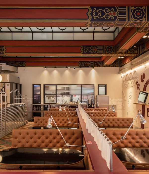
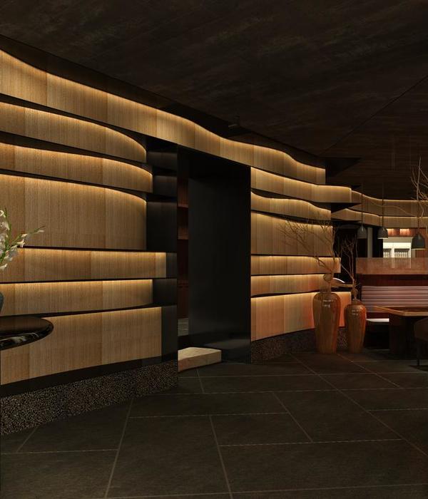
Following up the first successful collaboration, the Artist in Residence Room On The Roof in Amsterdam, i29 interior architects now realized the design of restaurant ‘The Kitchen’ for De Bijenkorf Utrecht, a high quality department store offering an extraordinary customer experience. A masterplan by Rijnboutt Architects optimized the complete department store including a new facade and brand new top floor, where the restaurant is positioned.
The brief was to create a unique dining experience which seduces and inspires. i29 developed a concept for the interior design expressing freshness and variety; a subtle reference to food in general, and the diversity of flavors presented in the open kitchen area. The layout reveals several spatial experiences throughout the 850 m2 open area, with a variety of seating. From private and cosy, towards more open and bright dining areas. This offers customers a choice in the way they would like to sit, eat, drink or work.
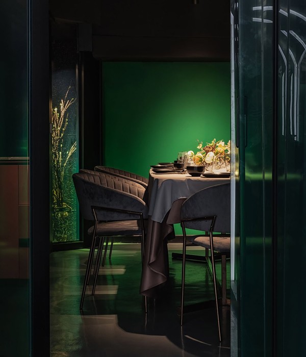
Different seating areas and atmospheres are created in contrasting materials and colors with a mix from rough to luxe. Fresh food from the kitchen is visible throughout the restaurant, as all partitions are made from transparent colored glass cabinets. The open kitchen area in the center of the restaurant is a self service system, where customers can order at one of the food counters. Looking from the department store, live cooking and fresh ingredients seduces customers to wander inwards the restaurant.
A triangular shaped open seating area next to the glass facade offers a diversity of furniture in black and natural wood in combination with a large lively green wall. The rough wood and plants are in contrast with the sharp glass partitions and all white ceilings. Brass details in lighting fixtures and flooring are matching to the yellow glass partitions. Fabrics are developed in custom colors to match within the overall material palette.
Inspired by the company name De Bijenkorf (beehive) and it’s hexagon shaped logo referring to a honeycomb, i29 designed a lively pattern of black hexagon tiles which seams to ‘grow’ naturally over the light beige flooring, bar and counter fronts. The challenge was to create an environment that was made for heavy use, whilst still keeping quality in sharp details and natural materials. This resulted into an interior that mirrors the brand identity of the store itself, aiming for quality, luxury, creativity and youthfulness.
{{item.text_origin}}

