- 项目名称:枕山 skin care
- 设计方:末染设计
- 项目地址:山西省运城市
- 建筑面积:230
- 摄影版权:RICCI空间摄影
- 客户:枕山
复杂化是简单的,简化是复杂的。每个人都可以做到复杂化,只有少数人能够做到简化。”——布鲁诺·穆纳里
“Complexity is simple, simplification is complex. Everyone can complicate. Only a few can simplify.”– Bruno Munari
于己oneself
有别于密集而繁华的城市日常,MOOTHAN.用归园这一设计概念向人们传递着平静舒适,质朴自然的感受。整体设计并没有拘泥于中式传统建筑细节,而是将承载着中式设计美感的几何比例充分运用在空间中,在不同空间的层叠交错中寻找新的平衡与美感。
Different from the dense and bustling urban daily life, MOOTHAN uses the design concept of returning to the garden to convey a calm, comfortable, plain and natural feeling to people. The overall design is not confined to the details of traditional Chinese architecture, but the geometric proportion bearing the aesthetic feeling of Chinese design is fully used in the space to find a new balance and aesthetic feeling in the overlapping of different Spaces.
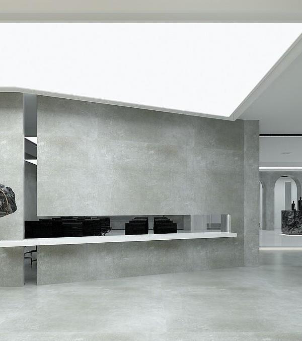
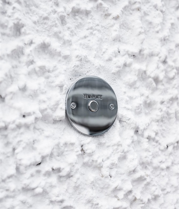
首先,顾客将进入简洁的入口空间,保留了原始质感的建筑材料映入眼帘,由室外延伸进入室内的转世材料,不用过于多、过于华丽的材质区冲击感官,而是用简单的且有力的材质点明事物本质。“少即是多”也恰好是本项目的宣言,设计旨在挖掘日常生活中隐藏的有价值的事物。
First of all, the customer will enter the simple entrance space, retaining the original texture of the building materials into the eye, extending from the outdoor into the indoor reincarnation materials, not too many, too gorgeous material areas to shock the senses, but simple and powerful materials to illuminate the essence of things. “Less is more” is also the statement of the project, which aims to discover the hidden value of everyday life.
展现的色彩极少,仅仅使用简单且有层次的灰色和少数较为鲜亮的白色作为点缀,整个空间呈现出一种“留白”和“词尽而意无穷”的感觉。整个项目以设计手法以极简主义为设计基点,从门头展示到室内陈设,每一处空间结构的布置,都体现出关联的内在联系。
The display of very few colors, only use simple and layered gray and a few relatively bright white as an ornament, the whole space presents a kind of “white space” and “the word is endless” feeling. The whole project takes minimalism as the design basis point. From the door display to the interior furnishings, the layout of each spatial structure reflects the internal connection of the association.
于身The body
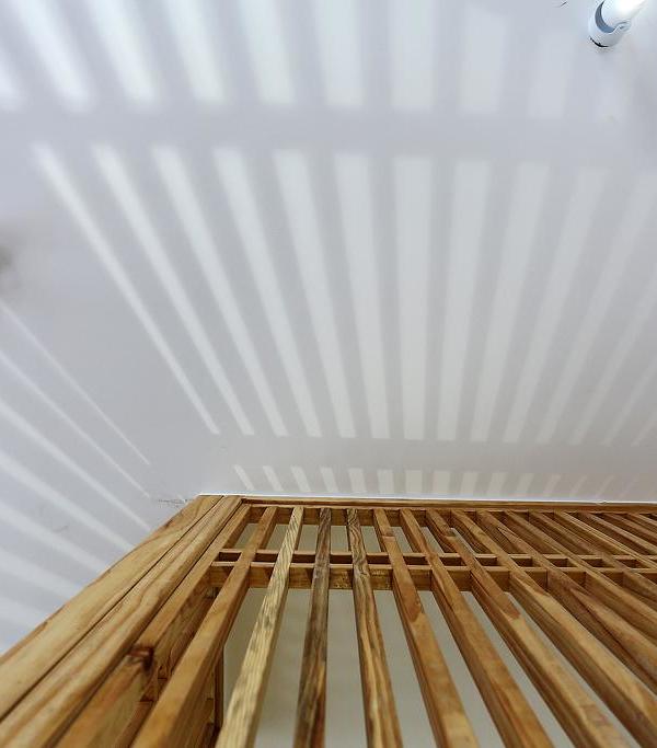
物质性的建筑如何才能具备活泼的生命力,在勒·柯布西耶看来,自然是光,所以他说,“建筑是那些组合起来的几何体在光线下精妙、恰当和出色的表达。”光的存在,使事物有着戏剧性的感知张力,也展示了其创造空间和时间的能力。光穿越于空间,引导我们从静态走向动态,从理性走向精神,从有限局部走向无限联想。
How can material architecture have lively vitality? In Le Corbusier’s view, nature is light, so he said, “Architecture is the exquisite, appropriate and excellent expression of those combined geometry in the light.” The presence of light, which gives things a dramatic perceptual tension, also shows its ability to create space and time. Light traverses space, leading us from static to dynamic, from rationality to spirit, from limited local to infinite association.
线条的优雅和圆润被很好地融合在这个空间当中,柔和了空间的冷硬感,几何美学的纹理在整个空间中缓缓流淌,随着时间的流逝展现出不同的呼吸韵律。在纯粹的空间探寻美的意义,塑造空间更是塑造生活,这正是MOOTHAN.一直追求的设计意义。
The elegance and roundness of the lines are well integrated in this space, softening the cold and hard feeling of the space. The texture of geometric aesthetics flows slowly in the whole space, showing different breathing rhythms with the passage of time. Exploring the meaning of beauty in pure space and shaping space is shaping life, which is exactly MOOTHAN. The design meaning that always pursues.
“在这里,比起大的动作,细节更加引人注目。我们的设计专注于展现事物的本质,通过留白强调了空间内“虚”的力量。人们将在此自由地探索重要的事物。”
“Here, the details are more compelling than the big moves. Our design focuses on the essence of things, emphasizing the power of emptiness in the space through white space. People will be free to explore important things.”
设计的魅力是打破边界与固有局限性,让空间表现出更多的可能性与趣味性,让行走于空间的人尝试不同的空间体验。树干、石头,似是无方向性地生长于空间中,商业空间变成艺术空间,塑造独特的气质。
The charm of design is to break the boundaries and inherent limitations, make the space show more possibilities and interestingness, and let people walking in the space try different space experience. Tree trunks and stones seem to grow in the space without direction, and the commercial space becomes an art space, shaping a unique temperament.
于境The environment
在整体空间中设计师通过简单地几何形状进行视觉化处理,并赋予其自立的表现,用不同材质进行分割,造型与造型之间形成对比,深化观者情感。
In the overall space, the designer visualizes simple geometric shapes and endows them with self-supporting performance. Different materials are used to divide the shapes, forming a contrast between the shapes and deepening the viewer’s emotion.
在楼梯间中,我们利用了利用若干圆形的灯光装置,插入到墙体当中,使这面墙具有一种阵列的秩序感。在楼梯间的顶部,我们采用了镜子吊顶的饰面材料,一直延伸至二层,缓解二层局部层高较低的压抑感,拉伸整个空间的开阔感。
In the stairwell, we used a number of circular lighting fixtures, inserted into the wall, to give the wall a sense of array order. At the top of the stairwell, we used the finishing material of mirror ceiling, which extends to the second floor, to relieve the low pressure of the second floor and stretch the sense of openness of the whole space.
“人是主角”的设计思想深以为然。场景的使用体验感、不同结构之间的穿插关系、动线中的触点设计……时刻在发生着的人与空间的互动,无疑是设计的核心。
于空empty
从静:一步一踏的游园新景,须臾:几何美学的空间游弋
From the quiet: step by step the new scenery of the garden,For a moment: geometric aesthetics of space
须臾,静寂,于一束光线中窥见世界的一角。
For a moment, silent, in a beam of light to see a corner of the world.
用纯粹的材料和最基础的颜色体块来营造空间内涵,让空间更加通透自由。展示柜的柔光灯膜与不锈钢层板的碰撞,硬朗与温和,理性与感性,不同元素的对话、融合,让空间在极简外表下,展现丰富的质感和细腻层次。简单直接的黑白更能彰显空间的力量和美感。
Pure materials and the most basic color blocks are used to create the spatial connotation, making the space more transparent and free. The collision between the soft light film of the display cabinet and the stainless steel laminate, the tough and mild, the rational and the perceptual, the dialogue and integration of different elements, make the space show rich texture and delicate level under the minimalist appearance. Simple and direct black and white can reveal the power of space and aesthetic feeling more.
于心heart
场景的使用体验感、不同结构之间的穿插关系……时刻在发生着的人与空间的互动,无疑是设计的核心。无论客户还是服务者,每每被这个紧张又繁杂的世界所裹挟,身心、视听、思想,都需要在一个特别的时空放松与疗愈。
The use experience of the scene, the interspersed relationship between different structures… The constant interaction between people and space is undoubtedly the core of the design. No MATTER THE customer OR the server, often by this tense and complex world, body and mind, audio-visual, thought, all need a special time and space to relax and heal.
整体色系以大地色为主,营造亲和氛围,在保持个人边界的前提下可以以不同方式产生联系与交流。简单的陈设、质朴的家具、复古的饰物,都在刻意避免光彩和色泽的出现,这种平易哑喑的肌理让人感到愉静沉淀、精神安然,延伸空间的放松感和沉滞气息,娴穆之外更加细腻。
The overall color system is based on earth color to create a friendly atmosphere, which can be connected and communicated in different ways while maintaining personal boundaries. Simple furnishings, plain furniture and retro accessories are deliberately avoiding the appearance of luster and color. This kind of quiet texture makes people feel calm and calm, spiritual peace, relaxation and sluggish atmosphere of extended space, more delicate besides demure.
后记
与语言一样,被定义为“容器”的空间作为物质的一种承载形式,构建了我们日常生活的真实性,同时也和句法类似,建筑物以及社区场所的空间布置,反映出社会中性别差异、审美趣味和经济关系的性质。在不同的空间形态里,设计的底层逻辑与内在思考无不与空间的使用者密切关联,以此赋予了空间独特的性格、色彩以及内在的自然属性。
Like language, space, defined as a “container”, serves as a carrying form of matter that constructs the reality of our daily lives. Similarly to syntax, the spatial arrangement of buildings and community places reflects the nature of gender differences, aesthetic tastes and economic relations in society. In different spatial forms, the underlying logic and internal thinking of the design are all closely related to the users of the space, thus endowing the space with unique character, color and inherent natural attributes.
在整个空间序列上,并没有拘泥于横纵线上的排列,而是通过分割、叠加、端景等设计手法,使空间错落有致,同时注入空间应有的自由与寂静。
In the whole spatial sequence, it is not confined to the arrangement of horizontal and vertical lines, but through the design techniques such as segmentation, superposition and end scene, so that the space is well-arranged, and at the same time, the space should be injected with freedom and silence.
项目信息——
项目名称:枕山skin care
设计方:末染设计
项目设计&完成年份:2022.04设计2022.08完成
主创及设计团队:孟飛、末染设计
项目地址:山西省运城市
建筑面积:230
摄影版权:RICCI空间摄影
客户:枕山
装修主材:水磨石、镜子、艺术漆
{{item.text_origin}}

