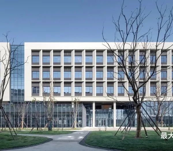
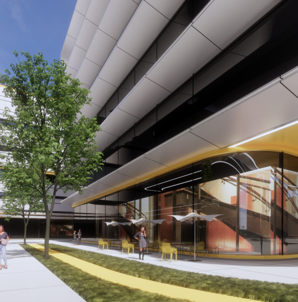
The building is located by the main street bypassing the city center which is intended for public and commercial buildings. Because of various programs the street creates a rather undefined and chaotic space. The design idea of the Velenje Bus Station is the establishment of an abstract floating volume over an open public space. The building with its typical image of facade membrane and segmentation of volume forms a new urban intervention with a typical day and night image.
Despite its diverse program, the object acts as a monolithic whole, which, with its image and shape, stands out in a street and clearly defines its public character. The overall graphic image of the facade is made as an abstraction of an electronic information screen in traffic terminals and a night image of the illuminated city forming the 'city lights' effect by night.
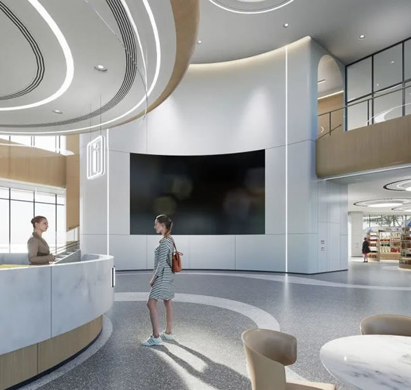
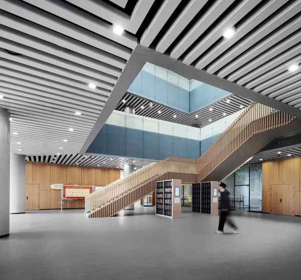
The main white volume of the building is placed on the base in green color, which forms highlighted area of the bus station programme and at the same time fuses with the park in the background. The ground floor of the building, where the bus station plateau is located, is designed as a fluid public space with an emphasis on the transport organization of the station. The volume of the building 'floating' over the transport terminal is divided into two functional segments, a public garage, and an office tower.
The concept of the facade membrane design is the unity that connects the building volume in spite of the diverse program into a characteristic whole. Therefore, a single material of facade membrane - fiber cement façade panels are used for the entire building. Perforation on façade panels illuminates the interior of the garage house but prevents views on the structure and parked cars. On the outside, there is no clear distinction between mere functional space of the car park and office spaces.
The irregular rhythm created on the facade visually decomposes the large volume of the building. The selection of the white color of the facade creates a contrast with the perforation and amplifies the graphic effect in daytime. In the evening and at night, the façade design has the opposite effect - the facade is a dark and illuminated garage creates a 'light display' formed by the perforations.
{{item.text_origin}}


