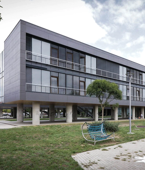
Lauterach is one of the most growing municipalities in Vorarlberg. "Recently, we have cracked the 10,000-inhabitant brand," said Vice-Mayor Doris Rohner proudly. In addition, the town as an "e5" municipality has particularly committed to climate protection and do have a linking to high- quality architecture. This is also evident at the Kindergarten Bachgasse: 25 years the modular container made of wood is already in operation. At the beginning of her professional career, Helmut Dietrich and Much Untertrifaller designed the nursery with skylights and sun screens in a very modular, functional and sustainable way.
The strong influx required more a new kindergartens: the nursery Bachgasse is located in the settlement border near the Ried, a roughly 800 hectare Natura 2000 landscape conservation area. On its west runs the Bachgasse, in the north east, the sufficient space for an extension. A commission for Vorarlberg) and looked at various kindergartens. "The kindergarten Susi Weigl in Bludenz by Bernardo Bader was very enthusiastic. He has so much wood and is so natural, calm and warm wanted Bader as architect ...“said Rohner "... his straightforward, sober architecture appealed to us very much."
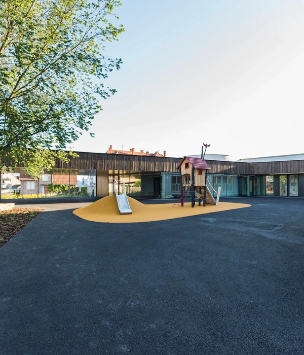
Now, with a little respect distance, a 20-meter-wide, 65-meter-long building is closing to the old building: it is entirely wood and has individual shape. Like a caterpillar the building body marches along stream lane in a regular rhythm. Its vertical wooden battens weather naturally and harmoniously with the landscape. Where he follows his predecessor, the neighbor building, he is as low as this one and has large, square window in the middle: This creates an optical relationship and also creates a connection because of the height. In front of the building is an `indoor` parking lot for scooters and other children games.
Currently, the nursery is developing in the north-east direction. Under a building protrusion you can slip into the "Kinderhaus am Entenbach", each group has its own entrance niche: blue, pink and yellow. The color scheme is by Monika Heiss. "It was important for us to design the kindergarten like a village," says Bernardo Bader. "Actually, the individual houses which are connected to each other got certain naturalness."
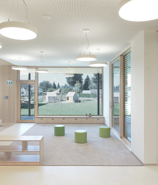
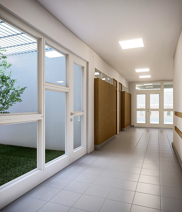
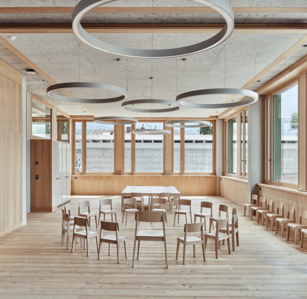
A friendly entrée room with coconut floor, wooden ceiling and bench forms the opening to an unexpectedly diversified inner life. A long, bright walkway, glazed on both sides, with beautiful, round lamps, reminding of a friendly volley or balloons, leads straight through the whole house to the square window at the end of the hallway. Under high light lanterns in the hallway are the wardrobes, which act as a necessary and differentiating element between the three groups, the movement room and the dining room. At 2.50 meters high, they are clearly articulated as service spaces and open up to both sides: the active asphalt pavement and the garden with morning sun in the southeast. Marion Moosbrugger von Landrise designed it with a small boulder wall, toddler swing and much more. At the covered terrace are repeatedly, room –high cupboards where they can store toys and garden utensil. At the same time the space provides a rhythm and structure to the building.
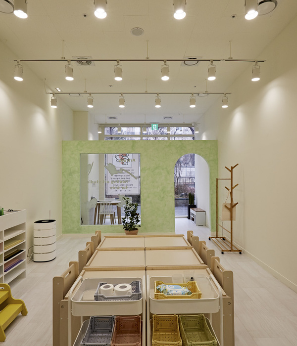
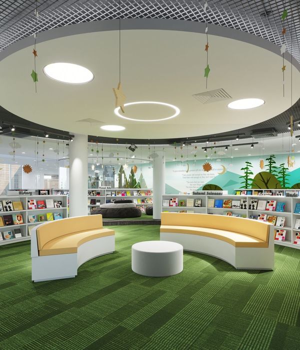
All other rooms, such as the dining room, the exercise room and the three group rooms, are almost five meters high. In this way, the resting areas for the children can be arranged on a gallery: at the side next to a top light, they offer the little ones their own sheltered retreat. If they are curious, they can also stop at the wire mesh and look down towards the group room. The group room is proportioned with about seven by eight meters and opens up with a large glass window to the garden. "We are fully satisfied. We have 65 children here; the smallest are just little bit more narrow side in the long base offered crossed the Ländle south- (shortname that we a very the a than 15 months old, "says Laura Dueler, head of the new kindergarten. She looks after the very small ones. "It is the first time that on the first day no one cried because they had to stay here. We notice a strong difference: the open views and the landscape have a soothing effect on the children. They behave differently. "
Light and wood characterize this nursery: a sleek white fir for ceiling and walls, hard ash at the heated floor, the group rooms are glazed up to a height of 2.50 meters, both to the corridor and to the garden. At this height, the walls are white with a surrounding wooden framework and acoustic ceilings create a homely atmosphere. A lot of loving details - such as the pull-out pedestals of the kitchen basements in the dining room, which also enable the smaller ones to reach the work area, the staircase load as a step-up aid on the changing table in the children's toilet or the compartment for the parents' make the building to a real children's house.
{{item.text_origin}}

