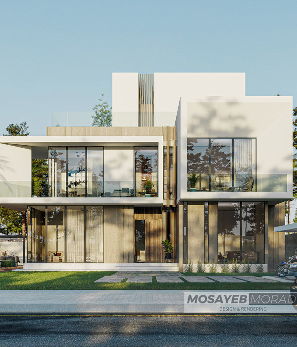
The two main challenges of this project were the narrow width and long length of the site, as well as the requirement to respect the presence of two chamfered walls on the sides, which resulted in insufficient daylighting from the southern side (According to municipal regulations, installing windows in chamfered walls is prohibited). Therefore, the primary question of the project became how to simultaneously increase the window area and daylighting while respecting the chamfered walls and minimizing the impact of chamfered walls as undesirable elements in the floor plan.
The context of the neighborhood “Yusefabad” also played a significant role in design. In this neighborhood, there are high-quality examples of modern architecture and common characteristics of modernist architecture in
(which have become scarce or disappeared in contemporary architecture), including Three-dimensionality of facades (in most cases) achieved through the use of projecting balconies and consoles that relate to the climate and light conditions. Creation of rhythm in the facade through interesting and diverse window designs and numerous eye-catching initiatives. Therefore, another question in the project was whether it is possible to design a volumetric composition for the facade instead of conventional surface facades, considering the limited width of the site.
In the further course of the design process, the transparent layer of the facade (windows) was set slightly back to create a space between the stone cladding of the facade and the transparent layer. This space acts as a joint between the interior and exterior, enhancing the quality of the interior space. Ultimately, the decision to use a single material for all facade surfaces allowed the primary focus to remain on the volumetric composition. By minimizing material diversity, the emphasis was placed on the cohesive integration of the volumes, ensuring that the main design concept was not overshadowed by a variety of materials. As you move along the alley, the facade orientation changes, providing different perspectives and adding visual interest. This variation creates a unique experience as you navigate through the space.
Similarly, within the interior space, the view to the outside varies as you stand at different angles relative to the window. By positioning yourself at different viewpoints, you can experience varying levels of visibility to the external space. Considering the surrounding buildings of the project, we come to the conclusion that most of them are simple boxes with facade cladding, and sometimes, material diversity is used to create attractiveness in the facade. Windows are often placed without a distinctive character in the facade. This repetition of patterns in building forms seems to be a kind of avoidance of innovation. However, in this project, an attempt is made to challenge this disregard for the facade and take a new approach to the concept of the facade (the façade tries to fade the borders between the inside and outside of the project and transform from a surface to a space.
{{item.text_origin}}

