闽南风情 | 比裕服饰办公空间的艺术探索
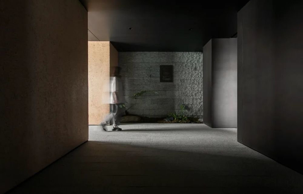
设计可以是艺术活动的探索,亦可以是美学概念的延伸。这正是设计看似如此简单,而又显得如此复杂的原因所在。
Design can be an exploration of artistic activity or an extension of an aesthetic concept. That’s why design seems so simple and yet so complex.
设计概念
━
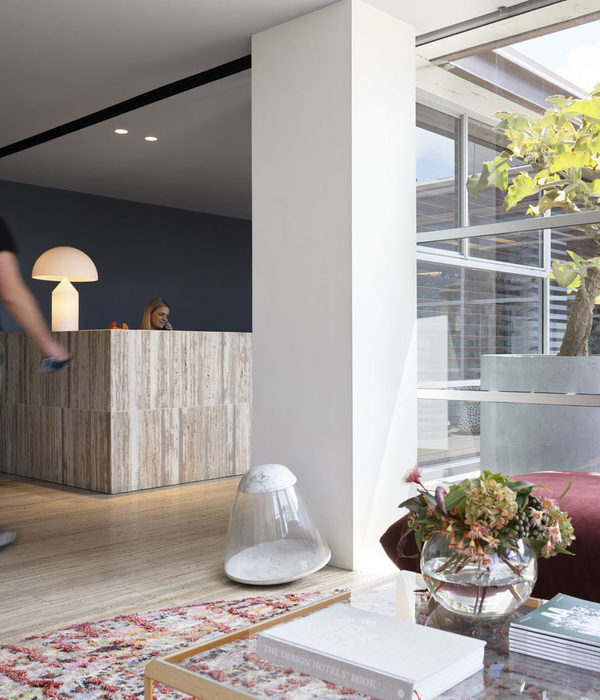
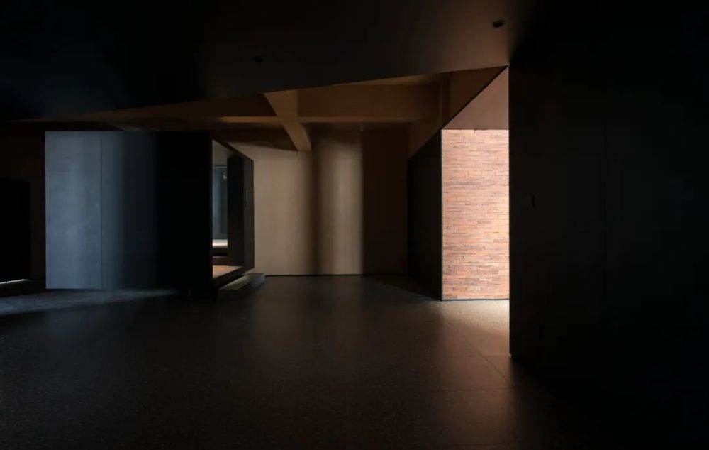
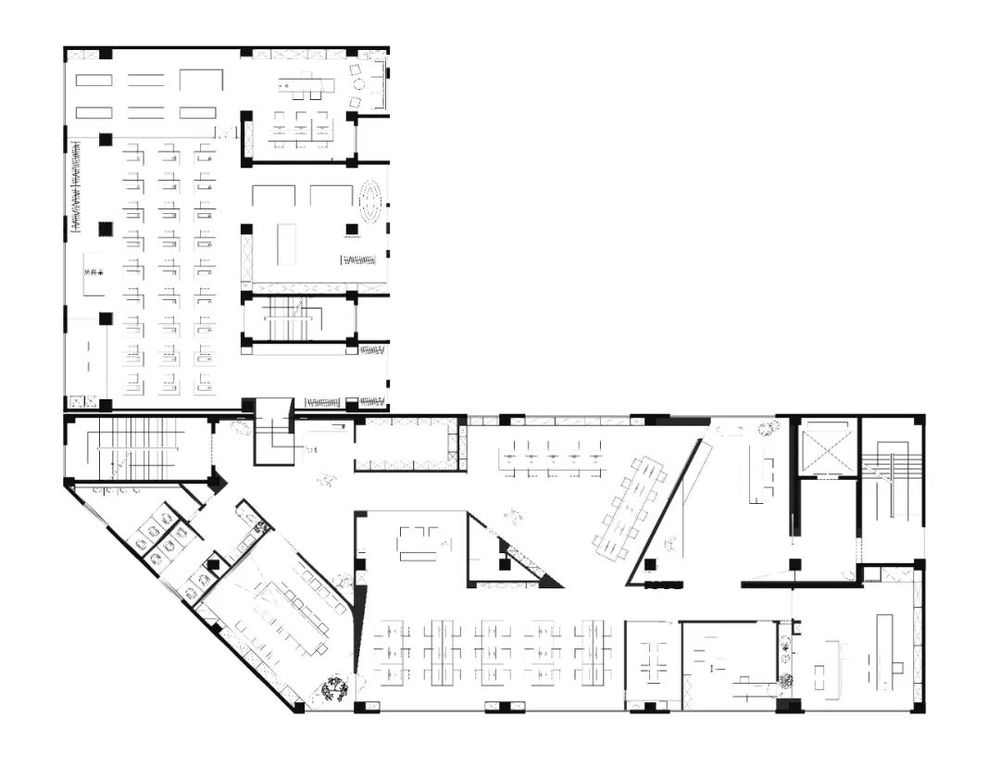
以闽南传统建筑材料及工艺结合服装立体剪裁手法去分割空间,空间序列以体块出发,从二维到三维渐次生成,把体块转换为功能的载体。
Southern MinNanbuilding materials and traditional technology combined with three-dimensional clothing cutting techniques to segment the space, space sequence starts from the volume, gradually generated from two to three dimensions, transforming the volume into a functional carrier.
01 ━
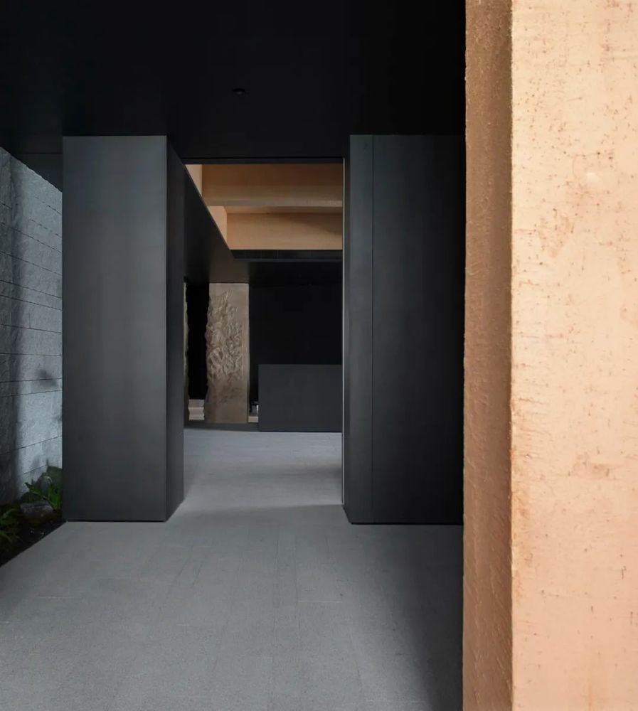

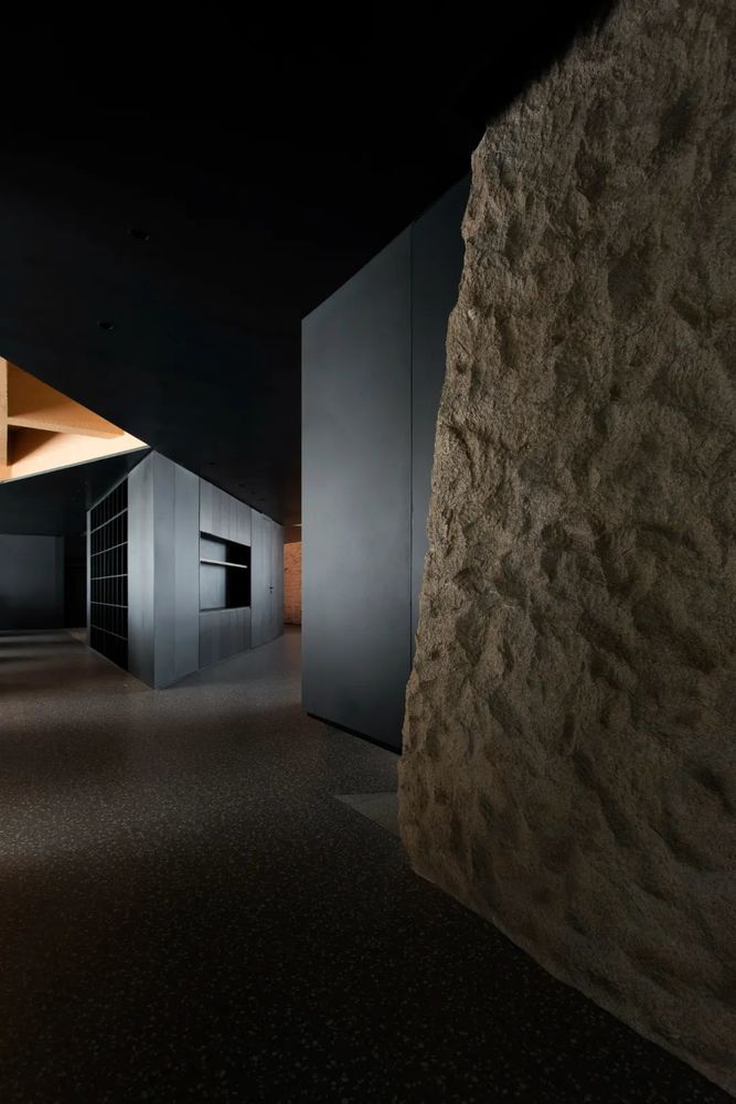
主体黑色调的表达更好地将视觉引到室外的美景,更好地与自然进行互动。钢板的硬朗包裹着泥土的松润,体块的互动关系中以材质作为媒介,材质之间的对话让空间的质感显得更加饱满。三角形交叠的天花和地板三角的分割线,是空间的延展,更似品牌的延展。
The expression of the black tone of the main body better leads the vision to the beauty of the outdoor, and better interacts with nature. The hardness of the steel plate wraps the loose and moist soil, and the material is used as the medium in the interaction of the block. The dialogue between the materials makes the texture of the space appear fuller. The triangular overlapping ceiling and the triangular dividing line of the floor are the extension of the space, which is more like the extension of the brand.
02━
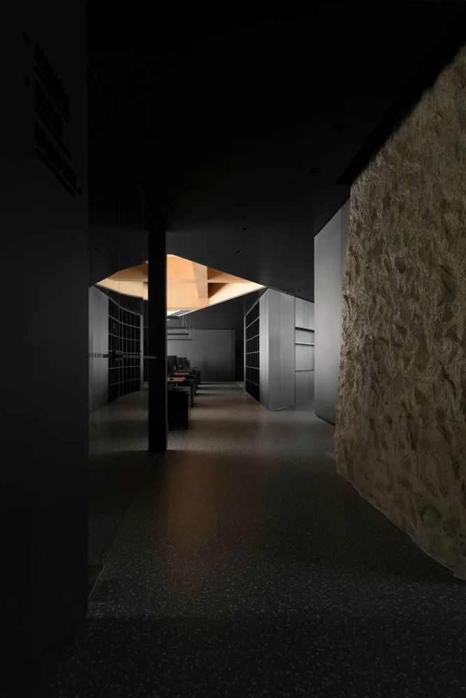
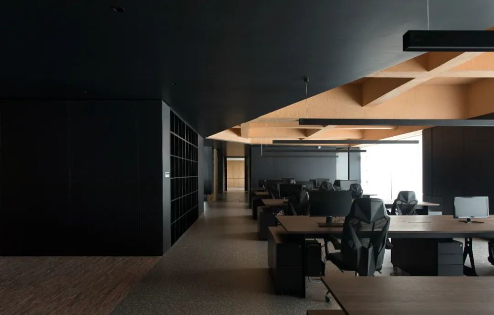
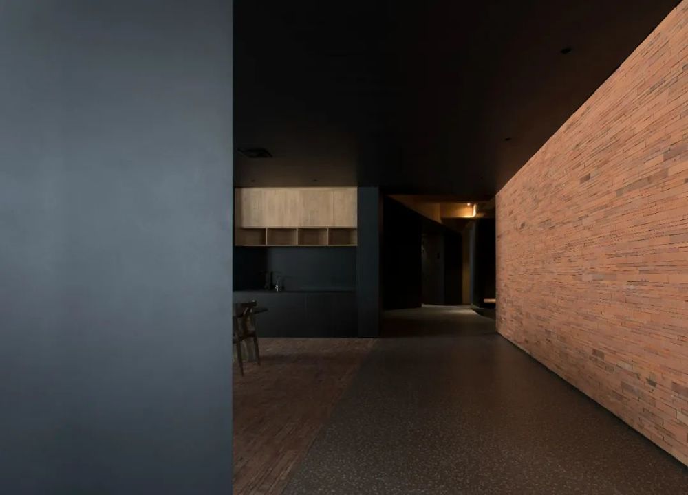
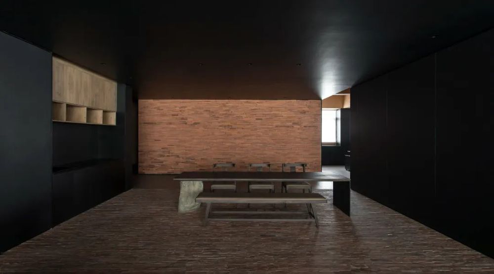
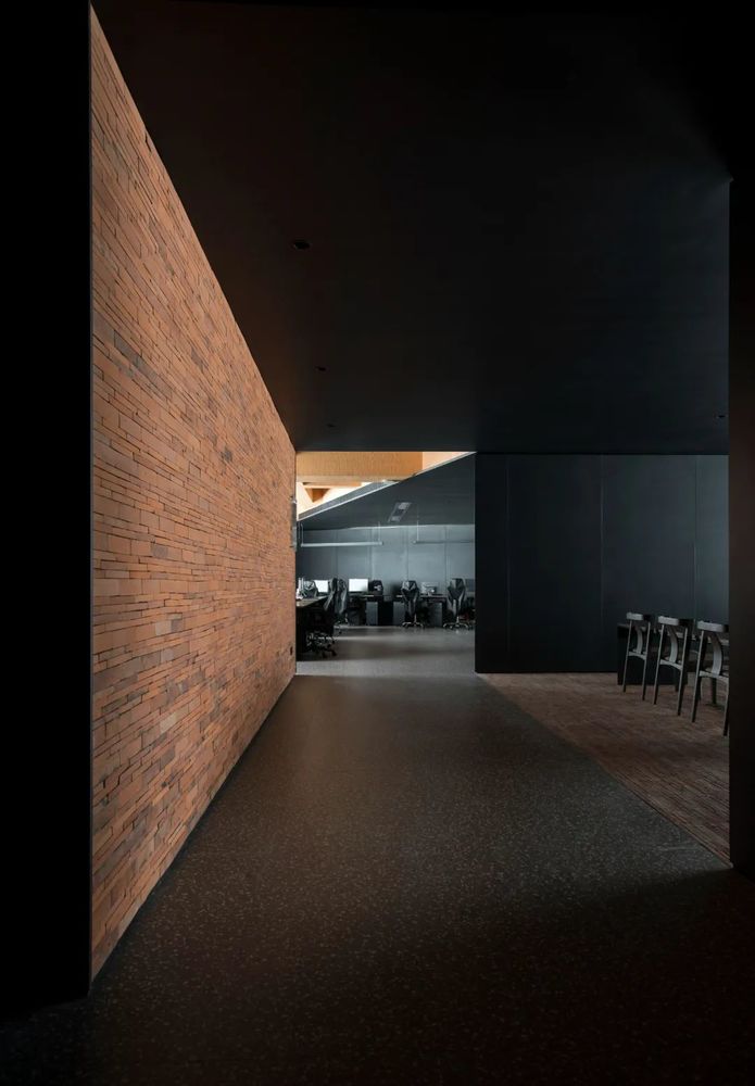
红砖的注入给空间增加了新的生机,立足于其中却又融入其中,让空间的层次显得更加富有趣味性。办公区解放盒子牢笼,打破传统隔间的办公环境,部门之间没有分割,只是通过位置进行限定,能更好地提高沟通的效率与轻松的工作氛围,创造出更加平等与和谐的工作环境,通过细节强调温度。
The expression of the black tone of the main body better leads the vision to the beauty of the outdoor, and better interacts with nature. The hardness of the steel plate wraps the loose and moist soil, and the material is used as the medium in the interaction of the block. The dialogue between the materials makes the texture of the space appear fuller. The triangular overlapping ceiling and the triangular dividing line of the floor are the extension of the space, which is more like the extension of the brand. 03 ━
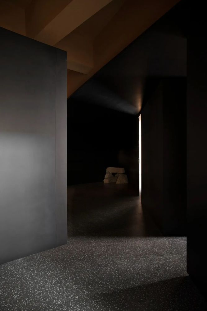
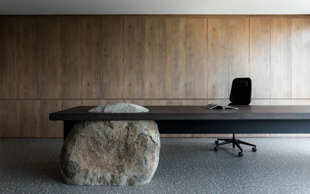
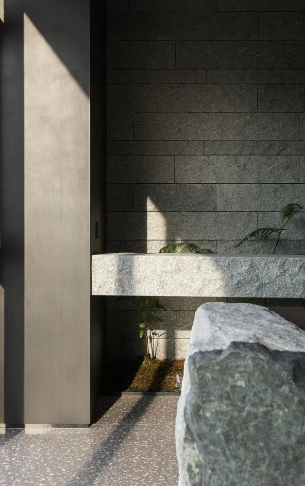
粗犷的岩石以最质朴的形式融入在空间之中,增加了整个空间的分量感,也为空间软装方向奠定了强有力的基础。
The rough rocks are integrated into the space in the most plain form, increasing the sense of scale of the whole space, and laying a strong foundation for the direction of space soft decoration.
设计愿景 Design vision
从品牌中抽象演绎出三角、方形等几何元素,运用到空间形态的构建。于本土企业的特色中找寻品牌传达的最佳契合形式,用体块构筑的“艺术画廊”颠覆了传统制造业的企业形象;实现了多样空间功能;对品牌内涵的含蓄表达,更添悠远意味。
品牌需要表达与传递,需要一个与各种因素产生聚合反应的空间,这个空间也是品牌的一种表达。
Geometric elements such as triangle and square are abstractly deduced from the brand and applied to the construction of spatial form. In the characteristics of local enterprises to find the best form of brand communication, the block built "art gallery" subverts the traditional manufacturing enterprise image; Realizing various spatial functions; Implicit expression of brand connotation, more add a long meaning. The brand needs expression and transmission, and needs a space that produces aggregation reaction with various factors. This space is also an expression of the brand.
Project Overview
项目名称:|比裕服饰办公空间 Project name | BiYuCostume officespace
项目地址:|福建石狮 Project Address | Fujian Shishi
项目面积:|1200m² Building area | 1200m²
设计公司:|莫逆设计 Designed by | MONI Design
设计主创:|卢厦平 庄 祥 孙宏达
Designtalent| Lu Xiaping Zhuang Xiang Sun hongda 设计团队 | 陈少天 连灿旭 张 勇 吴映红
Design team | Chen shaotian Lian canxu Zhangyong Wuyinghong
施工负责|林荣烈
Construction unit | Lin Ronglie
项目摄影|陈荣坤
Project Photography | Chen Rongkun
主要材料 |钢板红砖 粗石素土 原木
Main Materials | Steel Plate Red Brick Stone soil log

