The Little Man Cafe is located along the main community strip in the quaint part of Seddon. The neighbourhood in this area has undergone a shift in pace over the last few years of a gentrifi ed nature which sees more cafes and small businesses sprouting up accompanying the infl ux of younger families moving into the area.
The cafe occupies a corner lot once belonged to the old Post Off ice which has since moved a couple of spots up the street. The insides of the building was left severely dilapidated, however given its prime corner shop location and prominent street frontage, the new owners were keen to revitalise this empty shell of a building and in doing so, contribute to the growth of Victoria Street.
Despite the long and narrow interior (80sqm), owner’s desire was for a designed space which refl ected the idea of ‘home’; as though the cafe is playing host and customers are walking straight into a friend’s kitchen. An open plan layout was adopted (not dissimilar to an open-plan kitchen in a residential dwelling) to maximise the use of space and take advantage of the length of the shop. A fully equipped kitchen was allocated to the back of house, and a secondary feature kitchen (complete with a generous back bench and free standing island) marked as the centrepiece of shop was strategically positioned to allow patrons to interact with the barista and strike up conversations like one would around a friend’s kitchen island.
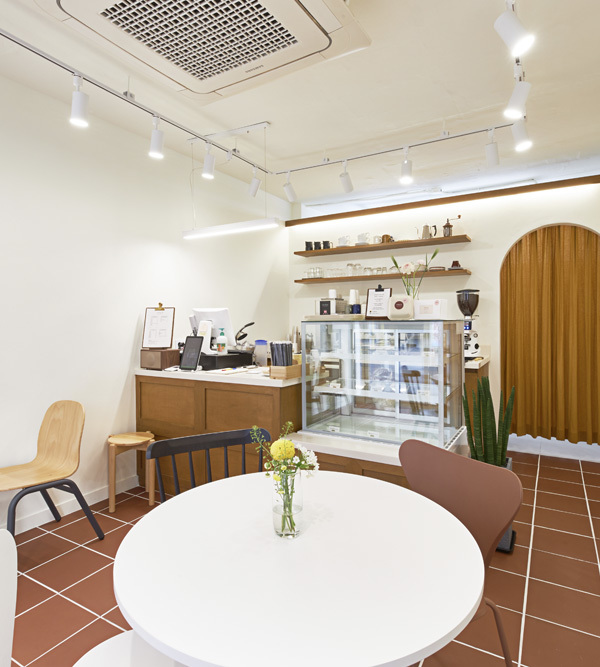
A restrained material and colour palette was carefully curated to create a fine balance between warm and sharp aesthetics; to be welcoming yet uncluttered. A predominantly white backdrop provided a crisp canvas for highlights of colour (Tiff any blue, in this instance, for crockery and feature tiles and splashbacks) to be used considerately. Timber accents in the joinery and loose furniture off er a warm counterpoint to the clean lines aligning with the long space. A clear and rational line of joinery fulfi ls storage requirements whilst providing design opportunities to craft a space that references a ‘homely kitchen’.
Minimal structural intervention was required in order to preserve the bones of the buildings. Existing brick walls were retained and painted for its texture. The existing pitched ceiling towards the rear, a charm of the original building, was restored and repainted.
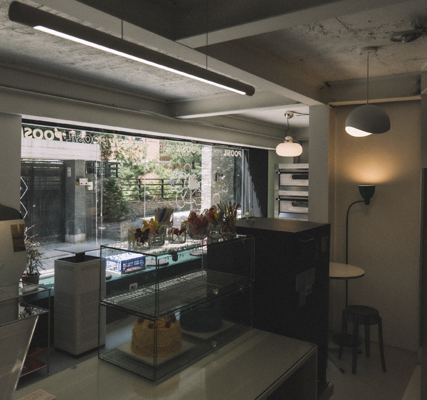
The original shop frontage of full-height glazing was retained to visually connect the new internal fi tout with street traff ic. To maximise the amount of natural light to the space, previously bricked-up openings along the northern wall were retrofi tted with large fi xed glazed windows. Wall openings which once housed cast iron letterboxes were also repurposed as windows. This collection of randomly sized openings off ered a quirky visual composition while referencing the original space. A skylight was added to further fl ood light into the back of house.
This interior, sustainable by virtue of its methodology, is simple, honest and cost eff ective. It provides a welcoming retreat for its patrons, just like they are welcomed home.
{{item.text_origin}}

