JS 住宅 | 简洁稳定的空间组织
项目中设置了一个简洁而稳定的元素,可以在不移动的情况下组织家庭空间,其尺度和位置赋予了周围空间更多价值。
A simple and stable element capable of organizing a home without moving. Its dimension and position give meaning to the space that surrounds it.
▼空间概览,overall view of the space ©Mariela Apollonio
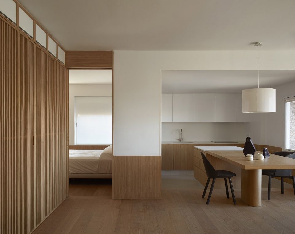
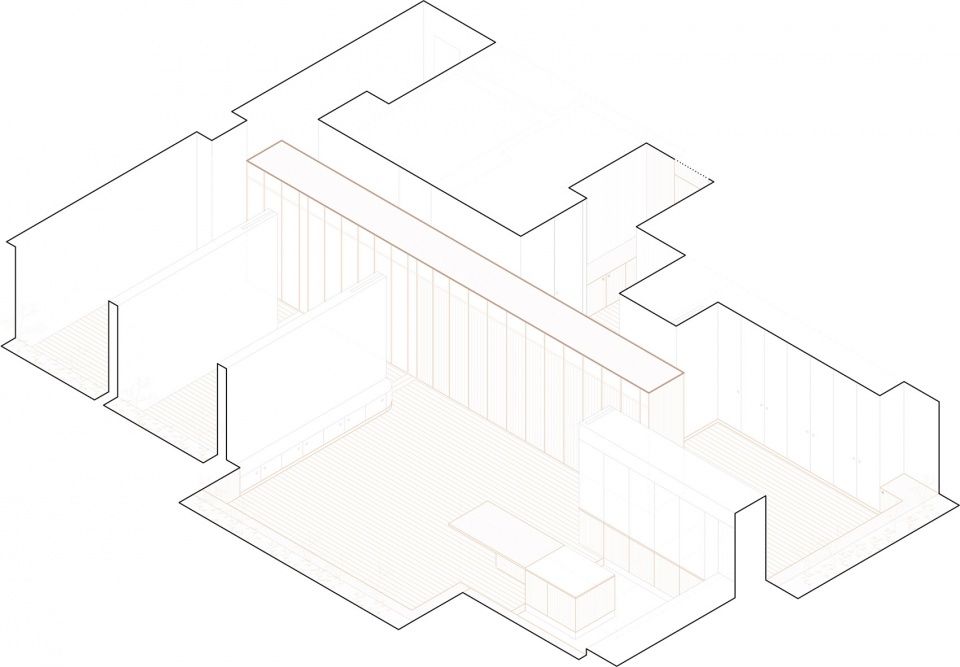
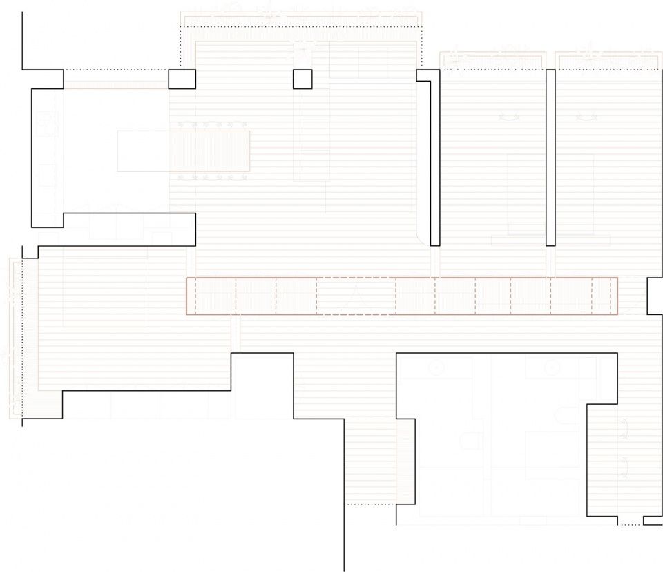
项目最初的设计策略简单明了,便于人们理解和友好地生活。位于空间中部的构件成为了设计的参考轴,住宅内所有的功能均围绕其布置。中心元素富有活力韵律,与其余空间的宁静相平衡。与垂直构件交接的铺地转化成了台座,根据空间需要变化高度,在主轴周围形成了一道连续的包裹。灯光和材料与功能相辅相成,酝酿出一种平静、精确而有秩序的氛围,创造了一个平和的生活空间。
The project starts with the intention of proposing a clear and simple strategy, capable of being understood and lived with kindness. A central piece becomes the reference axis of the proposal, serving all the uses of the house, located around it. The vibration and rhythm of the central element are balanced with the tranquility of the rest of the space. The pavement becomes a plinth where it meets the vertical and its height is decided according to the needs of each space, defining the continuity of the envelope that surrounds the main axis. A calm, precise and orderly atmosphere in which light and material interact with the objective of creating a peaceful home.
▼轴测图,axonometric
项目旨在重新规划一个分区明确的住宅,由小空间序列和没有照明的走道组成。住宅位于一栋公寓楼的十层,由于不同楼层在垂直方向上的连续性,空间的布局无法改变。这成为了项目的第一个挑战,即如何在显然不可改变的条件下实现空间的重新组织。住宅三面朝外,提供了许多采光选择。这些立面各具特色,全部都在最终的方案中发挥了重要的作用。
The project aims to rethink a house which was very compartmentalized, with sequences of small spaces and paths without lighting. Located on the tenth floor of an apartment building, its distribution and typology was understood as immovable due to the vertical continuity of the different floors. That was the first challenge: spatially reformulate a place with apparently inflexible starting conditions. The house offered many light options, it has 3 facades open to the outside, with different characteristics but all of them important in the final solution.
▼从入口看向客厅,view to the living room from the entrance ©Mariela Apollonio
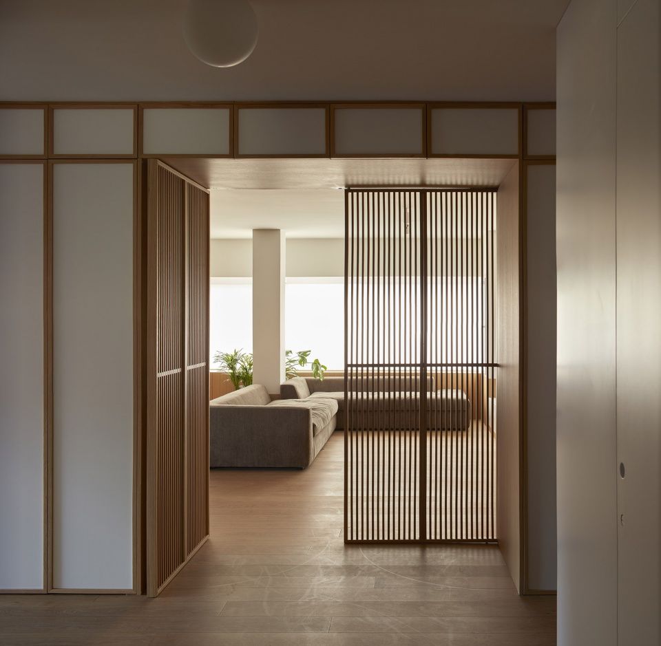
为了最大程度优化空间和自然采光,设计提出了一个简单明了的策略,即建造一个不用移动的中心元素来组织住宅,其尺寸和位置有望为周边空间提供更多价值。住宅的其他功能均围绕此中心元素设置,功能之间相互连接,且能够相互转换,满足住户整个居住过程的不同需求。
To optimize spaces and natural light to the maximum, the construction of a central element capable of organizing a house without moving is proposed. Its size and position aim to give meaning to the space that surrounds it, establishing a clear and simple strategy. The rest of the uses of the house are located and related around it, connected to each other and with the ability to exchange their uses throughout the life of the family that inhabits it.
▼空间中部的固定元素,unmovable element in the center of the space ©Mariela Apollonio
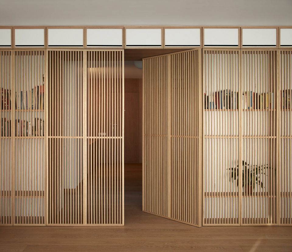
连接客厅、餐厅和厨房的主空间帮助改善了功能之间的比例。其他围绕中心元素的空间片段主要被规划为卧室,也可容纳工作室等功能。
The main space that links the uses of living room, dining room and kitchen, enables the section to refine the scale between them. The rest of the pieces that inhabit the facade around the central element, are dimensioned to be able to house rooms in their largest occupation, but with the possibility of also making work spaces compatible.
▼围绕中心元素的走廊和序列空间 corridor and sequenced spaces around the center element ©Mariela Apollonio
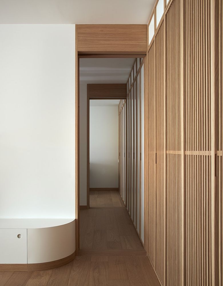
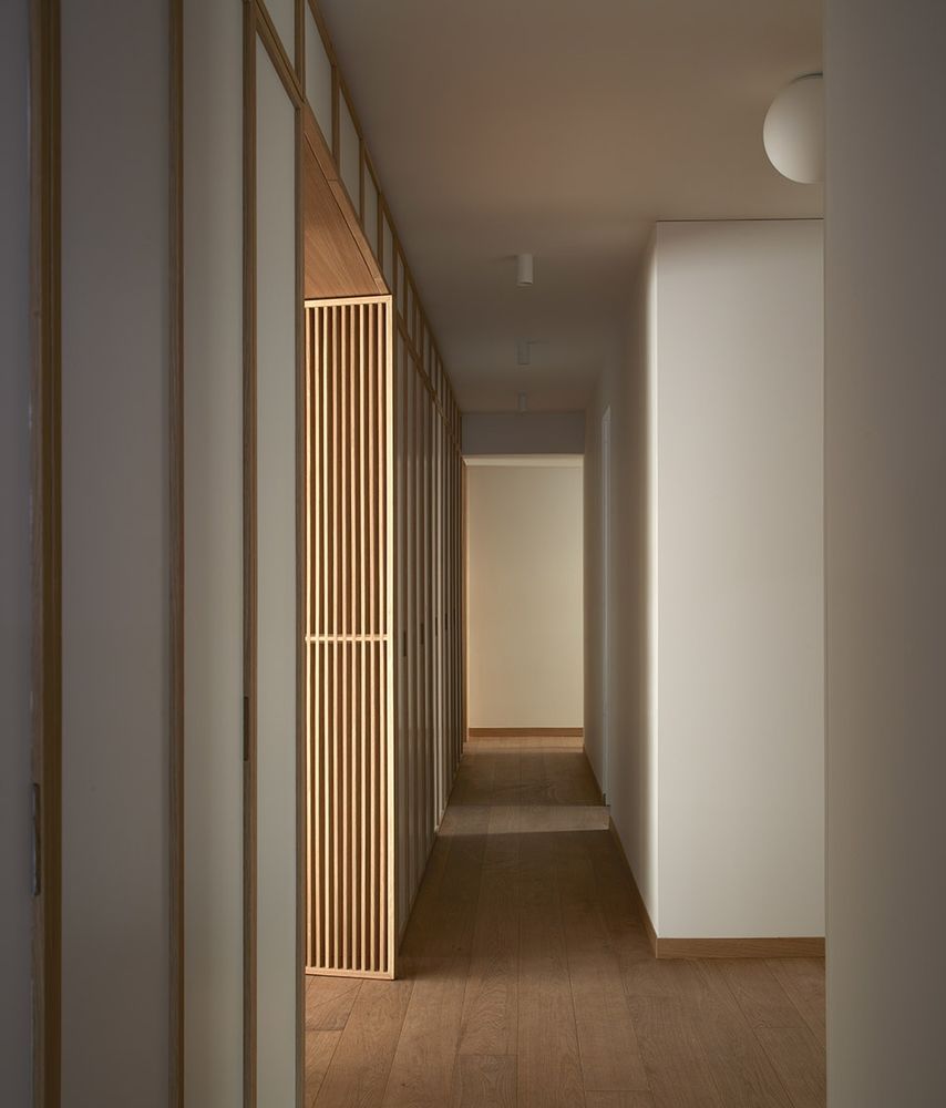
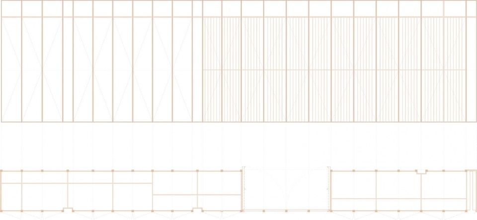
设计主要关注两个主要问题。第一是中心元素的建造,在其所处空间中形成了一个富有韵律的独特构件,吸收住宅的储物空间,同时融合了主要设施的布局。第二是橡木制的台座,可以被理解成垂直升起的铺地,高度根据需求变化。后者遍布整个住宅,为空间提供了连续性,并作为围合构件突显出中心元素的存在。
The house focuses its efforts on two main elements. The construction of the central element, which defines a metric, a rhythm and a singular character according to the space to which it falls, absorbing the storage of the house and also the layout of the main facilities. The second element is the plinth, built in oak, understood as the pavement that rises vertically, reaching the level required at any given time. This element runs through the entire house, giving continuity to the spaces and emphasizing, as a perimeter element, the focus on the central element.
▼中心元素中设置储物架,storage absorbed in the center elements ©Mariela Apollonio
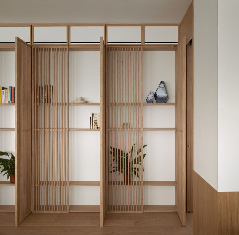
▼橡木台座,提供连续性,oak plinth providing continuity ©Mariela Apollonio

简洁的概念和材料让自然光可以自由地照入空间,形成了一种平静、精确而有秩序的氛围,希望通过住户每天的活动将其补完。
With this conceptual and material simplification, natural light is free to invade the house, generating a calm, precise and orderly atmosphere, hoping that the movement and life of the users complement it every day.
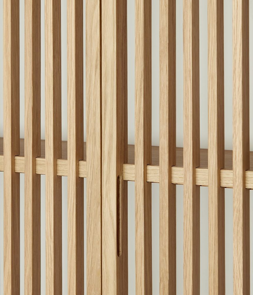
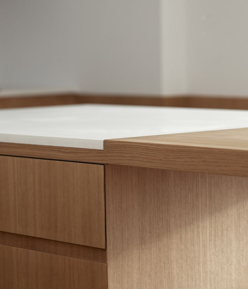
▼材料细部,material details ©Mariela Apollonio
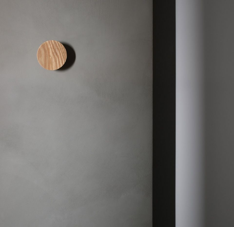
▼浴室,bathroom ©Mariela Apollonio

▼平面图,plan ©Horma
▼中心元素平面和立面,plan and elevation of the center element ©Horma
YEAR: 2021
LOCATION: Valencia
PHASE: Built
PROJECT TYPE: Architecture and interior design
AREA: 140 m2
TEAM: Horma | Nacho Juan, Clara Cantó, Jose Iborra, Ana Riera, Belén Iglesias, María Mateo
PHOTO: Mariela Apollonio
CERÁMICA: Adriana Cabello


