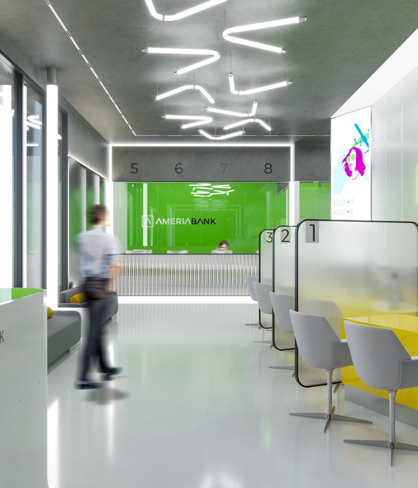
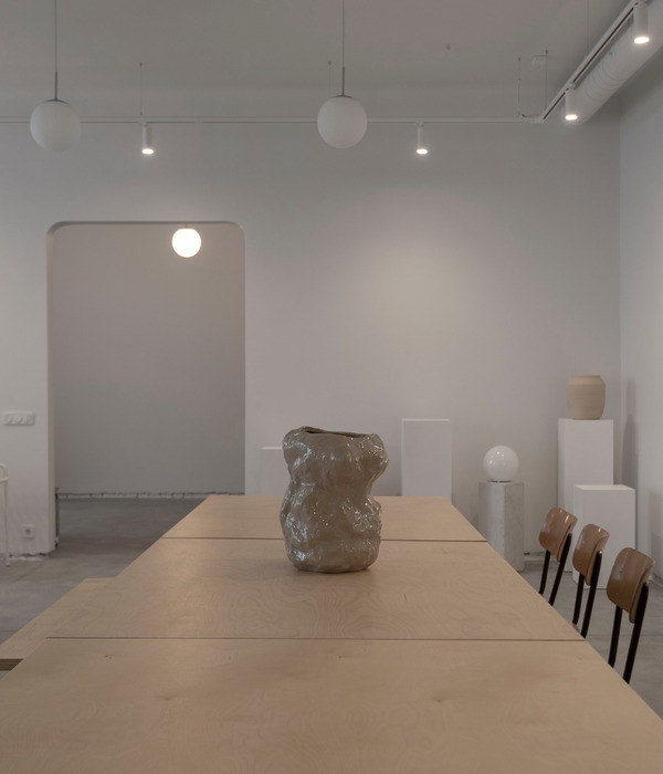
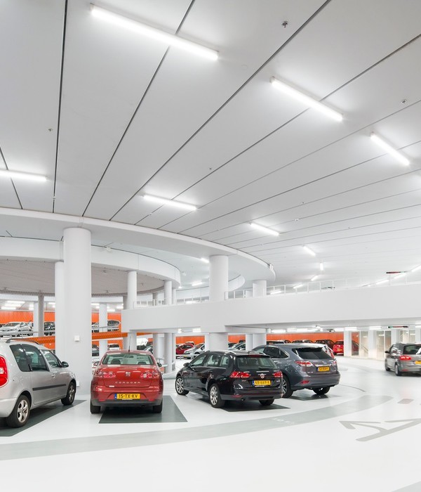
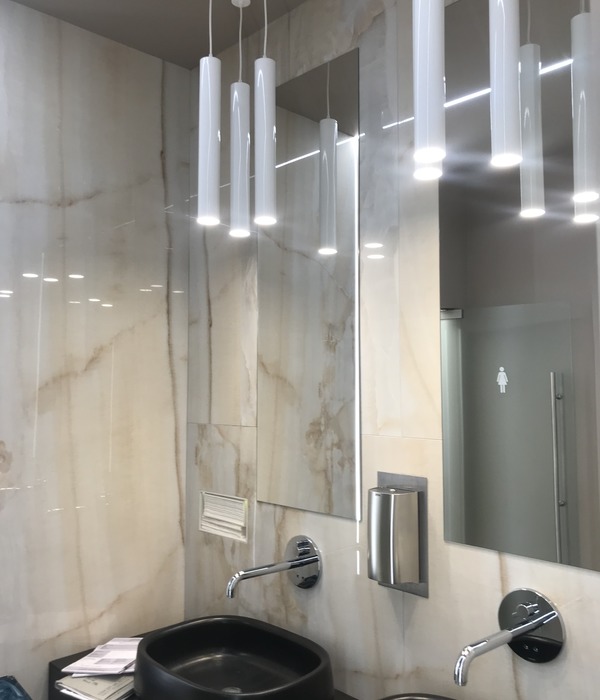
TBI incorporated light wood, exposed concrete, and green plants with an open ceilings and exposed installations to give the World Trade Center Barcelona Amenity Spaces a modern character of it’s own.
The World Trade Center Barcelona is a landmark office complex located on Barcelona’s waterfront and features 40,000m2 of office space and a large convention center.
The building was built by New York architects Pei Cobb Freed & Partners in 1999, more than 20 years ago.
Since then, the concept of workspaces has evolved a lot, both in interior design and in sustainability and the creation of employee wellbeing.
The new office design is more flexible, innovative and original. In addition, natural and sustainable materials, air quality, thermal and acoustic comfort and the promotion of physical activity increase well-being at work.
Large companies and business parks are increasingly aware that these concepts have a positive impact on their employees and consequently on their productivity and increase their ability to attract and retain talent.
As a result of the new tendencies, in 2020, the World Trade Center Barcelona launched a restricted architecture and interior design competition to create a new image and new common spaces with a more modern, innovative and sustainable design, with the idea of becoming the best business park in Barcelona.
TBI won this competition which includes the design of six new public spaces such as a new multipurpose room, a showroom, a new gym with changing rooms, a space with lockers for electric scooters and a bicycle parking.
TBI’s proposal is inspired by the current design of the World Trade Center Barcelona, which is based on the square. The floor plan, its structure and the design of the cladding are based with the utmost rigor of this geometric shape.
The design concept for the new spaces of the WTCB takes the theme of the square and reinterprets it in a new way: the pixel, a form that also consists of the square, but allows the creation of a modern, innovative and flexible texture, thus giving a new image to the WTCB, while maintaining the essence of the existing building.
The pixel concept can be adapted to the scale of all the spaces with a high aesthetic quality, from the smallest spaces of the building such as the changing rooms or the lockers to store the folding bikes to the design of the large central square, still giving its own character and a modern design to all the different spaces.
The common color of all the spaces is a modern shade of blue, derived from the sea that surrounds WTCB. Currently, blue is present in the design of the signage and therefore integrates with the color concept of the existing building.
Design: TBI Photography: courtesy of TBI
9 Images | expand images for additional detail
{{item.text_origin}}

