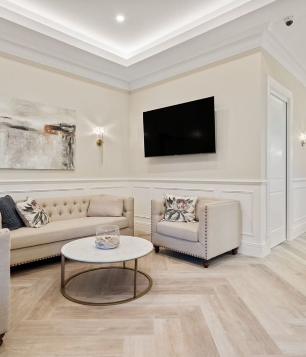
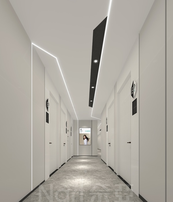
The creative challenge was to develop a powerful clinical identity, adaptable to a variety of layouts and scales. Moreover, the brand had to establish a strong presence in the medical community without following the typical elements of the dominating clinical environments. The inspirations for this clinic were Voronoi diagrams, a mathematical way of dividing space into a number of regions called Voronoi cells. The whole concept was to hint cellular rejuvenations and reconstruction that takes place in cosmetic dermatology clinics.
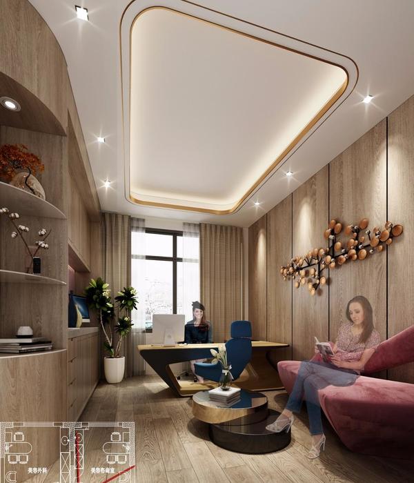
Universal associations of health and the medical environment were employed, as well as research in wellbeing ambience and the impact of lighting on human perception and psychology. The color and material schemes come as vital to showcasing the dynamic aspect of the whole concept. Black and its dynamic nature, is added to the dominant clinical white and blue lighting, with an aim to define the new clinical color palette. Sleek and glossy, interact with matte and rough finishes, while the reflections of linear lighting on lacquered ral 5014 wood panelling multiplies the poly lines of the layout on horizontal and vertical axes.
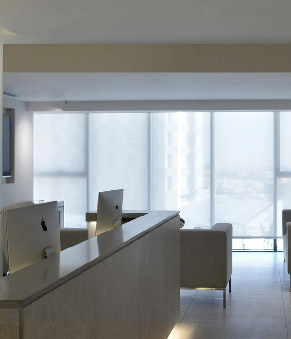
The reception area was conceptualized as a crack on a solid wall, mainly to hint layers of skin and resurfacing, while vintage car leather was used to add the elements of time, quality, and antiquity. Following the sensorial perception of our environment and its translation by the sixth one the brain, custom made aroma using strawberry basis is used produced by a Florentine pharmacist. Strawberries bring connotations of youth and freshness in a setting that seeks to promote health, rejuvenation and a more relaxed perception of our surrounding world.
{{item.text_origin}}

