Schoenenkwartier博物馆位于瓦尔韦克(Waalwijk)市中心—荷兰皮具与鞋业之城,是一座专为鞋靴设计、鞋靴生产和鞋靴时尚内容打造的全新知识中心。它坐落于一座列入文物保护的建筑群中,由建筑师Alexander Kropholler于20世纪30年代设计,该建筑曾经历过局部翻新,调整与扩建。目前建筑内收藏有12,000件藏品,包含多个常设展览、一个带有研究图书馆的信息中心、工作坊与礼堂、博物馆咖啡厅以及设计与推敲模型的实验室。关于建筑所有的规划设计以及室内全都基于其原有历史价值,并为工业、城市以及社区制定出令人激动的蓝图。
▼城市概览,Overview of the city ©Stijn Bollaert
The Schoenenkwartier Museum is a new and innovative knowledge centre for shoe design, shoe production and shoe fashion in the centre of Waalwijk, the Dutch leather and shoe city. It is housed in a listed building complex from the 1930s, by architect Alexander Kropholler, which has been partly renovated, transformed and expanded. The buildings now house a collection of 12,000 objects, several permanent exhibitions, a knowledge centre with research library, workshop space and auditorium, museum café and laboratories for design and prototyping. Both the planning and design of the building and its interior map out a new inspiring future for the industry, the city and the community, built on the values of the past.
▼建筑外形,Appearance of the building ©Stijn Bollaert
作为新型媒介的传统手工艺 Historic craftsmanship as a new connector
瓦尔韦克(Waalwijk)是一座典型的欧洲小城,通过本土手工艺的工业发展而成为大城市,但同时也在为其未来苦心奋斗。皮具生产和鞋类制造曾为de Langstraat地区带来文化,经济的繁荣,也是让该地区获得国际名声的骄傲产业,但如今皮具和鞋类制造逐渐淡出舞台。然而,这里仍然有大大小小鞋类品牌和成立于1954年的鞋类与皮具博物馆。该建筑将博物馆与创新中心结合,形成一座鲜活的整体。展厅之间有一个研究图书馆,还有多个创新设计实验室,用于教育,艺术家居住和各种各样的会议以及公司展示。鞋业博物馆将该地区的制鞋工艺带回到了梦开始的地方,该城市重新变成专业人士和创新人员前往的国际目的地,重新展现并弘扬了本地社区的文化历史。这里的藏品是无尽的灵感源泉。
▼接待厅,Hall ©MARIJE KUIPER
Waalwijk is a typical small European city that became big through the industrial development of a local craft, but at the same time is struggling with its future. Leather processing and shoe manufacture formed the culture, economy and pride of the region “de Langstraat” as an international player, but leather and shoe production have now disappeared. However, there are still areas of large and small shoe brands and the Shoe and Leather Museum, founded in 1954. The building is a combination of a museum and an innovation centre, interwoven into one living entity. A research library is located between the exhibition rooms, there are several innovation and design labs for education and artists in residence, and various possibilities for conferences and company presentations. The Shoe Museum has brought regional shoe craftsmanship back to where it started, the city is once again becoming an (inter)national destination for experts and innovators, and the cultural history of the local community is shown and enhanced. The collection is the endless source of inspiration in all this.
▼入口空间,Entrance area ©Stijn Bollaert
城市中心的公共复兴 Public revitalisation of the city centre
鞋业博物馆位于Raadhuisplein,是历史老城的核心地带,那里的市政厅与行政中心于上世纪建成。博物馆的整体功能,如带有工作室的办公咖啡厅,能够直接被人们从广场注意到并对公众开放,即使是没有参观展览的人也可以进入。除了作为博物馆或创新中心,鞋业博物馆还是面向社区的舒适场所。当你通过历史悠久的拱廊和滑门进入建筑时,能够感受到友好的公共氛围:入口地区完全开放,在建筑的中心是带有鹅卵石图案的内部铺地,仿佛置身于有屋顶的城市广场。
The Shoe Museum is located in the heart of the historic city centre, on the Raadhuisplein, where the town hall and city hall were housed in the last century. The general functions of the museum, such as the work café with the open work labs, are directly visible from the square and are also open to the public, even for people not visiting the exhibitions. In addition to being a museum and innovation centre, the Shoe Museum is a welcoming place for the community. The hospitable public atmosphere is also noticeable when you enter the building through the historic arcades with generous pivoting and sliding doors: The entrance area is completely open and in the centre of the building runs an inner pavement with a cobble pattern, reminiscent of a covered city square.
▼空间概览,Overview of the spaces ©Stijn Bollaert
真正的博物馆建筑会与时代同频 A real museum building that is in keeping with the times
相比传统博物馆,该建筑拥有与众不同的布局与气质。鞋类藏品既多样又宽泛独特,而目标人群(无论是国际时尚人士还是社区邻里市民)都有自己独特的需求与关注点。这就是设计该建筑的原因,建筑师希望每个人都能够从中获得属于自己的游览体验。从咖啡厅到展厅,完全开放的首层空间将所有功能整合一体,在中央新增的花园为人们提供了灵活多样的路径选择。壮观的全新大面弧形开洞,由上世纪80年代办公楼的旧立面翻新而来,让人们从这里就可以一览展览的风采。精心布置的楼梯和路线为人们提供了简化路线或只游览重点展区的可能,如果您愿意的话,还可以对某一个展览进行详细研究,同时也可以根据传统方式,沿着整条精心设计的路线参观。开放的博物馆布局呈现出多样的景观。您可以向前、向后或者游览展厅内部,信息中心和“制作工作室”(make-labs)也位于整条展线中合理的位置。这样的设计通过轻松的方式在藏品与观众之间建立联系。这是的鞋业博物馆成为一个充满活力、互相交流、灵感迸发的场所。有时,您也可以在其中某个花园或历史悠久的建筑中走走,形成独特的印象或简单享受这篇美丽的风景。
▼氛围与景色,Atmosphere and the views ©Stijn Bollaert
The building has a different layout and atmosphere compared to traditional museums. The shoe collection is large, extensive and special, but the intended target groups (from international fashion experts to families from the neighbourhood) all have different expectations, needs and attention spans. That’s why the building has been designed in such a way that everyone can determine their own way and pace. The completely open ground floor brings together all the functions, from café to exhibitions, and the centrally added garden gives flexibility and choice for the public routing. The spectacular new large round openings, cut out of the stripped- down old façade of the 80s office wing, allow you to catch a glimpse of the exhibitions from here. Cleverly placed staircases and routes make it possible to take shortcuts and only visit the highlights and study one exhibition in detail if you wish, but you can also visit the museum in the classical way and follow the entire beautifully thought-out route. The open layout of the museum means that there are many views right across the museum. You can look forward, back and inside the exhibition rooms, as well as in the knowledge centre and the “make-labs” which have been placed logically along these routes. This connects the collections and the people in a relaxed way. It makes the Shoe Museum a lively place for cross-pollination and inspiration. Sometimes, you can also look outside at one of the gardens or the historic buildings, to process your impressions or simply enjoy the beautiful place.
▼客座区,Seating areas ©Stijn Bollaert
适合所有人的建筑 Architecture for everyone
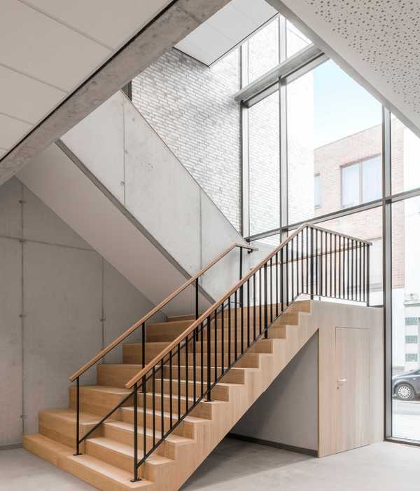
建筑师采用为人熟知的材质,例如红砖,钢、混凝土和木材,为建筑奠定基调。这是精心考虑后的选择:这些材料升华了藏品与历史建筑的氛围,并与其融合成为一件完整的艺术作品。同时,考虑到有些观众不经常观看这类展览,他们在抽象的博物馆空间中可能会感到不适或不自在,而博物馆则希望尽可能面向更广泛的群体开放。真实材料的选择和几何形体设计超越了目标群特的感官,呈现出普世的人类感官体验;从视觉到听觉,从触觉到嗅觉。材料的选择也考虑了可持续性。一方面它们必须能够历久弥新,另一方面,这些材料还必须以可持续的方式获取并能够再利用。
▼混凝土、钢、红砖的搭配,Collocation of the concrete, steel and bricks ©Stijn Bollaert
The tone in the complex is set by familiar materials such as brick, steel, concrete and wood. This is a deliberate choice: the materials reinforce the atmosphere of the collection and of the historical building and form one collective artwork. At the same time, it appears that some visitors may feel uncomfortable or unwelcome in abstract museum spaces because they don’t visit them that often, while the museum wants to be open to the widest possible audience. The choice of real materials and the geometric shapes used transcend the target group in the sense that they appeal to universal experiences of the human senses; from sight to hearing, from touch to smell. The materials are also chosen with sustainability in mind. On the one hand, this means that they must be able to withstand rough handling and age well, and on the other hand, that they must be sustainably sourced and reused wherever possible.
▼空间的纯粹,Purity of the spaces ©Stijn Bollaert
为建筑谱写生命新篇 Adding to the life story of the building
Raadhuis综合体是由建筑师Alexander Kropholler上世纪30年代设计的最重要的建筑群之一,该建筑群分阶段完成,80年代曾经历过一次扩建。这些建筑部分经过改造,翻新并扩建出新的空间。Kropholler标志性的建筑语汇和细节在翻新中得到了复原,这些元素也为新设计提供了灵感。以这样的方式,我们也像最初的建筑师那样,贯彻了个性和坚固的理念:还原木材于石材的本质。建筑师采用新的厚橡木拱形窗框,以Kropholler的方式,强化了开放的拱廊布局和广场上的凉亭。新花园采用了砖砌立面,高度刚好能让人们从市政厅广场看到新博物馆,同时不会过分吸引人的注意力。与历史建筑一样,这里也采用了宽接缝的大规格砖块,其对角交错的砌筑方式巧妙地与其他建筑的屋顶形状呼应。因此,加建的部分并不只是新奇的时尚标志,而是从悠久的建筑群历史中谱写的新篇章,这样的方式同样为长久的未来奠定了基调。
▼轴测图,Axonometric ©Civic Architects
The “Raadhuis ensemble” is one of the most important building complexes by architect Alexander Kropholler from the 1930s, which was realised in phases and extended once in the 1980s. The buildings have been partly modified, partly renovated and expanded with a new building section. The recognisable Kropholler principles and details were restored during the renovation, and they also inspired the new design. In this way, we apply the principle of individuality and solidity, just as the original architect did: wood is wood; stone is stone. The original layout of the open arcades and the kiosk on the square has been reinforced with new arched window frames, made from thick oak, in the “Kropholler” tradition. The new garden has a brick façade, just high enough to make the new museum visible from the town hall square, but low enough not to draw all the attention to itself. As with the historic buildings, large-format bricks with wide joints have been used here, whose diagonal, staggered masonry subtly refers to the roof shapes of the other building sections. This means that the addition is not an idiosyncratic fashion icon, but a logical new chapter in the overall story of the historically layered building ensemble, which with this approach still has a long future ahead of it.
▼展厅概览,Overview of the exhibition ©Stijn Bollaert
建筑遗产中的创新 Free handling of a compelling legacy
原建筑师Kropholler的建筑理念有时比较严格或刻板,如今这些元素与社会对博物馆的期望并不相符。因此建筑师有意识地以原有材料与技术为基础,应用了更加自由的设计手法。花园中新的开洞与旧市政厅的拱廊完美融合,实际上是由砖砌的完整圆形,这在Kropholler的理念中是一种“过错”。拱形天花不只是连续单一的尺寸,而是错落有致地排布。正式这些巧妙且颠覆性的设计细节将Kropholler严谨的建筑理念保留至今,最终新旧理念融为一体。
▼圆形开洞概念,Circle concept ©Civic Architects
▼传统中的创新,Free handling within tradition ©Stijn Bollaert
Kropholler’s architectural ideas were also somewhat rigid and constraining, which is not in keeping with the role that the museum wishes to fulfil in society today. That’s why a conscious decision was made to continue working with the original materials and techniques, but to design in a more liberal way. The new sawn openings in the garden fit well with the arched arcades of the old town hall, but are actually bricked in a complete circle, which would be a “sin ” according to Kropholler’s theory. The vaulted ceiling doesn’t have one continuously repeating size but is staggered several times. These and other subtly subversive design details bring Kropholler’s rigid architectural ideas to the present day, but ultimately the old and new beliefs form one unit.
▼空间概览,Overview of the spaces ©Stijn Bollaert
生产技术与方法的试验场 Testing ground for circular techniques and methods
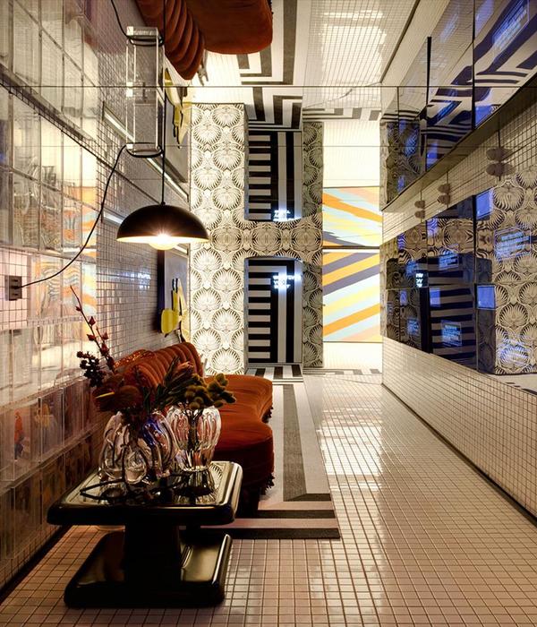
基于多样的设计与生产实验室,鞋业博物馆为设计,教育机构和商业团体提供了实验新生产技术的空间。在建筑与室内设计方面,也进行了不同技术与材料的实验。建筑师将一个压抑的80年代低层高办公室改造成了博物馆空间,采用特别的方式尽量多地保留空间。入口处的中央多功能接待桌由“石灰麻”支撑,天花采用回收的PET合成毡制成。入口处的实验性瓷砖墙面无可争议地成为最抢眼的元素,与La-Di-Da代理商共同设计。墙面将瓷砖工艺与创新和可持续理念结合,采用特殊形状的3D打印模具和其他上釉工艺回收的废料制成。
▼展示细部,Detail of the showcase ©MARIJE KUIPER
With its various design and manufacturing labs, the Shoe Museum offers space for designers, educational institutions and the business community to experiment with new circular techniques. Experiments have also been carried out with different techniques and materials in architecture and interior design. By turning an oppressive 80s office building with low ceilings into museum spaces, and by sawing out parts of it in a special way and preserving as much as possible. The central multifunctional desk in the entrance area is made of “lime hemp” with ceilings made of synthetic felt from recycled PET bottles. The undisputed eye -catcher in the entrance area is the experimental ceramic tile wall, developed in cooperation with the agency La-Di-Da. The wall combines ceramic craftsmanship with innovation and sustainability through the unusual shape of the 3D printed moulds and the use of waste from other glazing processes.
▼纯粹的材质搭配,Pure materials collocation ©Stijn Bollaert
社会凝聚力 Social cohesion
室内方面,设计师将教育,商业团体和本地创新手工艺相结合。通过与瓷砖工作室Cor Unum合作,瓷砖墙面原型作为小型传统生产项目得以实施,其中部分由劳动市场外的人建成。来自SintLucas职业学院的学生为礼堂设计了皮制坐垫,当地企业为办公空间提供了家居。这表明社会凝聚力和建筑产品之间的联系能够在公共建筑中得以实现。因此,该项目的设计成果将文化凝聚力,社交凝聚力和地区认同感融为一体。
▼工作室,Lab ©Stijn Bollaert
▼礼堂,Auditorium ©Stijn Bollaert
▼皮制坐垫, Leather cushions ©Stijn Bollaert
To develop the interior design, collaborations have been set up with education, the business community and creative regional crafts. In cooperation with ceramics studio Cor Unum, the prototype for the tile wall was developed and implemented as a small-scale traditional production, partly realised by people with a distance to the labour market. Students from the SintLucas vocational school designed the leather cushions for the auditorium, and local businesses provided the furnishings for the office environment. It shows that the link between social cohesion and architectural products can be realised in public buildings. It is therefore as one in cultural cohesion, social cohesion and regional identity.
▼瓷砖特写,Close-up of the tiles ©MARIJE KUIPER
▼瓷砖细部,Details of the tiles ©MARIJE KUIPER
▼总平面图,Masterplan ©Civic Architects
▼首层平面,Ground floor plan ©Civic Architects
▼一层平面,First floor plan ©Civic Architects
▼二层平面,Second floor plan ©Civic Architects
▼三层平面,Third floor plan ©Civic Architects
▼轴测图,Axonometric ©Civic Architects
▼剖面图,Section ©Civic Architects
▼圆形开洞概念图1,Circle concept 1 ©Civic Architects
▼圆形开洞概念图2,Circle concept 2 ©Civic Architects
▼圆形开洞概念图3,Circle concept 3 ©Civic Architects
▼圆形开洞概念图4,Circle concept 4 ©Civic Architects
Client: Municipality of Waalwijk User: Shoe Museum Architect: Civic Architects Interior design: Civic Architects Design tile wall: La-Di-Da Exhibition design: Tinker Imagineers Identity and wayfinding: The Invisible Party Cultural heritage research: Lotte Zaaijer Constructor: Archimedes Bouwadvies Project management: BBN Management: BBT Installation advice and building physics: Nelissen Ingenieursbureau Architectural execution: Wam and van Duren Interior design: Planemos, Cor Unum Ceramics, Lensvelt, Execution of installations: Van Dijnsen installatietechniek Exhibition implementation: Kloosterboer
{{item.text_origin}}


