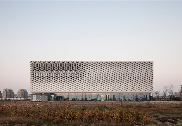
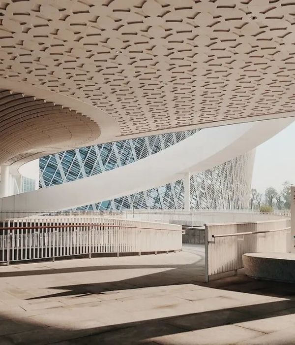
For a new bicycle storage at Berchem Station, the NMBS (Belgian Railway) launched a pitch for a graphical intervention. The large glass guardrails of the building seemed perfect for this. The winning concept consists of a typographical system that looks abstract on the outside, but is readable on the inside. The top half of the type is printed on the glass, the bottom half is painted on the floor. The design creates a dialogue with the structure and becomes part of the architecture. From the outside, it looks abstract, simple yet mysterious. On the inside, the type reveales to be a never-ending poem, consisting of words and short sentences related to movement and commuting, serving as a reward to the cyclists using the building.
Designed at
Visionandfactory
with Hugo Puttaert. Architect: Thomas Lootvoet
Photos by Roger Laute & Jelle Maréchal
{{item.text_origin}}

