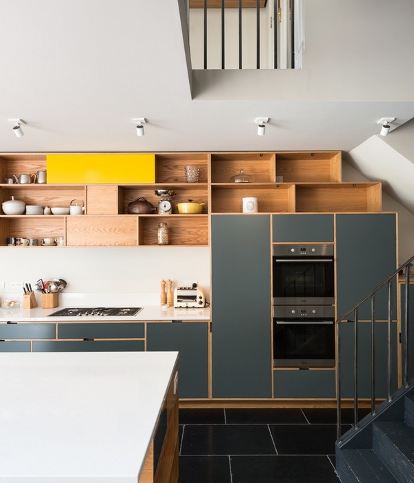
A renovated kitchen and a large living room, with an unconventional layout. This is how the partnership between Moca Architecture and client Rachel Lewin took shape. A project that started as an architectural and interior design consultancy, and evolved into the complete execution of a living room that mixes versatility and coziness. “They always wanted to have a Moca project, because of the boldness of the colors and shapes. It was a long time relationship.”, says Kátia Azevedo, one of the partners in the firm.
One of the main requirements of the client was the inclusion of a cafeteria table that would integrate the spaces and make the room an inviting place for the whole family. From that point onwards, the architects worked with rounded lines to suggest free flow and the connection between the living room and kitchen. The central table is made with lilac and beige Formica laminate sheets, and is embedded in a golden island, which brings more sophistication to the space. Another highlight is the checkered wooden panel, which delimits the extension between the hall, the entrance to the intimate area and the living room.
In the kitchen, the black countertops contrast with doors in pink and straw lacquer. Pink was also used in the tiles for the barbecue area, establishing uniformity between the spaces. The rounded shapes occupy the entire room and are also present in the furniture, which mixes made-to-measure pieces and thrifted items brought by the architects. “Something super important about this project, that matches perfectly with our style, was the thrifting of selected pieces.”, comments Kátia. Some of the furniture was acquired at auctions and was considered fundamental to dictate the mood of the entire project. An example is the set of chairs with a 70s aesthetic placed around the kitchen table.
The project reflects the originality of Moca's vision, bringing an intelligent layout that incorporates the client's needs and the possibilities of the space.
{{item.text_origin}}


