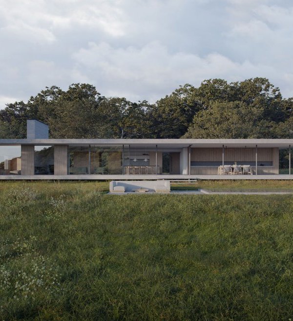
We took a classic weatherboard cottage located in St Kilda with a council Heritage Overlay and removed the previous 1980s extension to the rear. The two front bedrooms and bathroom on the ground floor, being part of the original main area of the house were retained. The brief was to add a master bedroom, ensuite, WIR and an east facing deck on the upper level and to refurbish the ground floor bathroom, new kitchen and to utilise the small area of land to the north east.
This is where things got interesting. Because the site tapered, becoming narrower to the rear, and the proposed building was intended to utilise this valuable unused space, it meant that the shape of the building also tapered. The geometry applied ensured that the upper level façades presented symmetrically to each ends of the property. We deliberately made the new additions visibly contemporary in contrast to the existing dwelling, but did not move too far away from the original. The galvanised custom orb cladding wraps up one side, over and down on the other, intersecting with the weatherboard cladding. Both familiar materials found on the classic Victorian workers cottages found in this part of St Kilda. The screened internal space is visually permeable, becoming an active and changing aspect of the dwelling depending on the time of day, conditions and lighting. The internal planning was extremely important as there was no room to build further back to increase the internal area of the house without detriment to the very small rear yard. Without increasing the size of the footprint, the internal planning was crucial to improve the functional layout and include in a stair to the upper level.
The honest interior finishes and the careful detail employed are clean, precise and practical. This aspect of the design was also very important to the client, and delivered a combination of sensibility and functionality that won’t date.
{{item.text_origin}}


