The Design Group has recently completed the UPC Polska offices, a telecommunications company located in Warsaw, Poland.
A good working place is a happy working place. This is the new UPC office in Warsaw – a space without barriers and unnecessary divisions, where each member of the team values the same and has the right to work in their own style. Here, modern style mixes with well-known and homely climates. The concept has been developed by The Design Group studio.
The office is located on two floors of a skyscraper in Warsaw’s Spark complex. It is a space smoothly blending different arrangement orders – strongly graphic styling intertwines with homely elegance and technical futurism. The whole creates a well-functioning workplace with the surface area of almost 3.3 thousand square meters. The office is a showcase of the company, and its home-like character is appreciated by many UPC employees. They find an extremely warm and cozy place here, where everyone is equal and one’s needs respected.
UPC is an international provider of telecommunications services – Internet, television, telephone. The modern, dynamic spirit of the company’s technology has found its expression in the arrangement prepared by The Design Group. This Warsaw-based studio, founded and managed by Konrad Krusiewicz, specializes in office design, and has won two awards in the Office Superstar competition this year!
Although many of the visual elements of the office are the result of a creative adaptation of the guidelines of the company’s brandbook, the designers had a great deal of creative freedom in this project. Colors, style and communication were precisely defined at the beginning – they are used in corporate identity, advertising or marketing materials. However, The Design Group team had an original idea how to translate these principles into functional architecture. The result is a surprisingly dynamic, energetic and visually humorous office, being a very homely space at the same time.
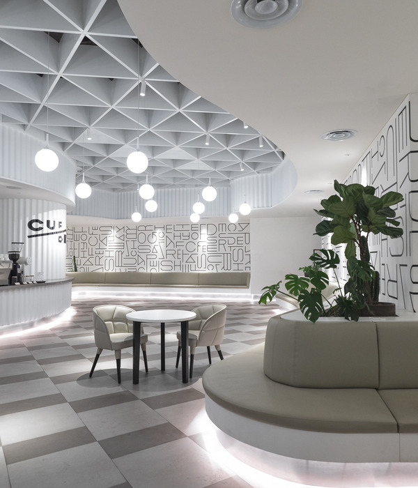
A good impression is necessary right from the moment you enter. And this is the case with the UPC office. The reception area was designed in a futuristic, technical style, with a solid dose of greenery and elegant furniture. Each of the elements has a cylindrical or oval shape, which can be seen especially in the shape of the enclosures and the phenomenal lamps under the ceiling. Against the background of the installation, there are interweaving luminous circles, three of which symbolize the complementary services of UPC. The elegant furniture from the best manufacturers makes this part of the office look more like a living room or a café than a typical waiting room.
Already here you can see a characteristic element of the office arrangement – refined, graphic iconography. It helps with orientation in space and provides visual enrichment. As a result, the space looks a bit like being a part of a computer interface, and to some extent like a comic book universe. The whole is completed by full-wall graphics with illustrations and motivational slogans, which were created as a result of UPC’s and The Design Group’s cooperation with a creative agency. Thanks to this, this environment is pleasant, modern and youthful. The distinctive color scheme blends with elegant industrial black and modern styling.
The key stage of this project was to develop a precise space plan. It was very detailed, based on a projection of the future behavior of employees and their working style. The Design Group’s experience in designing offices allows for an accurate prediction what functional solutions will work in a given space. In consequence, it was possible to arrange individual office areas to make the happy office idea and home climate perfectly visible. The goal could be achieved by, among others small chillout zones, coffee points or separate silent zones for concentrated working, spread over two floors.
The idea of openness is perfectly expressed by openwork walls and no clear divisions. Even the workstation partition walls are not very high. There are a lot of common places or greenery that make the office more friendly. Even the boxes used for rest in silence or meetings in small groups are separated from the surrounding space by glass walls, having the form of large booths set up in the office. And there is an auditorium in one of the conference rooms by the wall.
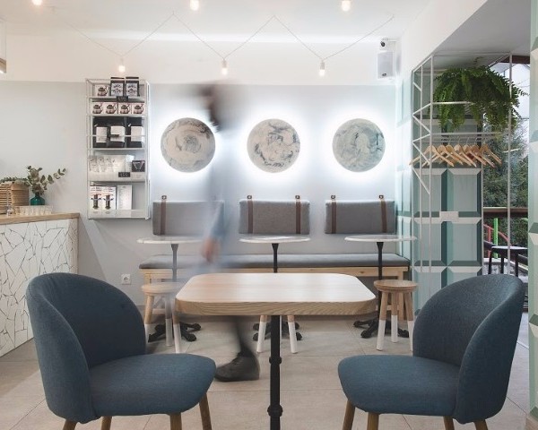
A home-like atmosphere has also been created thanks to the focus on high quality products and sophisticated aesthetics. For example, the catering area looks like an elegant, home kitchen. This effect is enhanced by, among others cabinet fronts made of copper-colored laminate.
UPC’s Warsaw office is not short of places that are supposed to foster team integration. From rooms for casual meetings, working together, to spaces for relaxation. The space plan and then the space arrangement served to create an exceptionally democratic space – a place where everyone feels happy, respected, listened to, where the employee’s needs come first and no one is more important than others. No divisions in architecture are to inspire people to level divisions between them and cooperate together. Numerous places to work and rest, scattered around the office, are to foster freedom of choice – where, how and whom we want to work with. UPC’s Warsaw office is open to employees – it is they who create this place, so it has been designed to be open to their ideas and needs.
Design: The Design Group
Photography: Fotomohito
22 Images | expand for additional detail
{{item.text_origin}}

