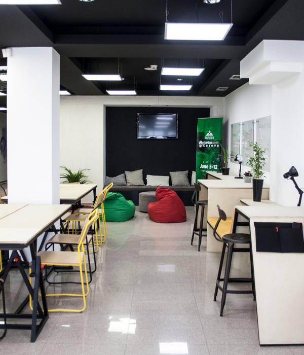
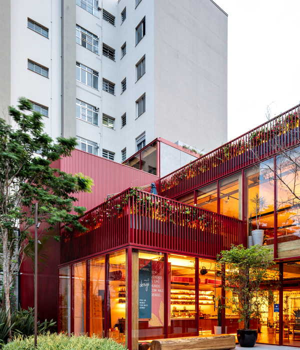
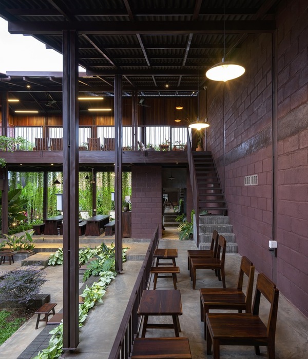
The building itself—a shophouse built in the 1950s with its distinctive characteristics of mid-century modern architecture has inspired the architects to create a mixed-use commercial space that functions as a café, a hostel, and a co-working space that rediscovers and appreciates the building’s heritage.
Architects respected the original design features of the building by maintaining the main features on the outside adding others to exalt them but working more freely on the inside. The materials, the furniture, the balance between finishes, the relation between the architectonic solutions, and the mood tone of the interior design, were completely redefined by creating new ambiances for the project. This 60-years-old half-reinforced concrete half wooden structure building has been preserved, restored and reconfigured to place the new programs. Though, the sense of living in a local shophouse is persisted. Downstairs has turned into a café while upstairs functioned as a hostel with unique communal space interconnecting all rooms together.
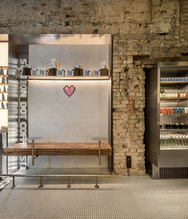
With the aim of unifying the space, the very diverse pre-existing materials and textures of the shophouse were painted with a single color—dominant in white. With the juxtaposition of the glass enclosures and the wooden flooring, the sprayed plaster combined with the textures of the masonry walls as well as the building structure both wood and concrete is ordered and yet valued. Yellow mustard, olive green, light salmon pink hues, noticeable in mid-century modern colors are applied on selected architectural elements with the 60:30:10 rule. These include walls, flooring, pillars, and accented ceiling help creating visual stimulation for beholders.
The design strategy was composed under the parameters of quality, simplicity, attention to detail and taste for the local and artisanal processes. The key visual focus of the place is the yellow plains that continuously run from the front of the building through its interior wall and floor in contrast with the white "L" shaped espresso and a brew bar in the café that allows the interaction between customers and baristas.
Some existent apertures were kept for being traces of the past and becoming a narrative story of the building. Some architectural features were used with its originated form but were replaced by modern materials such as a double casement door in which wooden frames were kept but its wooden panels were modified to laminated glass. The cedar wood represents a mood of authenticity and connectivity to the structure’s past. Multiple windows and openings are apertures that peer the view from inside-out to outside-in, encouraging the integration with nature, stimulating emotion, imagination and curiosity, establishing a direct relationship between the users inside and the living, ever-changing external environment.
Elements of mid-century modern architecture were reintroduced; for example, minimal decoration, geometric patterns with shapes like triangles, circles, or straight lines. are practically synonymous with mid-century modern design, these patterns were applied on a selected part of the building such as accented ceilings, wooden flooring units on the upper floor’s balcony. Mid-century furniture can be easily found identified by clean, straight lines accented with curved, smooth angles legs.
In addition, the new structure has been built for the third program of the complex—co-working space the new volume imitates the roof form of the pre-existing building. Metal sheets and translucent materials are applied. The shade and shadow effects give a connection between the ‘time’ and the ‘building identity’. Either sitting or standing, grouping or being alone, everyone can find the most comfortable posture. This is an interior architecture design that is closely related to the body. With dimensions, form, color, and light as the guide, and the space affects the body's feelings and then affects the emotional experience.
The pre-existing backyard lies between the old building and the new. It intentionally provides a transitional space from one to another as well as a relaxation area for dwellers. Altogether, the Concept Yard building is presented to the city as a piece capable of maintaining the intrinsic value of a building of the mid-century, gives it a new and optimized program and presence.
{{item.text_origin}}

