Ziinlife 北京展厅 | 穿越时空的奇幻家居 folly

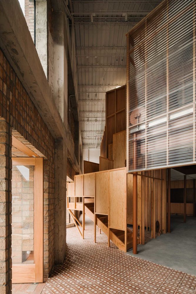
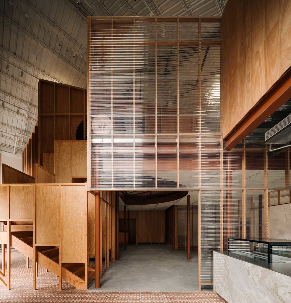


An interior of a former textile warehouse has been transformed into a furniture store made of a simple yet unique intervention. In Atelier tao+c’s next adventurous revival of old buildings, Ziinlife’s Beijing showroom may appeal to those familiar with isometric-styled drawings, otherwise Peter Eisenmann’s quirky eschewed planes. Of course—unlike Eisenmann’s frantic overlapping sketches—the interior functions effectively and aesthetically, perfectly fulfilling the required brief.
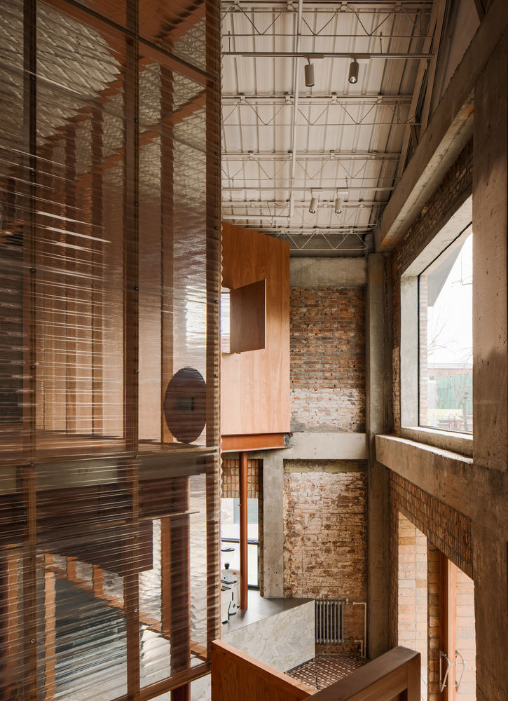
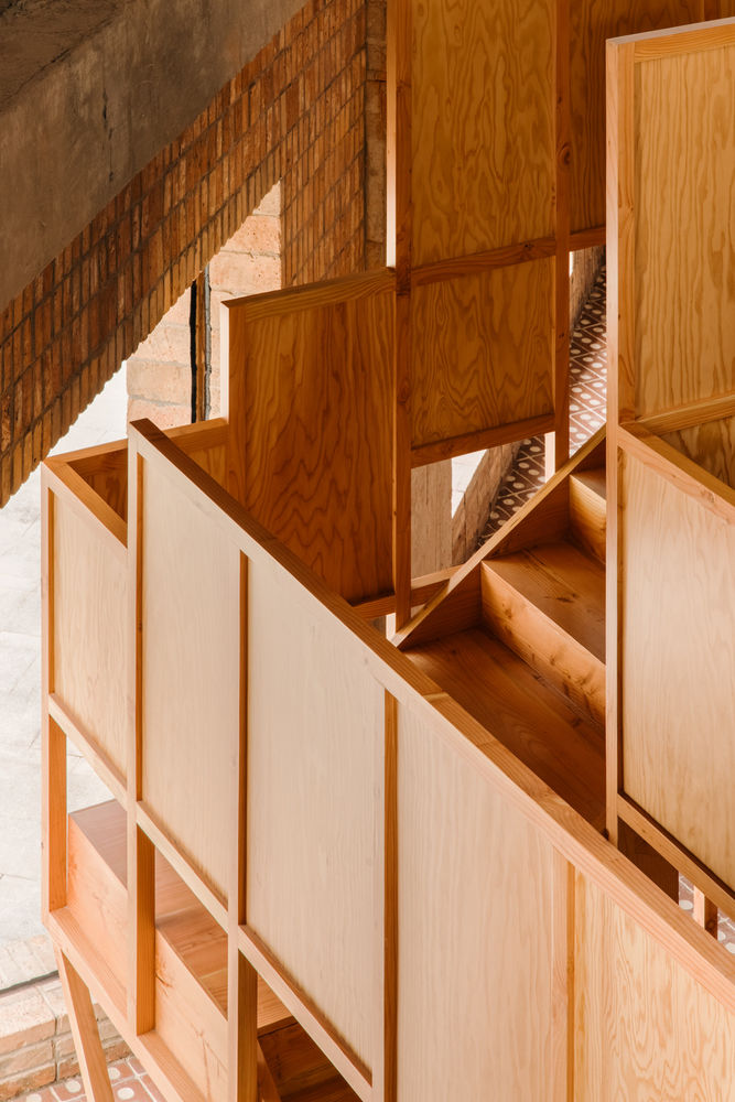
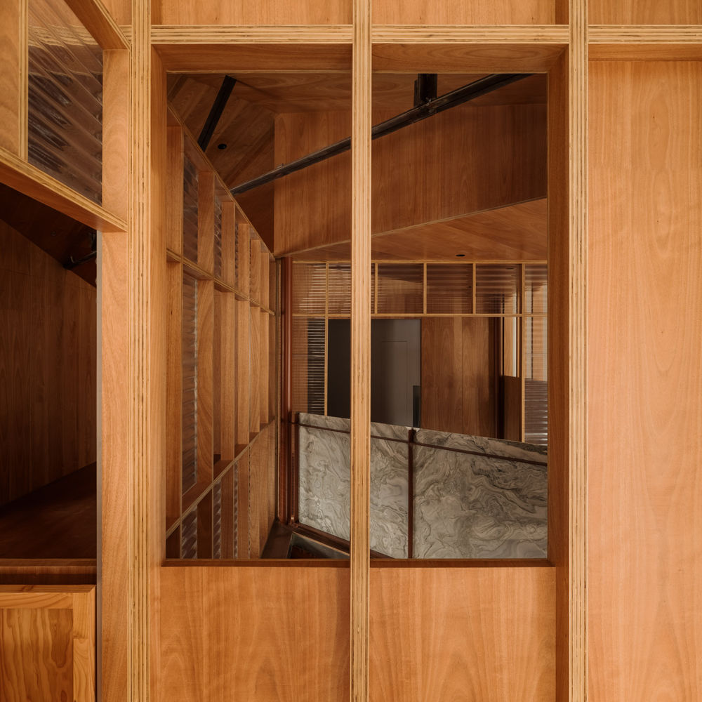
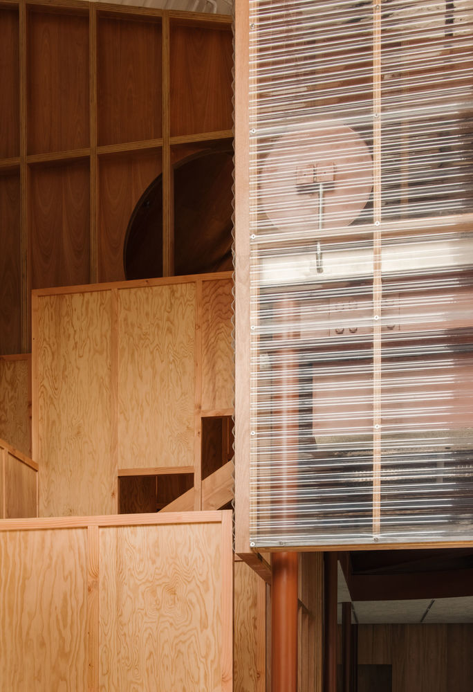
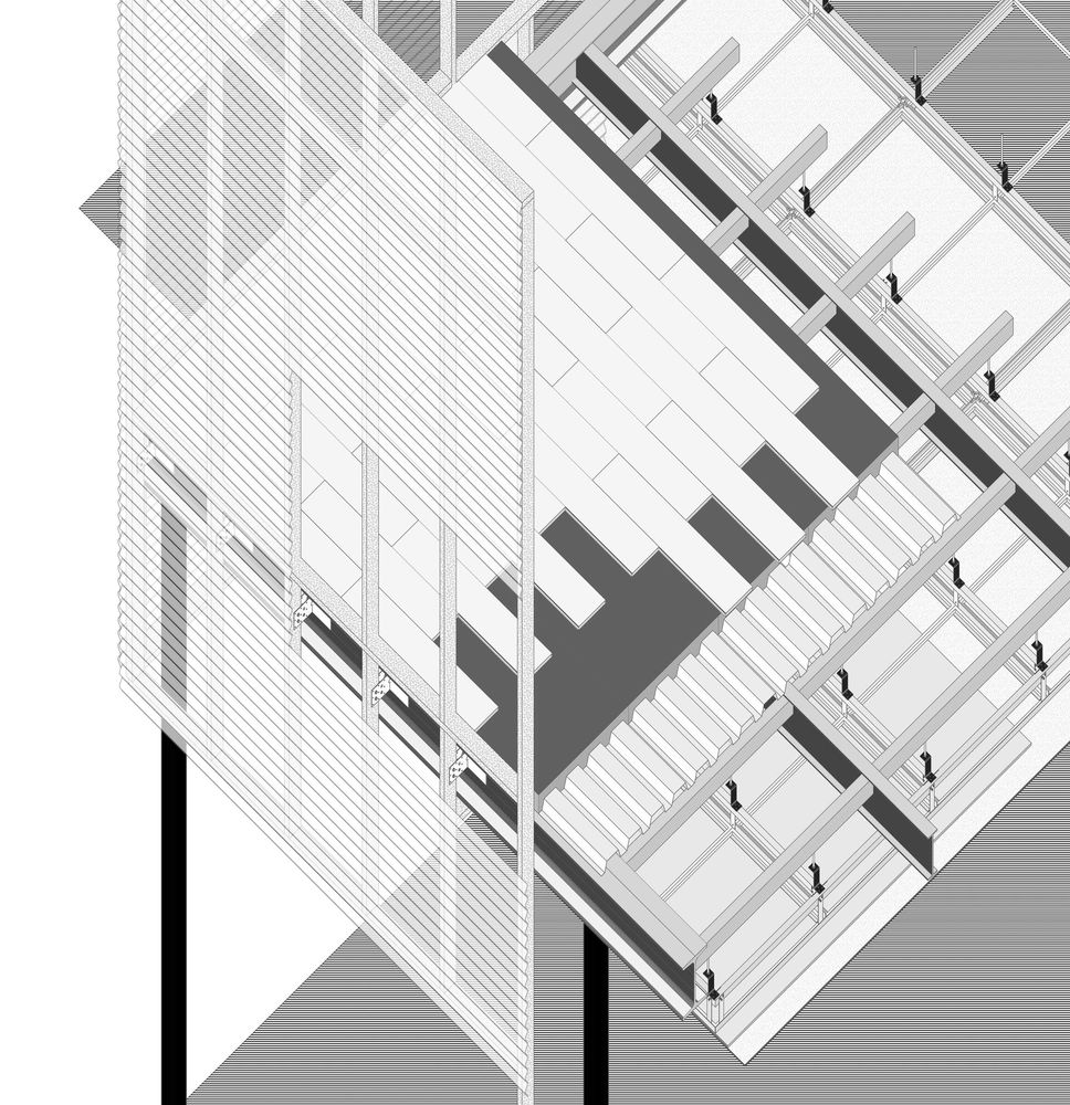
ZIIN, a furniture brand originating in Shanghai, occupies nearby Beijing’s Langyuan station, an area where typical red-bricked warehouses can be found. Built around the 1960s, the original structure was designed with a classic two-storey pitched roof. Not wanting to interrupt the existing framework, Atelier Tao+c approached the project concept as a ‘house within a house’. The showroom is designed of two intersecting timber scaffold-like structures placed inside at a forty-five-degree angle within the existing rectangular footprint.
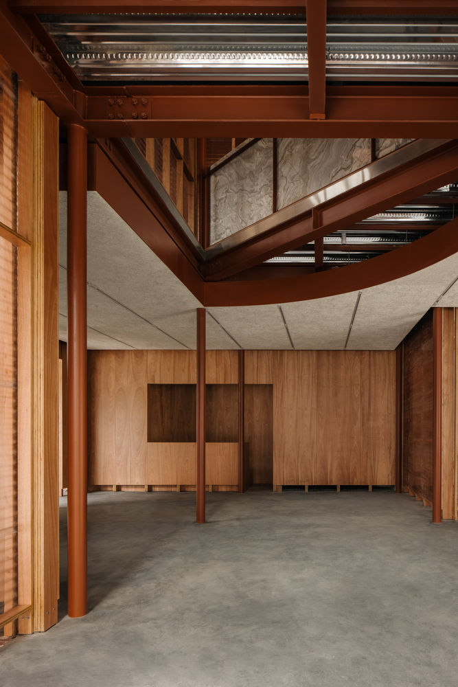

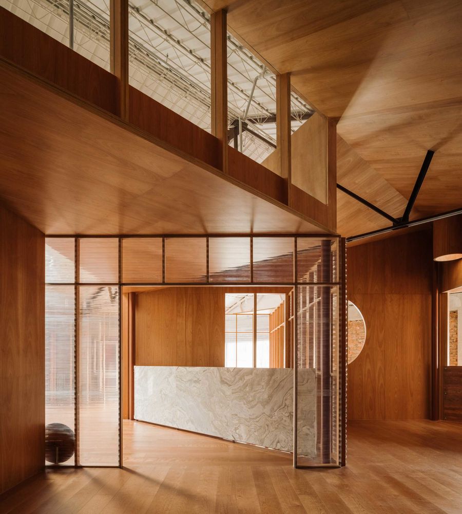
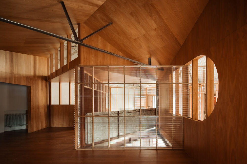

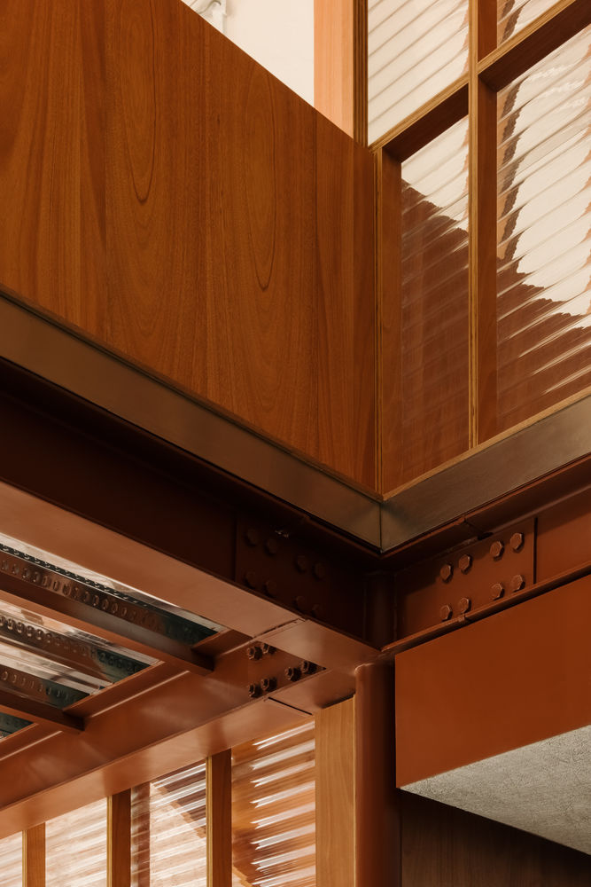
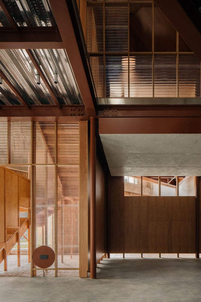
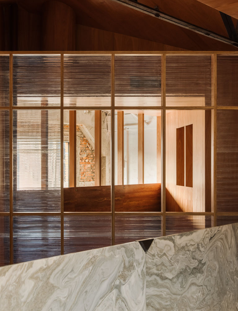
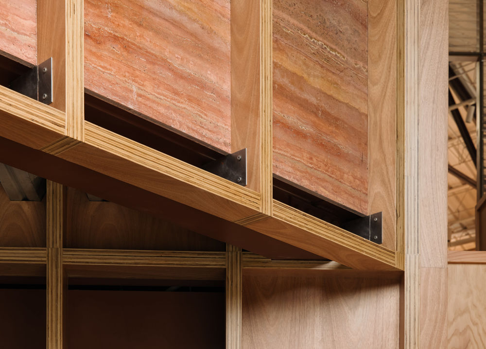
From the plan, the structure appears as two diamonds playfully touching the boundaries of the masonry façade. The interlocking structures allow for homogenous planning and display of furniture, eliminating much of the collection hierarchy. Though awkward on first impressions, the simple rotation establishes small pockets of spaces around the border for moments of solitude. Add to that the new structure is supported by a range of structural beams and polycarbonate partitions as dividers, it’s fair to say inside the ZIIN showroom resides a unique folly.
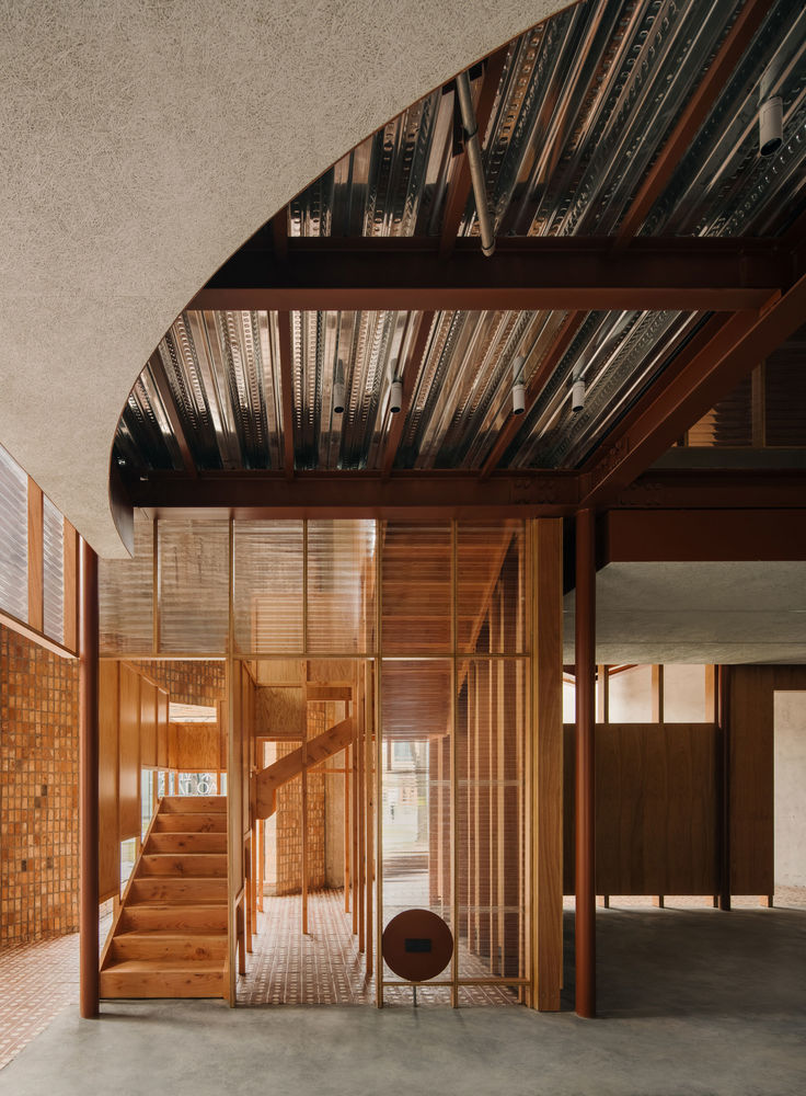
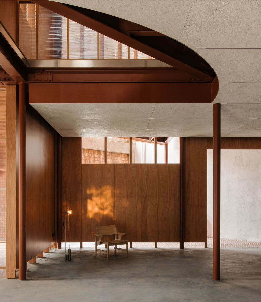
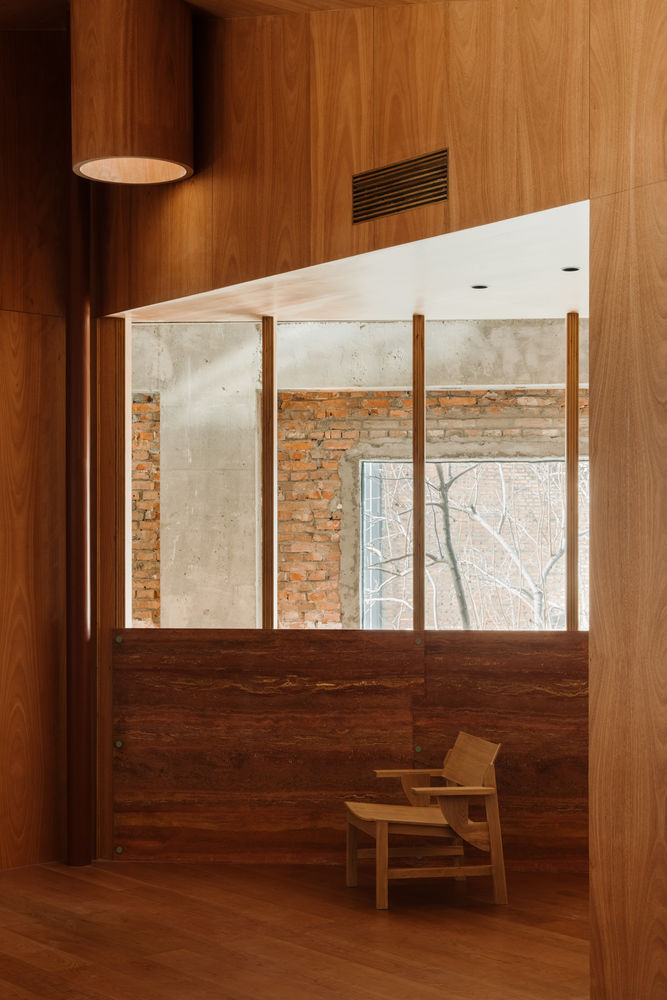
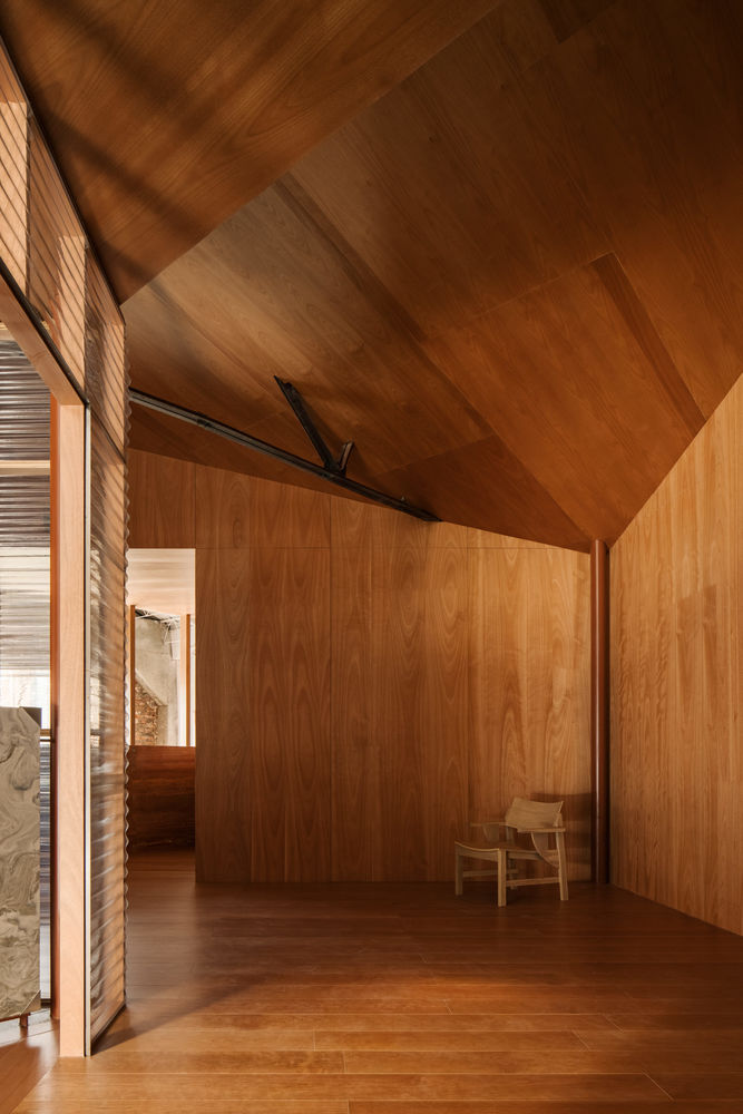
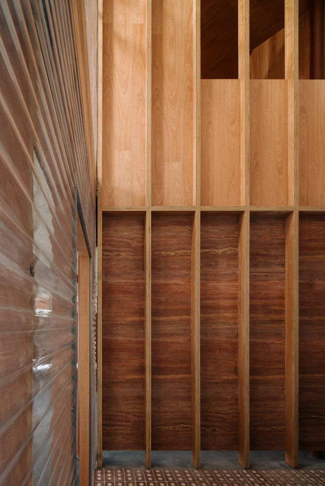
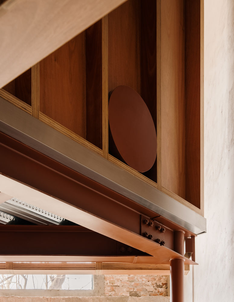
Upon entry, ZIIN’s interior welcomes visitors with an open space, warmed by the selection of red tones working in tangent to the warehouse’s red bricks. Syrupy timber and red ochre-painted structural beams are selected within the warm-toned building to complement the existing history. Flooring follows a similar sentiment, where brick and polished concrete are paired together, as concrete was the former structure of the walls. With the southern light pouring into the space and looking from below to the ground up, the furniture showroom amasses a robust conversation of old, new, and contemporary.
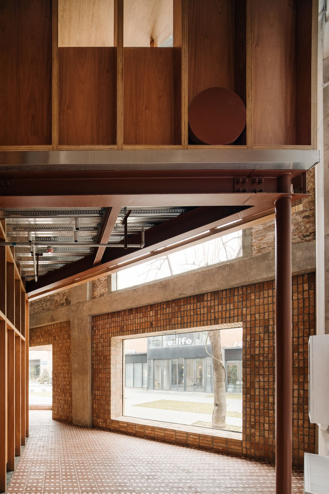

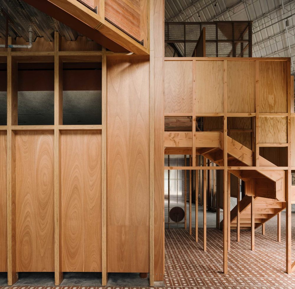
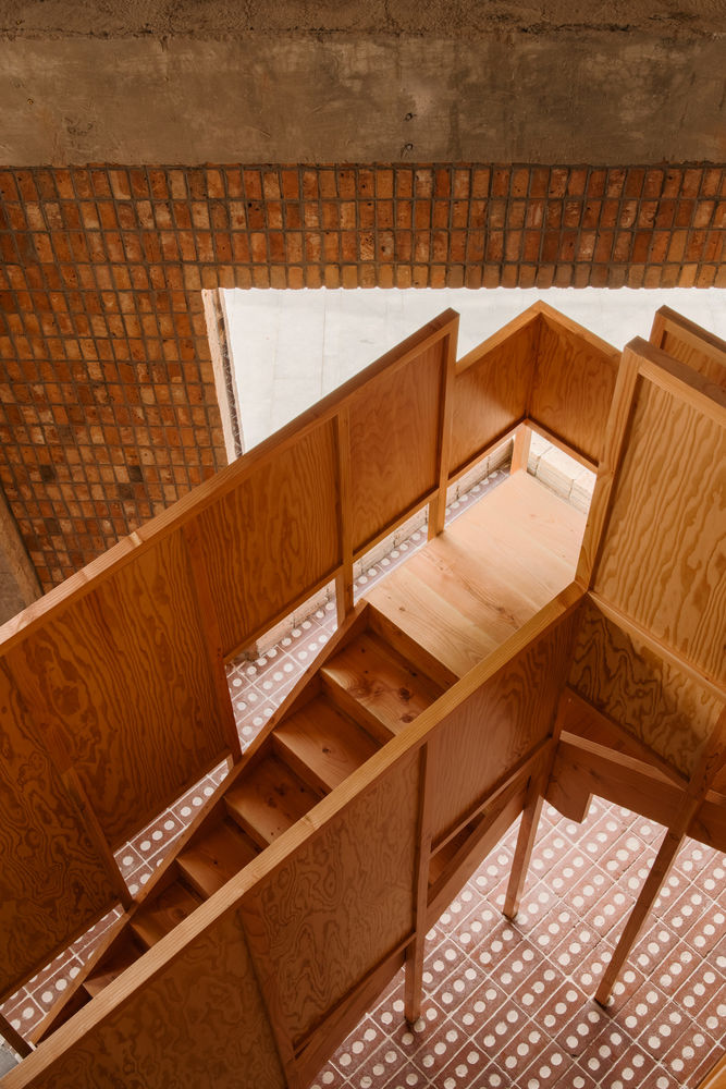
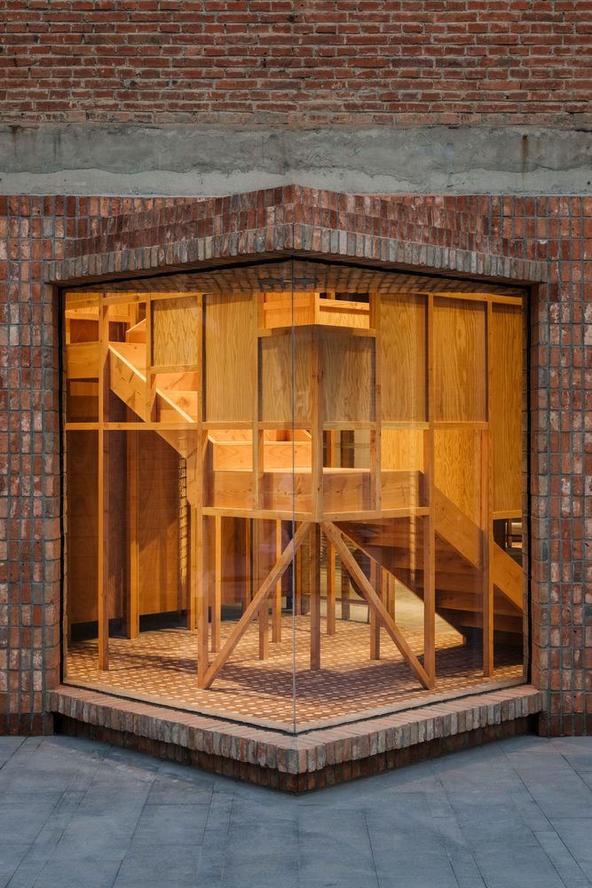
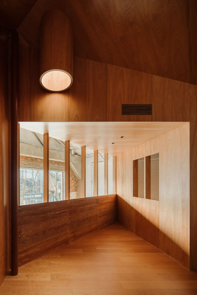
Like travelling within Eisenmann’s sketches, ZIIN’s showroom is designed to flow from one space to another. A timber staircase patiently waiting by the entrance (which also whimsically pokes out of the building’s façade) awaits to take visitors upwards to a similar layout yet enclosed with timber panels. While the display below may be perceived as more open, the above offers a more intimate setting, perhaps offering visitors a different perspective while appreciating the furniture display. Continuing the language of a house, the interlocking structure provides a small balcony for respite, simultaneously enjoying the architectural language and thought built into the interior.
Though it may feel contrived from afar and in plan, ZIIN’s showroom expounds on the common rule—look, but don’t touch! From my humble standpoint, Atelier Tao+c challenges this notion with some playful additions, allowing the structure to barely touch or poke its metaphorical finger out to entice curiosity.
[Images courtesy of Atelier Tao + c. Photography by Wen Studio.]
▼项目更多图片

