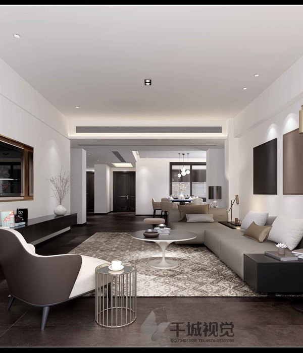
“ 有限空间,无限设计。”
01
▲门面细节FACADE DETAIL
时代赋予了我们众多选择,易让人迷失,设计师既是观察者,通过镜头旁观和记录着生活,亦是创造者,将设计注入空间之中,把理念融入简单的日常生活。
he era has given us many choices, which are easy to be lost. Designers are not only observers, but also creators who watch and record life through the lens. They inject design into space and integrate ideas into simple daily life.
02
分析
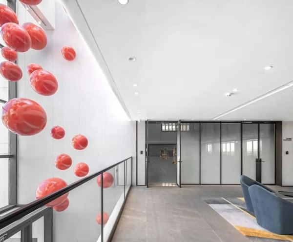
博洛尼展厅是设计师游小华设计的位于福州的一个展厅。业主希望通过优化空间配置更好地展示自己的产品、传递品牌理念。展厅中启用黑白简约的基调,辅以红棕元素的点缀,让空间安静通透而不显冷清寂寥,使来访者能以平和静谧的状态随时沉浸于空间。
Boloni exhibition hall is a exhibition hall designed by designer you Xiaohua in Fuzhou. The owners hope to better display their products and pass on the brand concept by optimizing the space allocation. In the exhibition hall, the simple tone of black and white is used, supplemented by red and brown elements, so that the space is quiet and transparent without being lonely, so that visitors can immerse in the space at any time in a peaceful and quiet state.
▼分析图,Analysis chart
▼分析图,Analysis char
03
再分析
展厅门头采用圆弧状切边配以中部方窗,辅以黑色的门套线勾勒,突显博洛尼品牌logo的同时也显露了展厅内部的空间,第一眼便极具视觉冲击感,而后便想通过方窗一窥究竟。
The door of the exhibition hall adopts arc-shaped cutting edge with square window in the middle, supplemented by black door pocket line, which highlights the Boloni brand logo and reveals the interior space of the exhibition hall. At first sight, it has a strong sense of visual impact, and then it wants to see through the square window.
▼展厅外观,Appearance of exhibition hall
设计师体验做饭的乐趣。 走入这个空间就能够想象到肥嫩的肉质被烤得焦黄脆嫩,浓香的汁液包裹在周围,在灯光下泛出点点的油光,扑鼻的香味阵阵袭来。
The combination of white and black, the interweaving of wood veneer and baking paint, combined with the natural properties of wood and the texture of artificial materials, describes the delicacy and beauty together. The real and natural wood veneer, smooth and delicate baking paint surface, with soft atmosphere lighting and sporadic warm white light embellishment, sufficient light in the room to walk, intersperse, infinite extension of the space, create a perfect proportion.
该展厅展示了博诺尼当季的新品,黑与红的视觉冲击,赋予了满满的时尚新颖感,使人眼前一亮。
The exhibition hall shows bononi's new products in the current season, with the visual impact of black and red, giving a full sense of fashion and novelty, making people bright.
04 成品展示
白与黑的搭配,木饰面与烤漆面的交织,结合木材的自然属性和人工材料的质感共同述说着精致与美感。木饰面的真实自然,烤漆面的顺滑精致,配合柔和氛围灯光以及零星的暖白光点缀,充足的光线在屋内游走、穿插,将空间无限拉长,营造出完美的比例。
The combination of white and black, the interweaving of wood veneer and baking paint, combined with the natural properties of wood and the texture of artificial materials, describes the delicacy and beauty together. The real and natural wood veneer, smooth and delicate baking paint surface, with soft atmosphere lighting and sporadic warm white light embellishment, sufficient light in the room to walk, intersperse, infinite extension of the space, create a perfect proportion.
整个案例当中最具有特色的吊顶,黑色三角形与白色线条,与空间中各个元素相互呼应,智能灯光系统调节着整个空间光影的变化,能够感受到光影在空间中穿梭。
In the whole case, the most distinctive ceiling, black triangle and white line, echo each other with all elements in the space. The intelligent light system adjusts the changes of light and shadow in the whole space, and can feel the light and shadow shuttle in the space.
透明的玻璃层板,亮白大理石的中岛台,演绎着现代极简生活的干净利落。平直的线条刻画,红黑的颜色碰撞,打造处不同寻常的生活空间。
Transparent glass laminate and bright white marble middle island platform represent the clean and neat life of modern minimalism. Straight line depiction, red and black color collision, create an unusual living space.
项目名称I PROJECT NAME
项目地点 I 福建.福州
面积 I 230M2
设计方 I DESIGNER YOUSPACE
主创设计 I CREATIVE DESIGN
游小华
艺术陈设 I ART DISPLAY
李京
参与设计 I PARTICIPATE DESIGN
卢艳萍、林娜
{{item.text_origin}}

