项目位于北京798艺术区核心区中二街上,原为画廊,由首层130平米的建筑、局部二层20平米的储藏间和73平米的户外院子组成。我们为中国工匠系奢侈品牌“端木良锦”将其改造为集零售、展示、体验、交流、接待、办公为一体的综合性工作室空间。
The project is located on Zhong’er Street in the core area of Beijing 798 Art Zone. The space is used to be a gallery with the ground floor area of 130 sqm, a 20 sqm second floor storage room and a 73 sqm outdoor yard. The prominent Chinese luxury brand Duanmu aims to transform it into a multi-functional space for retail, exhibition, experience, communication, reception and office for itself.
▼建筑外立面,the front view
建筑沿中二街朝东,面宽7.3米,进深24.6米,女儿墙高度4.6米。北侧紧挨饭馆,南侧为画廊,东侧沿街面对新落成的798艺术中心。东立面为唯一朝外的展示面,向内凹1.5米,由主入口和玻璃橱窗组成。建筑虽然地理位置颇佳,但原立面年久失修,破损严重,表面材质为暗红色面砖。
The building’s facade faces east, with 7.3 meters wide, 24.6 meters deep, and 4.6 meters high. It locates in between a restaurant on south and a gallery on north, and the east side faces the newly completed 798 Art Center. The Eastern facade is the only display surface, which is concave to 1.5 meters and consisting of the main entrance and a big glass window. Although the location of the building is quite good, the original facade is disrepair and with serious damage. Its surface material is dark red brick.
▼改造前后对比,before and after transformation
外立面改造Facade Renovation
立面作为建筑最重要的展示面,是此次改造的重点部分。除了建筑立面已严重破损,还存在以下几方面的问题,我们试图通过最直接的手法对原有立面存在的问题进行立竿见影的改造。
As the facade is the most important display surface, it is the key part of the renovation. In addition to the serious damage of the building facade, there are still several existing problems in the following aspects. We try to solve them instantly through the most direct responses.
▼立面改造过程,transformation process of the facade
▼改造后外貌,exterior view after transformation
问题1:立面南侧与相邻饭馆公用承重墙,饭馆二层平台玻璃栏板与原建筑关系“暧昧”,造成两者立面关系上的重叠混乱;
The first problem is that the building was sharing the bearing wall with the adjacent restaurant. The relationship between the glass railing on the second floor terrace of the restaurant and the original building is ambiguous, which causes the overlap and confusion between the two connected facades.
解决方式:在两个立面重叠处设置与饭馆重叠范围同宽的U型槽,使两个功能完全不同的建筑立面划清界限。
The solution is to set up U-shape gap with the same width as the overlap between the two facades, so that two facades with different functions can be clearly drawn.
问题2:女儿墙较低,使建筑整体街面视觉感受杂乱无章;
The second problem is that the chaotic overall visual perception from the street due to the low parapet wall.
解决方式:加高女儿墙,与旁边饭馆二层平台玻璃栏板齐平,对二层建筑形成了遮蔽,有效加强立面整体性,并与周边环境相协调,改善了沿街视觉感受;
The Solution is to make the parapet wall higher to block the street view from the chaotic facade elements. It not only effectively strengthen the integrity of the facade with the surrounding environment, but also improve the visual sense of the pedestrians.
"的格式进行了排版。如果您还有其他需要帮助的地方,请随时告诉我。
The third problem is the inner concave on the main facade formed a “dead space” next to the restaurant. The dead corner is easily become a garbage point, and sometimes, even become a ‘rest room’ for the restaurant guests after meals at night.
解决方式:为了彻底杜绝“死角空间”,同时突出立面玻璃橱窗的展示功能,以橱窗和主入口为边界与南侧边线和上边沿形成两个梯形斜面,将整个立面向内收缩,形成“景框”效果。“死角空间”彻底得到消解。
In order to completely eliminate the “dead space”, and to highlight the display function of the glass window of the facade, two trapezoid surfaces are created from the boundary of the window and main entrance to the upper edge of the concave.The whole facade is contractile inward to form the “Scene frame” effect.
橱窗Display Window
橱窗作为最重要的展示空间,我们摒弃传统盒子式的空间,而是通过延续立面的斜线在建筑内部构成一个楔形腔体。斜线尽端是预留一个“取景器”式的门洞,既作为橱窗的进出入口,更是与前厅西墙上通往院子的小门以及橱窗玻璃建立视线联系,可视时将内部的庭院展示给街道。
As the window is the most important display space, in stead of the regular box style space we create a wedge-shaped cavity inside the building by extending the slant line of the facade. The end of the slanting line is a “viewfinder” type of doorway, not only as the door of the window, but also connect the small door to the courtyard on the west wall with the window to establish the visual corridor to the inner courtyard.
预留一个“取景器”式的门洞,与前厅西墙上通往院子的小门以及橱窗玻璃建立视线联系,the end of the slanting line is a “viewfinder” type of doorway, that connects the small door to the courtyard on the west wall with the window
▼橱窗,the display window
通过延续立面的斜线在建筑内部构成一个楔形腔体,in stead of the regular box style space we create a wedge-shaped cavity inside the building by extending the slant line of the facade
橱窗由国内最顶尖的橱窗设计师打造,以汉代画像砖为灵感,将古代与现代完美融合,将上千年的历史和别具特色的“山川巡狩”故事巧妙连接,将猛兽的细图放大,融入电动装置,与橱窗的三维空间巧妙结合,完整地呈现在橱窗里。生动的场景已成为798艺术区里一道新的独特地标点。
The window is made by Chinese top display window designer. With the inspiration from brick of the Han Dynasty, we create a scene of historic “mountain Patrol” story with enlarged animals and plants. The vivid scene has become a new landmark for the tourists due to its perfect integration of ancient and modern, the use of electric device and the combination with the three-dimension window space.
▼橱窗以汉代画像砖为灵感,将上千年的历史和别具特色的“山川巡狩”故事巧妙连接,With the inspiration from brick of the Han Dynasty,we create a scene of historic “mountain Patrol” story with enlarged animals and plants
材质Material
外墙材料用白色外墙漆搭配镀钛金属线条。在南侧斜墙上开13厘米高的金属灯槽。灯槽背板用精选的俄罗斯花曲柳木板,衬托金属“DUANMU”英文字样,赋予店面华贵的气质。
The major material of the facade are the white exterior wall paint and the titanium golden plated metal. A 13 centimeter high metal gap is inserted on the trapezoid wall. The brand English name “DUANMU” is highlighted by the selected Russian Manchurian Ash as background with light hidden behind.
▼灯槽细节,detail
平面改造Floor Plan
建筑平面分为前厅、中厅、办公区、室外庭院四个区域。
The floor plan includes Front Hall, Middle Hall, office area and courtyard.
▼平面图,plan
前厅Front Hall
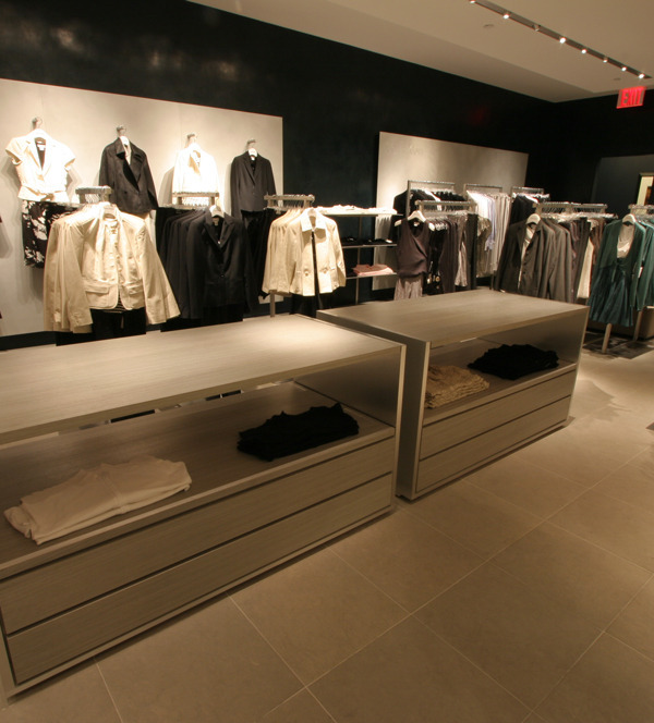
前厅部分为面向公众的产品展示体验区,采用浅色暖色主色调。利用“取景器”橱窗背后形成展台和展示区。南墙为两组主墙柜,通过深色墙面引导视线。
The front part is an area for product display and experience. The back of the viewfinder window is set to be a display area. Two group of main wall cabinets are setup on the south wall with dark blue color as main display area.
▼前厅内景,front hall
▼前厅展墙,front hall display wall
▼入口嵌花地板,entrance Floor with inlaid pattern
▼主入口细节,main door detail
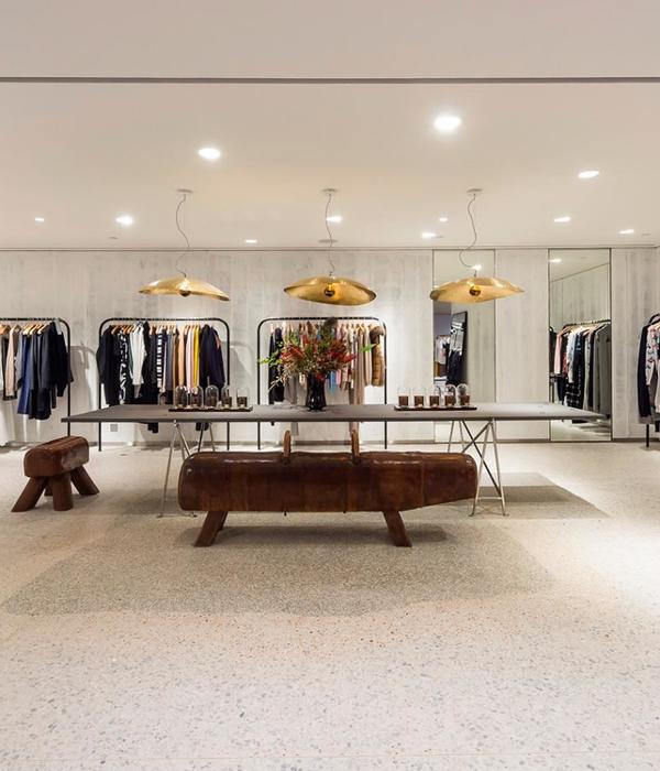
中厅Middle Part中厅部分是多功能区,墙面采用深湖蓝色主色调。我们将原建筑吊顶拆除,将坡顶木制结构完全暴露,增加室内空间感受。平面布局没有固定的家具,只在墙面通过导轨悬挂展品。可根据需要组织小型沙龙分享会、产品发布会、媒体采访、产品鉴赏、公开展览等。
The middle part is a multi-functional area with dark blue walls surrounded. We demolished the old ceiling and expose the original wooden roof structure to increase the height indoor space. There is no fixed furniture except hanging exhibits on the wall. Different activities, including salon, product launches, media interviews and public exhibitions, can be organized as required.
▼中厅部分是多功能区,墙面采用深湖蓝色主色调,the middle part is a multi-functional area with dark blue walls surrounded
办公区OfficeArea
办公区基本保留原建筑格局,仅增加了一个库房和一个玻璃隔断办公室。
The office area basically retained the original one, adding only one storeroom and one glass partition office.
院子Courtyard
院子呈长条形,现存6棵高约20米的杨树。改造前院子状况不佳。我们将地面重新修整,在保证良好的排水的前提下,沿树干运用室外木地板、白石子和灰石子相搭配划分出室外活动区域。
The long striped courtyard has 6 poplars with a height of about 20 meters. The yard was not in good condition before the renovation. We rebuilt the ground and the drainage. A outdoor wooded platform was designed along the trunk, and the ground was divided by white and gray cobblestones.
▼整修后的庭院,the courtyard after transformation
▼立面,elevation
▼剖面,section
项目所在地:798艺术区中二街,北京,中国
设计团队:端木良锦工作室
橱窗展陈设计:楼上橱窗
建筑面积:170m2
设计建造时间:2018年3月至5月
摄影:端木良锦工作室
Location:798 Art District, Zhong’er Street, Beijing, China
Design Team: Duanmu Studio
Building Area:170m2
Design & Construction Phase: March-May,2018
Photographer: Duanmu Studio
{{item.text_origin}}


