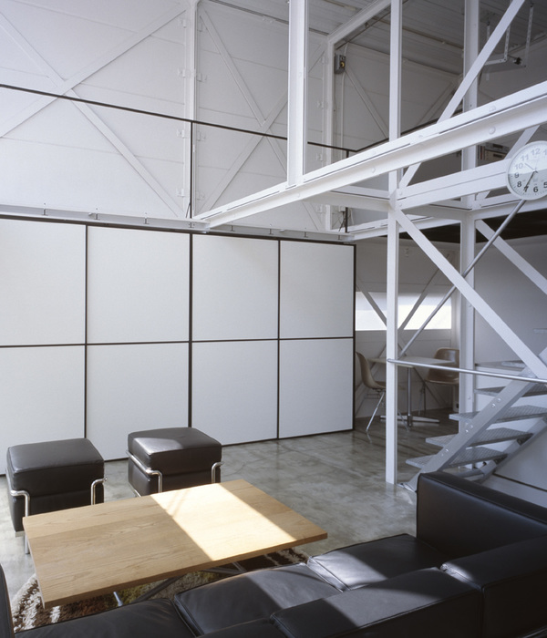
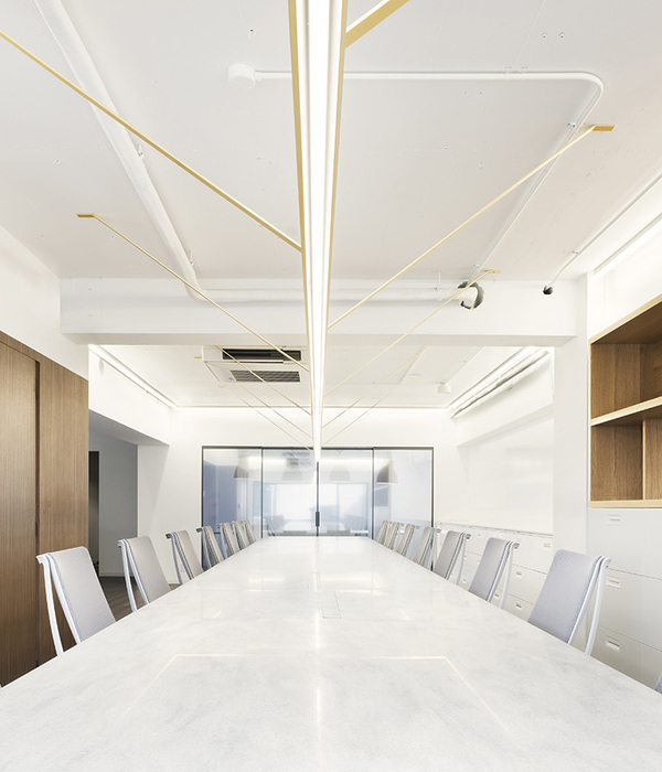
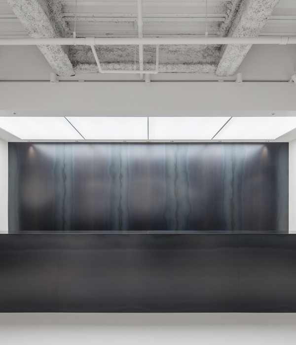
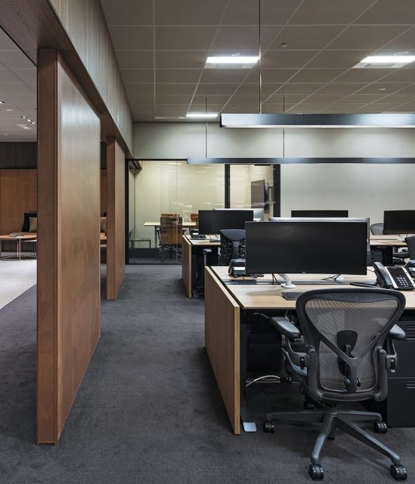
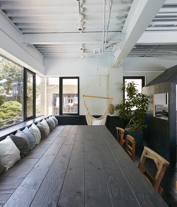
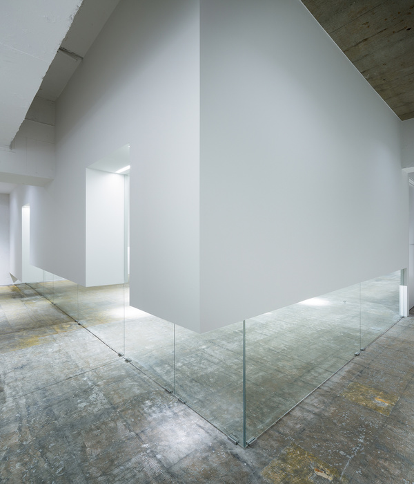
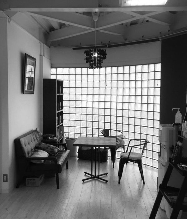
有时候空间就在那里,时间在它身上留下的是某种气质,与材质布局无关,空间的改造,改的是技术性的表征,造的是延续这个气质的底层通路。Sometimes, space just exists, and time leaves a certain temperament on it, unrelated to material layout. The transformation of space alters technical representations, creating a foundational pathway that continues this temperament.
▼主要空间概览,Overall view of main interior space© UKstudio
现状与挑战 Current Situation and Challenges
场地现状是一个暗黑调的工业风办公空间,空间设计同样由我们操刀,当时的出发点是最大程度保留场所精神,当时业主尚处于初创阶段,希望将个性的自我表达融入工业厂房的质朴粗粝氛围中。而这次改造,业主的诉求是希望在最短时间内,最小的改动下,创造一个明快简洁,更加注重员工体验的办公空间,同时也希望有过去空间的痕迹。
The current state of the site is a dark-toned industrial-style office space, previously designed by us. Our initial approach was to preserve the essence of the place to the maximum extent. At that time, the owner was in the early stages of their business, aiming to integrate their unique self-expression into the rustic atmosphere of an industrial factory. For this transformation, the owner’s request was to create a vibrant, simple, and employee-experience-focused office space with minimal changes in the shortest time possible, while also preserving traces of the previous space.
▼外立面现状,Current status of facade © UKstudio
▼内部空间现状,Current status of interior space © UKstudio
设计策略 Design Strategy
和这个空间的上次改造一样,我们再次基于原始空间的场所精神,通过空间操作的手段,从重新营造空间亮点以及调整布局与材质等手段来,在不大动骨架的前提下创造一个焕然一新的空间。
▼改造逻辑,transform logic © WBS里外工作室
Similar to the last transformation of this space, we once again based our design on the spirit of the original space. Through spatial manipulations, recreation of focal points, and adjustments in layout and materials, we aimed to create a completely refreshed space without major structural changes.
▼入口处,Entrance© UKstudio
空间 Space
由于限制条件,无法大量改造现有墙体,我们通过喷漆和湿贴墙皮将原空间里的混凝土和黑色变为白色。形成明快的底色。布局去掉了围合工位的黑色金属网,或完全开敞,或替换为更厚重的空心砖,增强空间收放的节奏感。
▼轴测空间分析图,axonometric spatial analysis © WBS里外工作室
Due to constraints, significant modifications to existing walls were not feasible. We transformed the original concrete and black elements into white using paint and wet-applied wall covering, creating a bright base color. The layout removed the black metal mesh enclosing workstations, creating an open or partially enclosed space. Metal mesh was replaced with heavier hollow bricks, enhancing the rhythm of spatial expansion and contraction.
▼门厅处的水吧,The pantry © UKstudio
原始门厅的空间活动围绕一个悬挂的金属网造型展开,其下的水泥墙将门厅与茶水间局部区隔,一侧的会议室被提升到一个台阶上,台阶系统贯穿门厅和茶水间,我们保留了这个空间布局,同时将金属网造型的骨架保留,将“皮肤”打开包裹住两侧的公共空间,通过这个操作,将公共空间上部的立面形象连为一体,形成更开阔的门厅形象,“皮肤”由黑色金属网替换为白色飘板造型,提升上部空间的色调亮度。
▼门厅改造分析图,lobbyrenovation analysis © WBS里外工作室
The original entrance hall featured activities around a suspended metal mesh, and a cement wall beneath partially separated the entrance hall from the pantry. One side of the meeting room was elevated on a platform, with the platform system extending through the entrance hall and pantry. We retained this spatial layout, preserving the framework of the metal mesh while opening the “skin” to envelop both sides of the public space. This operation unified the upper facade of the public space, creating a more expansive entrance hall image. The “skin” transitioned from a black metal mesh to a white floating panel, enhancing the brightness of the upper space.
Elevated conference room © UKstudio
▼金属网,Metal mesh © UKstudio
▼水泥隔墙,Cement partition wall © UKstudio
由于原始空间有大量黑色元素,企业基因里也有酷的态度,于是我们将门厅对景的屏风改为黑色夯土材质的弧形墙面,一方面区隔空间,一方面作为一种精神意向的存在。墙面弧形的处理弱化了黑色带来的严肃感,同时茶水间的空间进一步扩大通过微调走道尽端房间的立面角度,形成与人互动感更好的姿态。
Given the abundance of black elements in the original space and the company’s cool attitude, we transformed the screen facing the entrance hall into a curved wall with a black rammed earth texture. This wall serves to delineate the space and act as a statement of intent. The curved treatment softens the seriousness conveyed by the black color, and the pantry space is further expanded through slight adjustments in the angles of the corridor’s end room facades, creating a better interactive posture.
▼走廊休闲空间,Relaxing space at corridor © UKstudio
在整体的白色调的空间基底里,我们在开放办公区创造了一个纯黑的区域,与之相对的是被刷成白色,但依然保留原始墙面肌理的文化墙,文化墙上过去的阴刻标语被水泥抹平,留下一片崭新的白,附在过去的肌理上。新创造的黑与过去的白形成无声的对话。
▼形体变化分析,analysis ofscalechanges © WBS里外工作室
Within the overall white-toned space, we created a purely black area in the open office. Opposite to this, a culture wall was painted white but retained the original wall texture. Past engraved slogans on the culture wall were covered with cement, leaving a fresh white surface against the existing texture. The newly created black engages in a silent dialogue with the existing white.
▼黑色与白色的碰撞,The collision of black and white © UKstudio
▼保留原始墙面肌理的文化墙,Retained the original wall texture © UKstudio
▼墙面的尺度处理,Wall scaling © UKstudio
▼墙面的尺度处理,A glimpse of the work area © UKstudio
通过对工位的增减,我们加入了更多的员工独处空间,通过尺度处理,形成灵活的使用场景,半围合的形式消解了极小空间的压抑感,平面位置的相互交错又保证了视线的阻隔。通过设置小爬梯,人也可以上到这些小房间的上部,从另一个视角体验空间,形成有趣的办公体验。
By adjusting the number of workstations, we added more individual spaces for employees. Through scale adjustments, we created flexible usage scenarios. Semi-enclosed forms alleviated the oppressive feel of small spaces, and the interweaving of plane positions ensured visual separation. By incorporating small ladders, individuals can access the upper parts of these small rooms, experiencing the space from a different perspective and contributing to an engaging office experience.
▼拓展区,Expansion area © UKstudio
▼拓展区细部,Details of expansion area © UKstudio
扩建 Expansion
为了增加员工共享交流休憩的空间,业主扩建出了一片被命名为“the nonsense space”的区域。办公区域的黑白色调可以使人快速进入紧张的工作状态,我们希望“the nonsense space”可以让人从这个状态里完全跳脱出来。于是暖色成了这里的主角。
"the nonsense space"分析图,analysis of "the nonsense space" © WBS里外工作室
▼过渡空间分析图,transition space analysis © WBS里外工作室
To increase shared communication and relaxation spaces for employees, the owner expanded an area named “the nonsense space.” The black-and-white theme of the office area quickly induces a focused working state. “The nonsense space” is designed to provide an escape from this state, with warm colors taking center stage.
▼“the nonsense space”区域,“the nonsense space” © UKstudio
▼“the nonsense space”区域的弧墙,Arc wall of the“the nonsense space”© UKstudio
我们通过设置曲折的步行流线和遮挡视线的片墙形成了两种风格空间的过渡,留白的墙面作为下一个空间的序章,而入口处的片墙一角被轻微折弯,犹如一个纱帘引人进入。
We created a transition between the two styles of space through winding pathways and partially obscured walls. Blank walls serve as prologues to the next space, and the entrance wall’s corner is slightly bent, resembling a welcoming curtain guiding people inside.
▼“the nonsense space”区域内部空间,Interior space of “the nonsense space” © UKstudio
▼空间材料细部,Materials details© UKstudio
我们用木地板将这个区域的地面抬起,形成木板台阶系统,与门厅的台阶系统呼应,同时作为休憩和分享空间,这些台阶也成了可以被自由定义的“座椅”。墙面和固定家具使用未精细加工的材料,通过裸露的材质本色和简易的搭建方式营造松弛感。
▼外观夜览,Night view© UKstudio
▼平面图,plan© WBS里外工作室
▼立面图,elevation© WBS里外工作室
立面细节图,elevationdetails© WBS里外工作室
▼细节大样图,construction details© WBS里外工作室
{{item.text_origin}}


