SMART CASUAL | LABS DIZAINS
Firm: LABS DIZAINS
Type: Residential › Private House
STATUS: Built
YEAR: 2023
SIZE: 1000 sqft - 3000 sqft
BUDGET: $100K - 500K
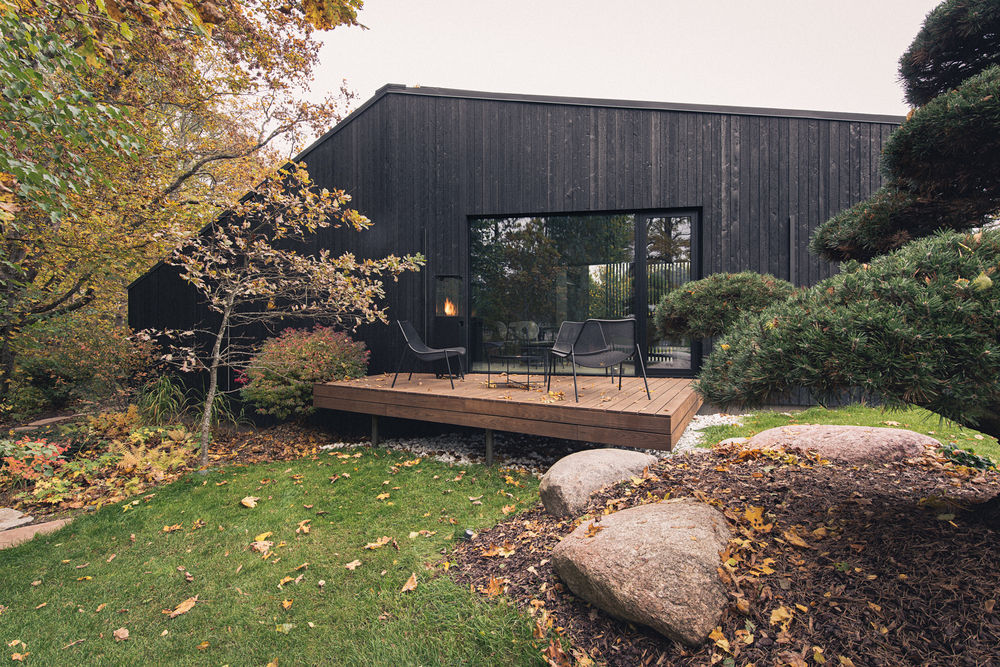
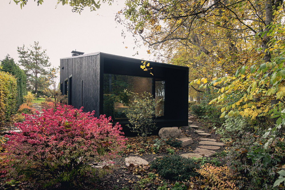
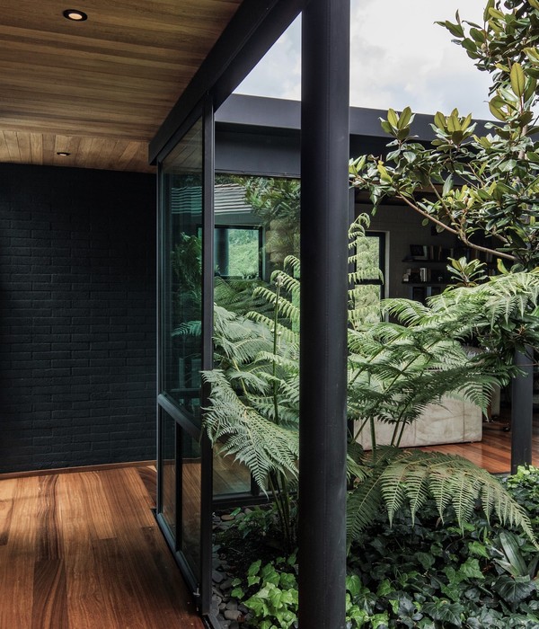
The architecture of this house is characterised by three core values: nature, nature and - nature. Nestled in the picturesque landscape of the Gauja valley, it projects the laws of nature into both the interior and the exterior.
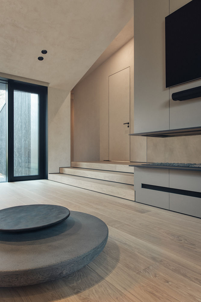
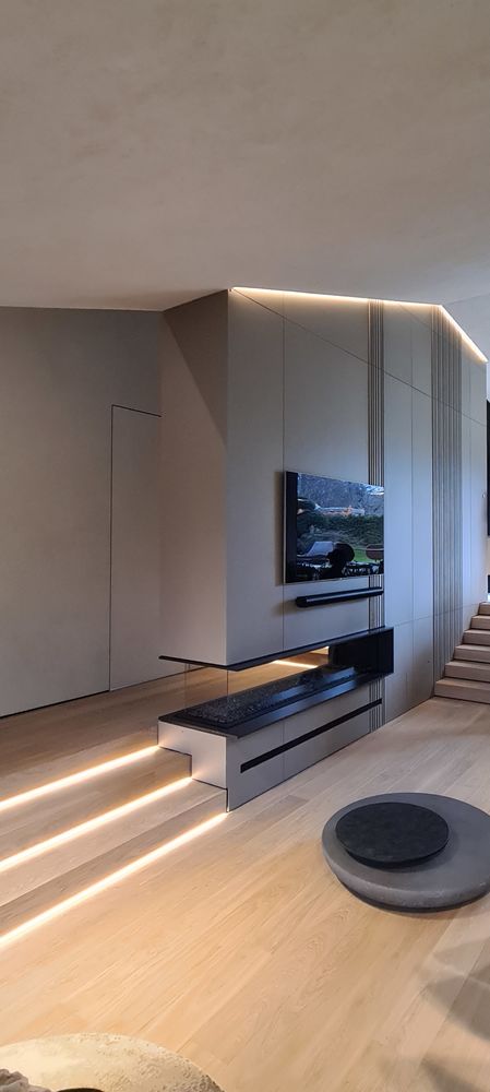
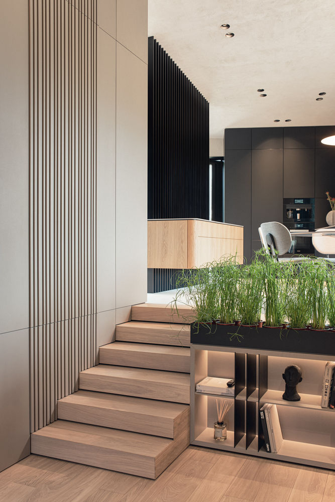
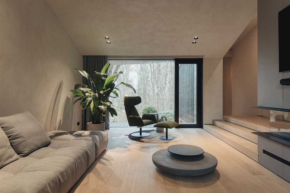
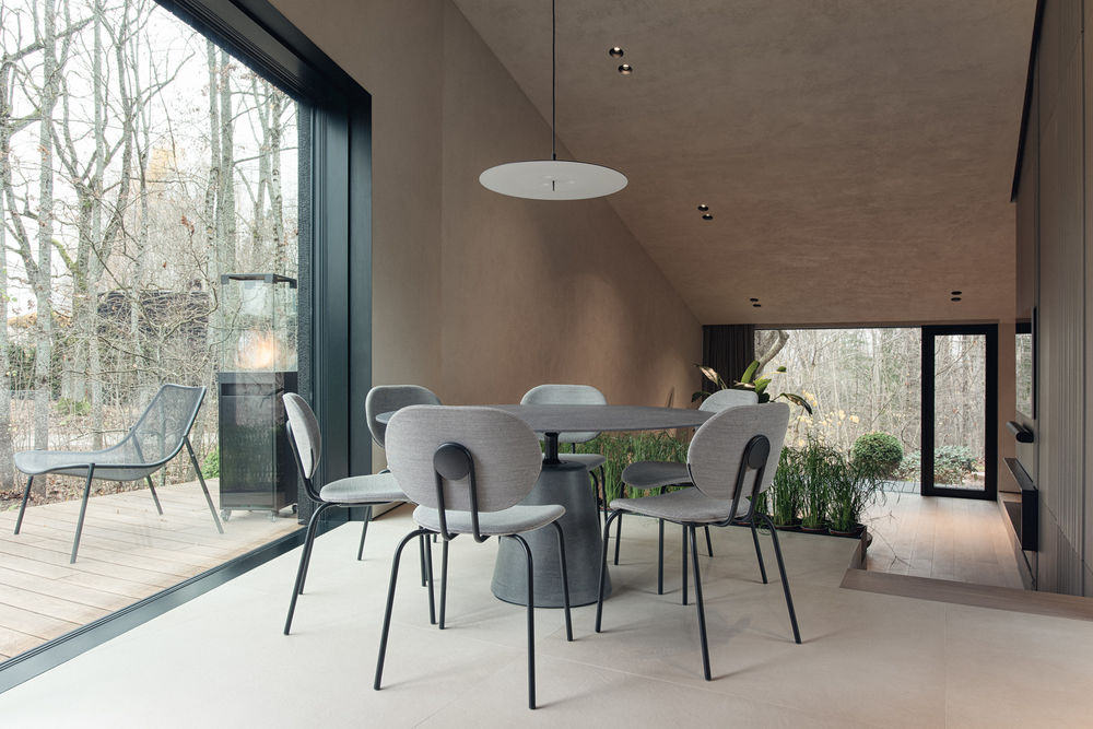
The functional layout of the rooms is built around the heart of the building - the fireplace, surrounded by the kitchen, living room and terrace with outdoor hot tub, with two bedrooms and en-suite bathrooms set slightly apart. Following the topography of the site, the building is built on three different levels. A central axis of movement runs through the building, leading the visitor in a straight line towards the landscape outside the window. The interior is deliberately free of daylight curtains, so that the landscape outside can be fully enjoyed and the sunlight can enter unhindered.
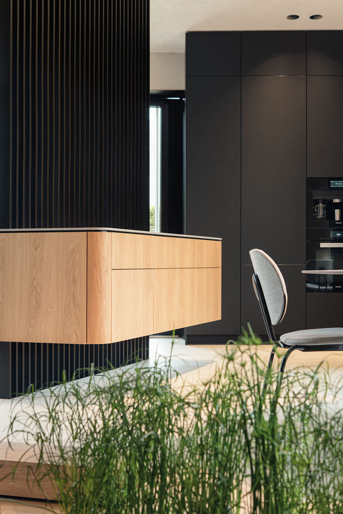
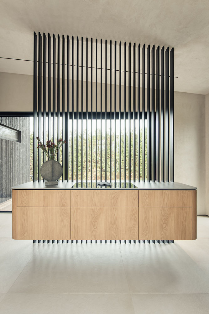
The aim of this interior is to accentuate the architecture without spoiling the space with unnecessary elements, while at the same time maintaining transparency - this principle is particularly evident in the carefully planned kitchen island, which is raised above the floor on an openwork slatted structure, giving the impression that the island is levitating in mid-air.
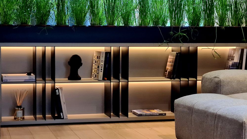
All the furniture is designed at maximum height to preserve the laconic lines of the ceiling and organically blend the finishing materials. Natural finishes, mostly sourced from the Baltic region, dominate the interior.
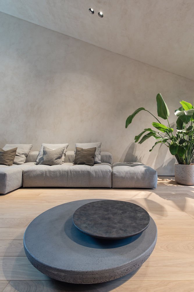
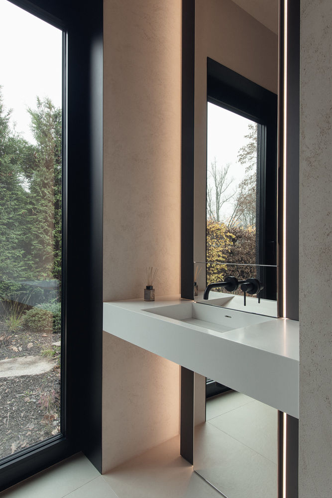
Only the ceiling and walls are finished with eco-friendly, tinted lime from Italy. By painting both planes in the same finish, no shadow seam is visible, thus achieving a seamless room effect.
The kitchen worktop is made of cast or reconstituted stone powder. The flooring is oak parquet from Lithuania. The designer hardly ever uses cabinet furniture in his projects, preferring to use local carpenters.
The house is currently occupied by a single person with a dynamic lifestyle, but it is envisaged that a family could live here in the future. With this in mind, the designer designed the storage systems early on and adapted the size of the kitchen to accommodate more people.
The main idea behind the interior design is the same as the architectural setting of the building - interaction with nature. The main feature of this interior is that it does not exist in itself - the boundaries between the surrounding nature, the architecture and the interior are visually blurred. The planes of the walls are visually merged with the sloping ceiling planes thanks to the carefully chosen lime plaster. Nature and daylight enter the rooms through the large sash windows. The interior itself is designed to be as transparent as possible, including the central kitchen island, mounted on an openwork lattice structure, which allows an unobstructed view beyond the window. The occupant can follow the natural processes without being distracted by unnecessary or garish details in the interior, and the building's position in the terrain enhances the experience of the interaction between nature and man.
The main task of the interior was to complement the non-standard geometry of the building - 3 different floor levels and sloping ceilings. Therefore, in order to have a visually uniform horizon line when being higher or lower on one of the levels, the solution was to use the same lime plaster on the wall and ceiling planes, leaving no visible shadow seam - in this way the boundary between the walls and ceiling is blended together.
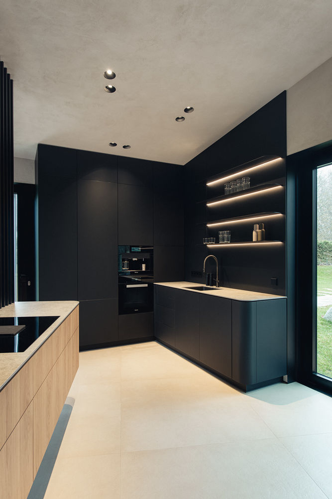
One of the client's requirements was to hide all technical ventilation grilles as much as possible. This was solved by hiding the entire ceiling in the eaves. Other subtle details, such as the joining of furniture and finishing materials and the hiding of unwanted visible structural parts, have also been taken into account to create solutions that are invisible to the eye and elegant, for example by joining furniture materials at 45° angles.
All the solutions were carefully thought through, especially the technical part, where the desired solution for the hidden ventilation grilles was achieved in collaboration with the architect. This project is a team effort where each of the "players" did not try to dominate - the landscaping, architecture and interior are seen only together and complement each other.
To achieve the effect of the ceiling and walls as a single plane, a natural, full-weight tinted lime plaster was used. The application of this finish was a technological challenge: the plaster was applied by hand with such care that there are no differences in pattern - the final result is homogeneous in all rooms, with no differences in texture or shade.
The functional layout of the rooms is tailored to the client's wishes, respecting ergonomic requirements and offering ingenious functional solutions for non-standard situations, such as the kitchen island, which was not originally planned.
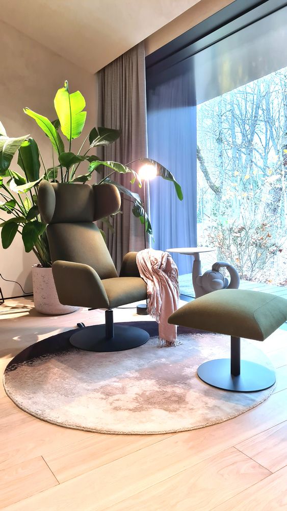
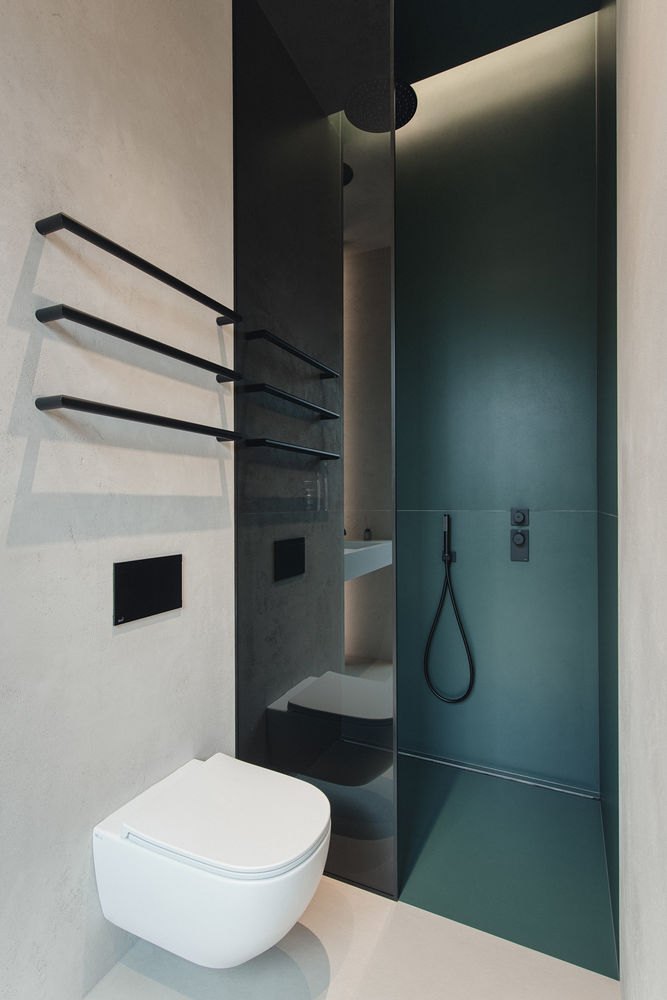
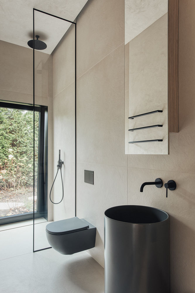
Natural tones dominate the interior: variations of browns and greys, muted greens and accents of black. As the windows are open without curtains, this choice of interior finishes and furnishing materials blends with the view outside the window and suits all seasons.
The lighting is controlled by the Casambi wireless lighting control system, which allows for a wide variety of lighting scenarios, creating a unique lighting solution that is unique to the interior and the client.
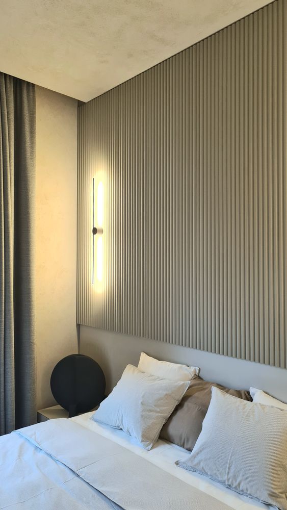
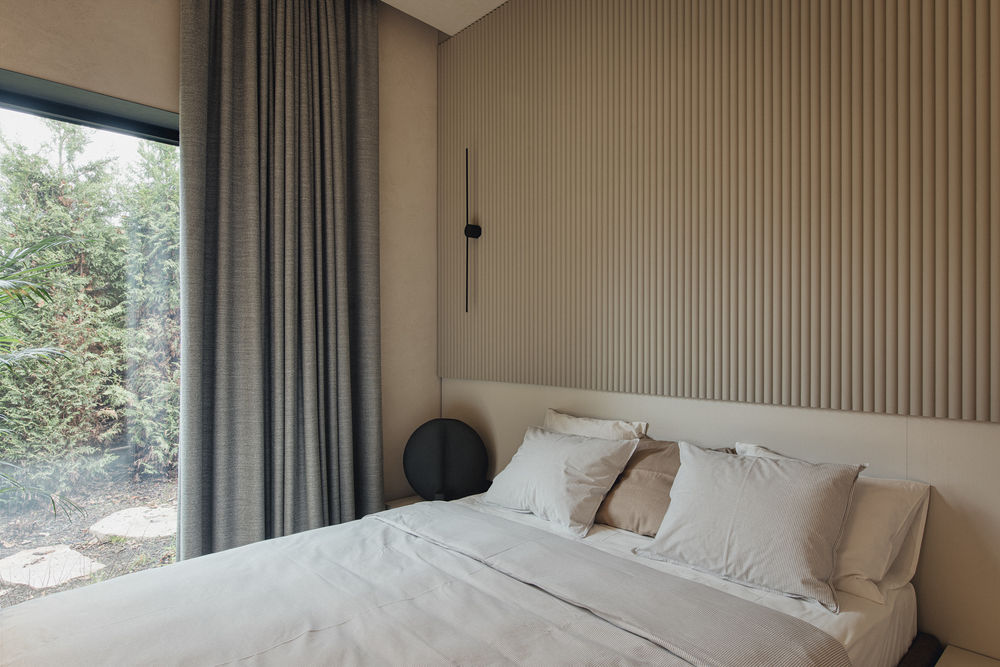
All the furniture we produce has customised solutions. For example, the kitchen island "hangs in the air" thanks to the openwork construction of the slats. It is worth mentioning that the design of the island has been so carefully thought out that there are absolutely no visible fixings - neither for the grids in the ceiling and floor, nor for the island near the grids, and the sockets are cleverly hidden in the opening sides of the island. The same effect of lightness is also achieved in the beds, where the legs are designed in such a way that they are not visible and the bed "levitates in the air".
All the materials used are of high quality and have a long service life. Manufacturers have also been selected for lighting and finished furniture, offering products with innovative design, excellent functionality and quality. Local carpentry has been selected for the furniture to be manufactured.
The interior is designed to be in line with current trends in design and innovation, but not tied to them - it will be relevant years from now. This is how the interior is sustainable - no need to invest extra money after a long period of time to replace elements that have gone out of fashion. It is also versatile: a single person, a couple, a family or a guest house can occupy the space.
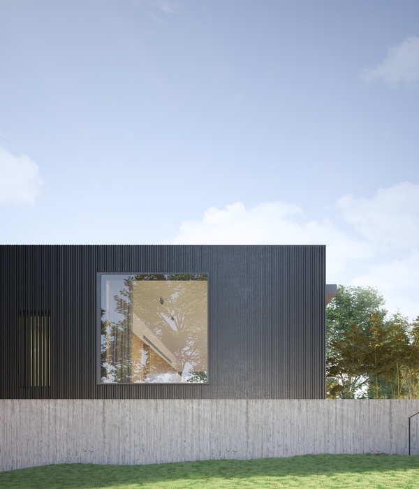
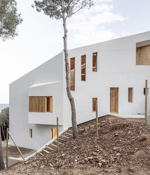
The architecture of the building itself follows the topography of the site and all existing trees and shrubs were preserved in the landscaping process, as well as the fact that the site has no fence. The architecture of the building fully respects the surrounding environment and blends organically into it, just as the interior blends into the architecture. The owner ensures his privacy with outdoor blinds completely hidden in the facade. In the interior, there are deliberately no additional curtains, except in the bedrooms, where they serve more as an element of cosiness.
The building is also a good example of a passive house, with energy from solar panels and a heat pump, and an efficient heat recovery ventilation system.
Architecture: architect Pēteris Bajārs, OUTOFBOX Architecture
Interior: interior designer Aleksejs Čurbakovs, LABS design
Landscaping: Labie koki
Text by Sabīne Krese, published in the December/January 2022 issue of Deko magazine
