Designer: Faber Design - Architecture Project: Lasan Restaurant Location: Birmingham, United Kingdom Area: 270m2 (2906sq.ft) Photography: Courtesy of Faber Design
设计师:费伯设计
If you’re looking for your typical Indian restaurant, look elsewhere, because thanks to an extensive makeover, Lasan is anything but average. Famously the winner of Gordon Ramsay’s the F Word in 2009, it has been delighting Birmingham diners since 2002 from its home in the historic Jewellery Quarter.
如果你在寻找你典型的印度餐馆,那就去别处看看吧,因为多亏了一次广泛的改造,拉桑绝不是一般人。2009年,作为戈登·拉姆齐(Gordon Ramsay)“F字”(The F Word)的著名获奖者,它从2002年起就在历史悠久的珠宝区的家中为伯明翰餐厅带来欢乐。
The agency responsible for its recent transformation, including a completely redesigned (and relocated) bar area, is Faber Design - Architecture. Specialising in interior design and branding for the F-B sector, Faber works with bars, restaurants and hotels across the UK to create unique, memorable and cohesive design concepts. Led by creative director Tony Matters, a designer with almost 20 years’ experience, Faber has “completely reimagined what was a tired space lacking a clear identity, and created an elegant, stylish restaurant and bar, centred around the customer experience,” says Tony.
负责其最近改造的机构,包括一个完全重新设计(和重新安置)的酒吧区,是Faber设计公司。
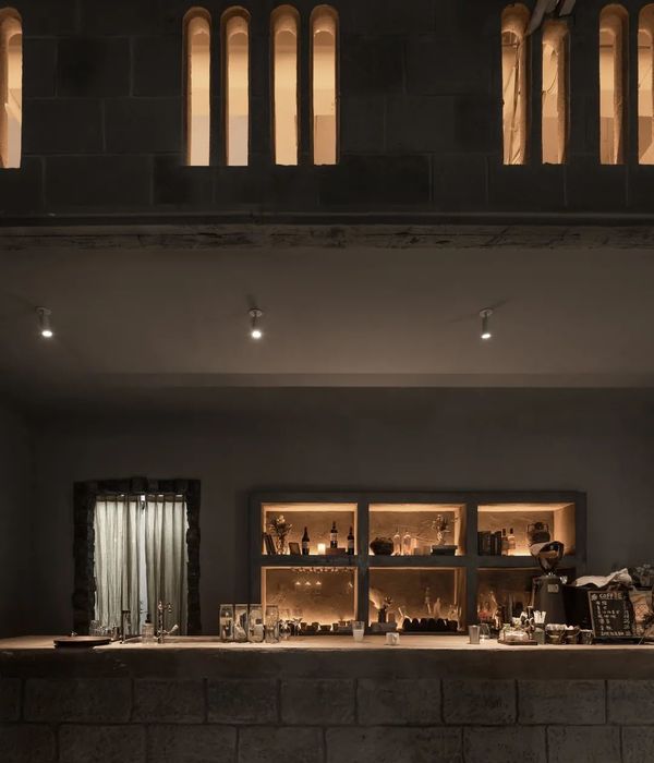
A key part of this customer-focussed metamorphosis was a total rethink of the bar area. Originally located in the main dining room, the layout gave the impression it was for diners only. In its new position, the dramatic U-shape design with nostalgic brass detailing has become a real focal point. It’s one of the first things guests see as they enter the restaurant, cultivating a sleek, cocktail-bar feel as you walk in. This new layout has also enhanced the overall experience for diners by creating a more peaceful environment to enjoy dinner, away from the hustle and bustle of bar traffic.
这一以客户为中心的变形的一个关键部分是对酒吧区域的全面反思。最初位于主餐厅的布局给人的印象是,它只适用于食客。在它的新位置,戏剧性的U形设计与怀旧黄铜细节已成为一个真正的焦点。这是客人进入餐厅时看到的第一件事之一,当你走进餐厅时,他们会培养出一种优雅的鸡尾酒吧的感觉。这个新的布局也增加了食客的整体体验,创造了一个更安静的环境来享受晚餐,远离拥挤的酒吧交通。
Lasan may have had a complete refurb, but Instead of that shiny, pristine feel you usually get from a newly refitted venue, it somehow feels as though it has always been this way. “We wanted a timeless space which would appeal to all ages,” explains owner Jabbar Khan, “where you could be a youngster or a more mature person, but still feel you are in the right place. That comes with something that is designed to be timeless, not to fit in with a fad. That’s what good design should deliver.”
拉桑可能有一个完整的回旋,但不是那种闪亮的,原始的感觉,你通常从一个新装修的场地,它感觉似乎一直是这样。“我们想要一个对所有年龄层都有吸引力的永恒空间,”老板贾巴尔·汗解释道,“在那里,你可以是个年轻人,也可以是一个更成熟的人,但仍然觉得自己的位置是对的。”这是设计来的永恒的东西,而不是与时尚相适应。这就是好的设计应该提供的东西。“
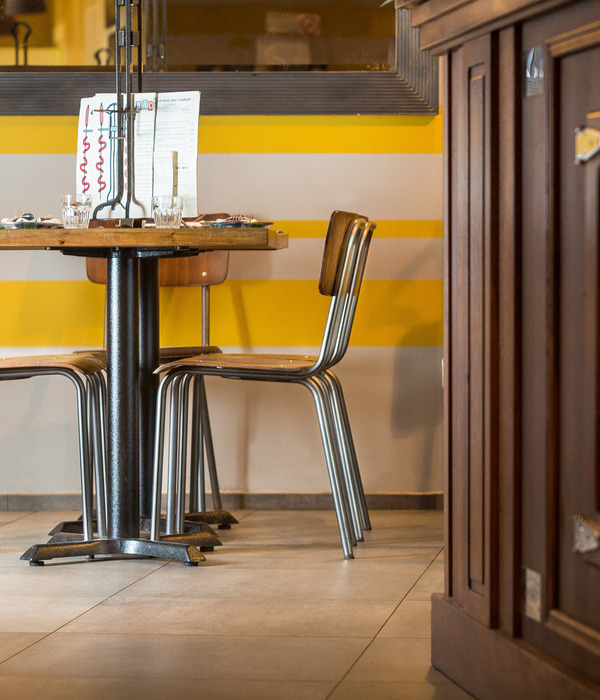
This sense of authenticity and classic elegance is exactly what Faber was trying to achieve with the redesign. “We wanted to create a sense of history and a design that would really stand the test of time,” says Tony. “We achieved this by choosing classically inspired lighting and combining traditional hardwood flooring with deco-style geometric tiling. We also used luxurious but elegant materials such as marble, brass and wood to provide that sense of durability and opulence you associate with older buildings. Even the wall art tells a story and adds to that feeling of longevity.”
这种真实性和古典优雅的感觉,正是费伯试图通过重新设计来实现的。托尼说:“我们想要创造一种历史感和经得起时间考验的设计。”“我们通过选择古典灵感照明和结合传统硬木地板和装饰风格的几何瓷砖来实现这一点。我们还使用了豪华但优雅的材料,如大理石,黄铜和木材,以提供你与旧建筑相联系的耐久性和富足感。甚至墙壁艺术也讲述了一个故事,增加了一种长寿的感觉。“
{{item.text_origin}}

