SharikavaLocation: Zhytomyr, UkraineArea: 86 m²Year: 2020Team: Yaroslav Pavlivskiy, Andriy Gusak, Armine Avakyan, Nikolay PaninPhoto: Tanya KrasnayaThe modern world is a pretty hectic and fast paced place but it keeps moving forward even at uncertain times. That’s why for many people in this world coffee is a daily necessity and coffee shops are the places where we are all meeting with friends or taking some time to be alone or spending lots of hours working on something. It’s more like a second home for us. Therefore, the design of these spaces must meet the high standards of architectural functionality, aesthetics and human psychology to make sure that people would want to come there every day and feel themselves like home.
Interior design of the “Sharikava” coffee shop in Zhytomyr became the embodiment of a new concept of the famous Ukrainian franchise, which combined the main features of the brand Sharikava and rethinking the design of the public spaces.
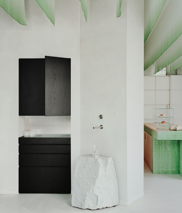
The use of natural materials, bright color palette and unusual decorative elements on the ceiling have created an atmosphere of natural tranquility in the place.
The main task for us was to create a completely new space, respecting the basic philosophy of the “Sharikava” franchise, which says that the visitor is part of their family. The advantage of a rich green color in the interior of the new establishment became one of the key design elements and a kind of a special focus, which provided the cafe with a sense of natural surroundings. The use of this color in design has a positive impact on the well-being of people and helps to relieve stress by giving energy.
Bezmirno team sought to achieve a common friendly environment by combining green on the walls and floor with a warm shade of wood and soft lighting which would attract people to come to this place and improve their mood just from being in an aesthetic surroundings.
The main feature of the new “Sharikava” coffee shop was an unusual installation on the ceiling, which displays the brand logo and borders with wooden beams. The imitation of the leaves of a franchise logo creates the strong feeling that you are not in the city center, but somewhere in the rainforest, among the birds chirping. This installation is an interesting visual addition to the overall interior of the cafe which provides an identity to the project that was the main direction of the design.
To conclude, the rich color palette, brick walls, the use of natural materials, futuristic bar area with satin-finished stainless steel and customized decorative elements on the ceiling have turned the usual double space into a free, modern and attractive place for people to visit not only for a cup of coffee but for an emotional recharge in the surroundings of a natural oasis right in the middle of the city as well.
The public space of the new coffee shop is divided into two separate zones. In the first and more spacious one is a large bar counter with satin-finish stainless steel, where the barista will make you a cup of coffee and will offer you to sit down at one of the communal tables made of concrete or buy something from the official merch on a cabinet made with veneer plywood. In the second hall, connected to the main zone by arch, you will always find a place at smaller tables to relax from the hustle and bustle of the city in a company of loved ones.
The large number and variability of seats allows café visitors to spend their time in company or alone without disturbing each other. Thus, communal tables located in the first hall are best suited for meetings in large companies, while smaller tables in the second hall are best suited for more personal conversations or for a quiet lonely break, with a cup of coffee and a great book.
PLEASE FOLLOW US
FACEBOOK INSTAGRAM PINTEREST
visit our
OFFICIAL BEZMIRNO WEBSITE
作者:
图片@Bezmirno Architects
语言:英语
{{item.text_origin}}

